| Image |
Comment |
| 07/21/2002 09:09:00 PM |
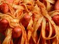
Fettucini Feelingby HoltwComment: I love the fettucini but I stared a long time at what I thought were pieces of hot dogs and was wondering what they were doing in an Italian dish. lol. Then i discovered they were hands. lol. The pic has originality and a sense of humor and what better way than to show "embracing one's love for pasta" ? However, I do think you should have rearranged those fingers/hands so that they had been more immediately obvious as hands. So, my main critique is with the composition. Right now it has somewhat of an unappealing quality to the pic. All this is my personal taste, mind you. BTW, in your household do you use utensils or do you eat all right from the trough? :) |
| 07/22/2002 07:33:00 PM |
Ropesby Emese GaalComment: nice but a bit monotonous. Introducing some other object or re-arranging some of the rope would have given some tension to the img. |
| 07/25/2002 12:10:00 PM |
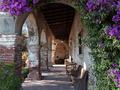
Aged Eleganceby GotchaComment: A fine picture while meeting the challenge requirement at the same time. Like the mood of this picture as well as the splurge of green and purple color. Would have been nice if the foreground flowers and leaves could have been a tad sharper. |
 Photographer found comment helpful. Photographer found comment helpful. |
| 07/24/2002 04:03:00 PM |
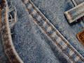
Old Dirty Bluesby AlemmsanComment: That's a fun interpretation of the texture challenge and totally valid. Effective way of cropping the image. The unraveled fabric peeking out of the pocket is a nice touch. |
| 07/21/2002 09:27:00 PM |
|
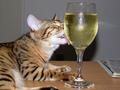
| 07/22/2002 07:37:00 AM |
Delectable Dropletsby jaidComment: Great picture. Love the sharpness of the cat, the icy water on the glass. Reflections in the base of the glass are superb. Somehow I can't make up my mind whether the newspaper adds or is just a sloppy distraction. Too bad not more of the bottom paw could have been shown. The black spot behind cat and glass is somewhat unfortunate but it provides nice contrast with the white cat fur. BTW, are you training your cat to become an alcoholic? :) |
| 07/22/2002 10:19:00 AM |
Cement, of coarseby ScottEmmonsComment: sorry but i find this a bit boring and monotonous, sort of like a basic texturizer filter in photoshop. |
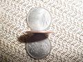
| 07/25/2002 09:34:00 AM |
quartersby g04tComment: Not enough tonal contrast between the coins and the cloth. Top right is light and bottom left is dark; should have been the other way around, methinks. Coins are out of focus. |
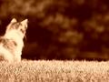
| 07/22/2002 03:46:00 PM |
Smooth as Grassby AaronComment: Perhaps everything is deliberately out of focus but I don't care for it. Ditto on the over-sepia toning. |
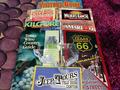
| 07/25/2002 10:09:00 AM |
TX-Toursby Frank BeckmanComment: This is all lined up too neatly to make it interest. The brochures are also dead center. Can't figure out what those discs on the left are and they distract. |
Home -
Challenges -
Community -
League -
Photos -
Cameras -
Lenses -
Learn -
Help -
Terms of Use -
Privacy -
Top ^
DPChallenge, and website content and design, Copyright © 2001-2025 Challenging Technologies, LLC.
All digital photo copyrights belong to the photographers and may not be used without permission.
Current Server Time: 04/17/2025 06:04:36 PM EDT.