| Image |
Comment |
| 07/15/2003 08:29:38 PM |
Waiting for Fireworksby paganiniComment: Truly beautiful colors. Would have liked to see a bit more sky but not at the expense of losing that incredible blue/purplish water in the foreground. There is an alternative interesting composition to this and that is to crop out right below the sky; makes for a very intriguing composition. Perhaps something to consider next time you shoot in that vicinity. The water is really great. So, you're in the sunset business, too? ;) |
 Photographer found comment helpful. Photographer found comment helpful. |
| 07/15/2003 12:57:25 PM |
The Touristby greenem2Comment: This is very cool, greenem. Love it. Nice application of lines, lively colors. Also find this an excellent representation of Mr Tourist. If you have more digital art somewhere on a website, would love to visit it. |
| Photographer found comment helpful. |
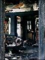
| 07/15/2003 12:43:22 PM |
|
| 07/13/2003 08:09:39 PM |
|
| Photographer found comment helpful. |
| 07/12/2003 04:06:51 PM |
baby got backby grigrigirlComment: Hey, your picture; you call and make the shots. Somehow, though, i can't believe that this pose and model would be boring in nude. Just a little puzzled, that's all. Besides, most people might like this version just the way it is. I'm merely the opinion of one :) |
| Photographer found comment helpful. |
| 07/12/2003 10:06:48 AM |
baby got backby grigrigirlComment: Like the lighting of this picture. Like the pose of the hands and arms. I'm honestly not a good judge to evaluate this picture: I don't quite understand the title (am i very nerdy?). I also tend to prefer nude over sexy clothing with holes and so on. There's nothing wrong with that, it's just that i personally don't care too much for it. The picture also reads as a little busy, might have been better without a few of the straps hanging there. Might have liked this a lot better if it were nude, since i do like the pose and composition. Just my personal taste, mind you. |
| Photographer found comment helpful. |
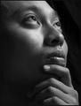
| 07/12/2003 09:43:57 AM |
conehead digestby grigrigirlComment: Really nice portrait and deviating nicely from the usual serious poses one tends to associate with portraits. Love the composition and the wonderful mood created here. Good job on the lighting, too. Nice how your mood and smile mirrors that of the sculpture. Find this picture very classy and original. Again, i have the sense that this picture captures the real you very well. That sculpture you have is great and a fantastic prop!
That's really the pits about these challenges. Perhaps as Magazine Cover it isn't the most suitable submission but as for self-portraits it should have garnered top 5. It's one of the reasons that i prefer lately to spend my time viewing/commenting on people's portfolios rather than on challenge submissions.
From what i'm seeing, you'll be able to pull a lot more good stuff out of the Minolta but you are also definitely worthy of better gear. Message edited by author 2003-07-12 13:52:48. |
| Photographer found comment helpful. |
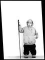
| 07/11/2003 06:28:03 PM |
Me and my Monopodby JPRComment: I have seen this image a few times and must say that it has impact. Also, the way you framed it goes well with the imagery itself. The horizontal is slightly off but perhaps you wanted it that way. |
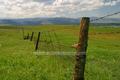
| 07/11/2003 11:24:24 AM |
Fenceby paganiniComment: Yes, definitely what grigri said. Then there's the psychology of the fence/barrier language, that i see being expressed by lots of people, here as well.
It is powerful to me because it IS a more personal/unique view of Colorado. Not the usual 'scenic' shots of the mountains that people have come to associate with Colorado. Here, there are the mountains as well but the image is really saying here, here, there is much more to Colorado and its landscape.
Suspect that the image wasn't really all that much of a fluke after all. You probably 'saw' it clearly and it was good enough to slam on the brakes for.
Probably my usual mumbo jumbo. Message edited by author 2003-07-11 22:15:17. |
| Photographer found comment helpful. |
| 07/11/2003 10:23:25 AM |
soft sun by DrJOnesComment: DrJ, i owe you, and your model!, an apology.
This submission is one of the best, if not the best, submission here. It has real professionalism; i suspect you are a pro and also have the studio and the appropriate gear. The biggest difference between this and your magazine cover is that this picture, my taste mind you, is much more appealing and far less lewd (for lack of a better word). This is probably because there are no skimpy clothes. The message of the image is a great deal softer as well. Not so much in-your-face but i think all the guys' reaction is still the same ;)
The lighting here is perfection. The pose is lovely and so is the hat. For some reason, what i like most is that hand reaching towards the hat. It's a bummer that you can upload 150 kb max because i would have liked to see this image without the compression blockiness. 8
Hope my apology will be accepted. Salut |
| Photographer found comment helpful. |
Home -
Challenges -
Community -
League -
Photos -
Cameras -
Lenses -
Learn -
Help -
Terms of Use -
Privacy -
Top ^
DPChallenge, and website content and design, Copyright © 2001-2025 Challenging Technologies, LLC.
All digital photo copyrights belong to the photographers and may not be used without permission.
Current Server Time: 04/09/2025 04:59:12 AM EDT.