| Image |
Comment |
| 04/27/2005 08:59:18 AM |
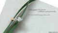
Writing a Love Poemby admart01Comment: Very nice soft lighting (used a soft box or natural?) The text is very subtle and brilliant, the CO. name is very shy and perfect for the look. Colours are nice and the jewel really is nice. 2 things i really don't like tho, is the reflection on the ring (orange) which to my eyes, doesn't fit at all with the restof the picture, and the paper on which the ring rests. The white borders kind of breaks the pattern for me. Also, perharps a little more energy in the colours would've helped. Very nice work! 7 |
 Photographer found comment helpful. Photographer found comment helpful. |
| 04/27/2005 08:55:57 AM |
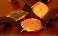
Hamilton Watch Company circa 1958by bcobleComment: First thing, the colour of the text is all wrong., It really breaks the mood of this shot. Composition could use some work as we see little details like the boarders of the watchs beneath the closest watch's bracelet. The tip of the right watch's bracelet. Those are all distracting details which makes this shot less then perfect. The lighting is interesting as it gives power to the gold, but unfortunatly, takes away from the sharpness, making the picture seem out of focus slightly. nice try. 5 |
| Photographer found comment helpful. |
| 04/27/2005 08:53:37 AM |
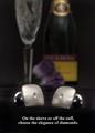
Diamond Cuff Linksby cajayComment: Very cool idea. And quite unique so far! Lighting is good, unfortunatly, i'm not a fan of the composition. With the Champain and glass in the background, i feel it takes away from the picture and doesn't really serve any purpose. Perharps its the straight angle of the camera which doesn't give energy and/or movement to the shot. I would imagine the same kind of setting but with the items on the boarder of a counter, with a couple in the background, easing into the evening... 6 |
| Photographer found comment helpful. |
| 04/27/2005 08:51:31 AM |
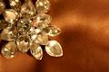
Elementalby utroComment: Interesting composition. Some text could've helped here. A frame as well. Unfortunatly, the DOF doesn't give this item justice; since its entirely of the same colour, using a very wide aperture (2.8, 3.2?) didn't help to bring out the jewel. It kind of blurs the whole thing. nice try tho. 5 |
| Photographer found comment helpful. |
| 04/27/2005 08:49:09 AM |
Diamonds are foreverby TrollManComment: Idea is good, unfortunatly the result is a bit deceptive. There is not enought emphasis on the jewel, we can barely see it. the B&W approach doesn't help it either. Sharpness is good tho. Composition could use some work too, i feel the model is Croped in a wierd manner. 5 |
| Photographer found comment helpful. |
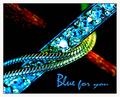
| 04/27/2005 08:47:56 AM |
Blue for youby JohannesFrankComment: Rich in colours, and composition is interesting. Unfortunatly the imagine seems out of focus (probably due to lighting) and it sort of breaks the effect a little. Text is nice, but i find it a little too intrusive over the jewel. I don't like the white frame, as it takes away from the item, perharps a black frame with fine blue line would punch a little more? 7 |
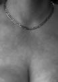
| 04/25/2005 06:49:13 PM |
All You Need Is Goldby Mr_PantsComment: I'm not too sure what to say about this shot. Lighting is poor and what seems like a very off focus doesn't help. Not enought lighting on the neckless makes this pic a not very good seller in a magazine. 3 |
| Photographer found comment helpful. |
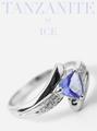
| 04/25/2005 06:44:11 PM |
Iceby bruskiComment: Superb lighting mastery. Composition is very good. Text is very nice and brings lots of synergy to the shot. Masterful. One thing i don't like is the big reflection on the jewel. Its very subjective, but its a bit too big for me. Either way, i suspect this is gonna make it first place. 9 |
| Photographer found comment helpful. |
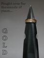
| 04/25/2005 06:41:26 PM |
Gold - Fought over for thousands of years....by theSajComment: Interesting looking ring. Setup is nice, unfortunate that the background was so close to the items, as they drop shadows which ruins the effect. Text is rather poor and doesn't bring anything to the picture. 5 |
| Photographer found comment helpful. |
| 04/25/2005 06:39:36 PM |
Jewelry with a purposeby DogAngelComment: DOF is quite nice, could've used a little more lighting and i'm not sure about the composition too much. Model didn't seem to enjoy herself too much either. 5 |
| Photographer found comment helpful. |
Home -
Challenges -
Community -
League -
Photos -
Cameras -
Lenses -
Learn -
Help -
Terms of Use -
Privacy -
Top ^
DPChallenge, and website content and design, Copyright © 2001-2025 Challenging Technologies, LLC.
All digital photo copyrights belong to the photographers and may not be used without permission.
Current Server Time: 04/07/2025 06:11:44 AM EDT.