| Image |
Comment |
| 04/30/2005 07:47:17 PM |
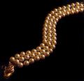
Pearldragonby marvinComment: Cool idea, i like the movement this shot offers. Unfortunatly lighting is poor and sharpness suffers greatly. Colours are a bit stale too. 6 |
 Photographer found comment helpful. Photographer found comment helpful. |
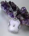
| 04/30/2005 07:46:48 PM |
Graceby gudbjargarsonComment: Interesting reflection. Unfortunatly, the fact that the reflection is almost as 'crisp' as the actual jewel makes it hard to distinguish which is which. Lighting is not strong enought and makes the picture suffer from poor sharpness. a tighter composition or some text would've helped. 6 |
| Photographer found comment helpful. |
| 04/28/2005 07:35:54 PM |
MAMBAby aznymComment: Wow, this is awesome! I really love this shot! Reminds me of the Sentinels in The MAtrix for some reason. Lots of movement which gives the rock a very 'organic' feel. Colours are rich and lighting is dead on. Sharpness seems very good as well, but unfortunatly... and sadly... its SOOO SMALL! ARg! I want to get closer to my screen. I'd wished for something a bit closer. Text is also a bit too 'non existant'. Other then that, Very Very nice work! 8 |
| Photographer found comment helpful. |
| 04/28/2005 07:32:47 PM |
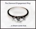
...dream come trueby lilnukeeComment: Way too much light and fuzzyness. The ring is not sharp and out of focus. I think the Aperture is to blame here. Text is too present, takes away from the item. Frame is a bit claustrophobic on the item as well. 4 |
| Photographer found comment helpful. |
| 04/28/2005 07:24:40 PM |
Topazby aerogurlComment: Nice colour. Lighting is a bit wierd (from top?) and doesn't really tive the ring any credit. Perharps its becase there is too much contrast between the colours. Composition is good, but a bit on the boring side, since there is nothing to complement the ring. Especially the colour of the 'background', which goes from light white to dark greenish. 5 |
| Photographer found comment helpful. |
| 04/28/2005 07:22:34 PM |
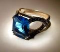
Sapphires and Diamondsby hughletherenComment: Nice composition. I'd wished for an even crop on both sides of the ring tho (top and left). Lighting is good but is hard on the 'black' jewels. Text is nice, perharps a bit too intrusive. Overall tho, the picture lacks the little 'humphs' it needs to catch the eyes in a magazine. IMO. 6 |
| Photographer found comment helpful. |
| 04/28/2005 07:19:01 PM |
The Perfect Settingby ChasSourekComment: Cute idea. Unfortunatly, the white takes away from the ring. Composition is intersting, if a bit 'large'. The rings are a bit small tho, hard to see, and they seem a tiny bit 'not' sharp enought. 7 |
| 04/28/2005 07:17:59 PM |
Elainesby Rando D300Comment: Nice colours! Wish they could've been a little more bright. The pic shouts for Contrast IMO, and the jewel is unfortunatly, not well focused. Perharps due to lighting? NIce non the less. 6 |
| Photographer found comment helpful. |
| 04/28/2005 07:06:28 PM |
Elegant Vintage Jewelryby ladpupmoeComment: Cool idea. Matchs pretty well with the rock. Lighting is somewhat dull and could've used some HUmphs. Lots of little grainny spots and dirts in the pic, which could've been avoided with some spot editing. That really kills the effect. Also a Frame of some kind (black and purple?) would do well here. 5 |
| Photographer found comment helpful. |
| 04/28/2005 07:04:53 PM |
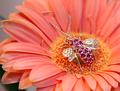
The Links Collectionby EddyGComment: Cool concept! I really like the shades of the skin vs the jewels. They seem to be missing some sharpness unfortunatly. Text is cool and looks good, not in the way too much. I seem to think you selected the jewels out of the pic for better editing... 6 |
| Photographer found comment helpful. |
Home -
Challenges -
Community -
League -
Photos -
Cameras -
Lenses -
Learn -
Help -
Terms of Use -
Privacy -
Top ^
DPChallenge, and website content and design, Copyright © 2001-2025 Challenging Technologies, LLC.
All digital photo copyrights belong to the photographers and may not be used without permission.
Current Server Time: 04/07/2025 06:11:52 AM EDT.