| Image |
Comment |
| 11/07/2004 10:47:10 PM |
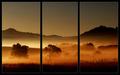
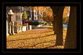
Daybreak by BradComment: The frame work is outstanding. It would not have been the same for me, without it. Not only is the picture amazing in its colours and tone, but the framing gives it a very nostalgic effect, very close to Japanese art, where they often use the same framing effect.
One thing i tried here, was to change the stroke's colour to a golden/orange instead of the gray. Found it gave the artwork a little more punch. 9 on me mate. |
 Photographer found comment helpful. Photographer found comment helpful. |
| 11/07/2004 09:58:07 PM |
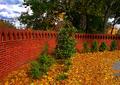
Novemberby JohannesFrankComment: This picture seems very interesting and nice. Unfortunatly, because of the "very big" frame, we do not see much of it. The colours look really rich, while the sky could've used some work.
As a recommendation, i would propose to remove the frame completly, and just add a little framing line, a few pixel-distance from the actual picture (black background) with a nice golden colour. This would bring out a lot more of the image.
An unwriten rule of framing: Never use the dominant or most 'foreground' colour as a frame display. Go with the soft and unique colours. (in your case, yellow, green or Red would've probably given more punch). |
| 11/07/2004 09:54:23 PM |
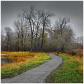
Novemberby jimmythefishComment: Amazing Contrast in colours. Perfect representation of November. The grading of colours from Rich to sad-gray is very well done. For some reason, i wish i could've seen a little more on the left, perharps a 'wide' angle shot would've helped. This place is pure delight for an 'Halloween' or 'creepy' Tim Burton feature film (Sleepy Hollow-esque). I would really like to know where it was taken! |
| Photographer found comment helpful. |
| 11/07/2004 09:52:22 PM |
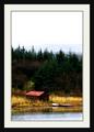
Novemberby oksamitComment: Very nice Framing of the picture. The colours are nice and warm, even for a November application. Perharps would've been a little nicer without the gray darmac on the far right. Perharps with a clever croping, it could be removed without loosing too much of the wall. If a chance comes, a re-shoot of this location, but from a lower perspective would give good results, perharps in catching more of the sky to create a good contrast with the red and green... |
| Photographer found comment helpful. |
| 11/07/2004 09:49:46 PM |
Novemberby dwterryComment: Colours are very nice and rich. Also really enjoy the crop, although i think i would've prefered it without the tree on the far right. Also, I would recommend bringing the 'orange' frame line a lot closer to the picture. The separation, as much as being unbalanced (bigger black spacing inside then outside) creates a void between the picture itself and 'end' of the pic. See my 'October free Study' picture "Heaven-Seen-Through-Urban-Eyes" to better see/understand what i mean (I am in no way implying that my picture is better then yours). |
| Photographer found comment helpful. |
| 10/02/2004 11:41:59 AM |
MAIDby DrJOnesComment: Very nice Colour theme (Hair and background). The model"s movement is nice and fluid, but could've been slightly accentuated but a better stretch of the right leg. The slight fuzyness of the background set gives the image a good warmth dreamy look. |
| 10/02/2004 11:40:36 AM |
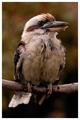
Kookaburraby moodvilleComment: Intriging colours, especially in the background, which brings out the 'fall' mood out of the picture. Nice usage of shadows and highlights for the very dim colours of the picture. Its too bad for the blurry tail of the bird, which would've been more interesting "in-focus". |
| Photographer found comment helpful. |
| 10/02/2004 11:39:20 AM |
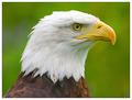
A Proud Birdby mariomelComment: Very nice image composition. The background feels somewhat plain, unfortunatly, which in turn, seems to down-tone all the colours of the picture. The usage of a Frame does help with the overall feel of the picture. |
| Photographer found comment helpful. |
| 10/02/2004 11:37:47 AM |
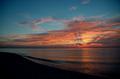
Graceful Departureby connieComment: Rather plain idea. It feels like the colours tones are missing, perharps not bright enought. A good Orange filter would've greatly improved on the depth too. Throught PS, i was able to bring out the colours better and intensify the sky greatly. |
| 10/02/2004 11:10:56 AM |
Parrot Portraitureby buzzrockComment: Nice composition of the picture (Central). For some reason, i feel like the picture is slightly overexposed, perharps due to the white contrast on the bird's face. Also, perharps a themed colour for the frame would've brought more punch to the picture (yellow or green?) |
| Photographer found comment helpful. |
Home -
Challenges -
Community -
League -
Photos -
Cameras -
Lenses -
Learn -
Help -
Terms of Use -
Privacy -
Top ^
DPChallenge, and website content and design, Copyright © 2001-2025 Challenging Technologies, LLC.
All digital photo copyrights belong to the photographers and may not be used without permission.
Current Server Time: 04/12/2025 09:14:19 AM EDT.