| Image |
Comment |
| 03/01/2005 09:11:19 AM |
ny8.jpgby yelenaaComment: I'm guessing that you had the camera stood on top of something for this shot which wasn't quite horizontal?
Hence the slightly crooked verticals. Never the less a good capture of NY city life and environment. |
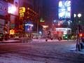
| 03/01/2005 09:09:26 AM |
ny9.jpgby yelenaaComment: I've been to the US but never to NY, this typifies NY for me.
A good urban shot almost photo journalism. I like this shot and the one of the neo signs because it teaches me about an environment that I would otherwise no less.
What I'm trying to say is I like to learn about other DPC'ers parts of the world.
Nice candid shot, gives enough info of the surroundings and a feeling of being 3am, even if you hadn't told me. |
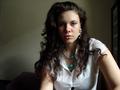
| 03/01/2005 09:00:30 AM |
new11.jpgby yelenaaComment: This would be my second favorite. On the minus side the background is a bit cluttered. The cushions and the picture are distracting.
On the plus side an intense look very compeling, yet relaxed. Very atractive.
Again not quite so harsh lighting on your left and a reflector to lighten your right side would have been better IMO. |
| 03/01/2005 08:55:35 AM |
slika4.jpgby yelenaaComment: I don't feel qualified to comment on your portraits as its not an area of photography I've had much experiance of.
But I think this is my favorite out of the collection. What I would say is, the highlights are a little blown and the shadows a little deep. I know the high contrast is part of the image, (that's the way it seems to me anyway), but I think its a bit harsh. I can see from the other shots that like me you don't have any studio lights and therfore rely on the natural light from the window.
You can use a simple reflector, some white card, or tim foil to litten the shadows, its works very well.
I like the pose, very interesting and the catchlights in the eyes are very important. |
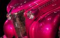
| 02/14/2005 04:19:36 AM |
Things Weren't So Rosy in the 30's by KylieComment: I'm at work with a few minutes to spare so I had a quick peek at the site, as soon as I saw the second place winner I knew it was yours having seen your car shots before.
Well done, I know you did for you not the ribbon, bet it feels good anyway!!
It really is a cracking image though... |
 Photographer found comment helpful. Photographer found comment helpful. |
| 01/29/2005 02:45:20 AM |
Erasby KylieComment: Yep, I like this one the best of this little series of four. Why??? Well the others are good but, the grain just gives it that much more interest, feeling, works the imagination I think. I mean the subject is the same the composition is almost identical. I would clone out the trees to remove the sense of scale, as well as the little bit of guard rail on the lower tier. |
| Photographer found comment helpful. |
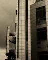
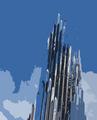
| 01/29/2005 02:39:20 AM |
Two in a Different Lightby KylieComment: That golden or yellow filter really works with the chrome or mirror of the structures. Makes it look even more stunning. |
| Photographer found comment helpful. |
| 01/29/2005 02:33:08 AM |
Straight Shooterby KylieComment: Yep, I like the abstract images more that the more straight forward building in a scene type. This is good.... |
| Photographer found comment helpful. |
| 01/29/2005 02:31:40 AM |
Chemistryby KylieComment: Hmmm, this is very different. It would look great as a poster, that size I mean. Very modern, chic whatever. I like it very new and fresh. |
| Photographer found comment helpful. |
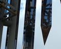
| 01/29/2005 02:28:27 AM |
Chiseledby KylieComment: I like this, the reflections the simplicity....
Hope you don't mind but I had a bit play around with this one, what do you think?
 |
| Photographer found comment helpful. |