| Image |
Comment |
| 10/06/2004 03:30:17 AM |
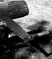
Old Sawby lytaComment: Nice idea, I think closer would have been better, to bring out the texture of the saw blade and the log. The framing seems a bit off to me, too much happening at the left. I think the slightly burn out area of grass accentuates this. Very nice effort. |
 Photographer found comment helpful. Photographer found comment helpful. |
| 10/06/2004 03:25:39 AM |
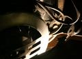
Machine Spiritby LongComment: Nice idea ans good effort. The parts are there but not as interesting to look at as some. The lighting has caused some over exposure of part of the image and its direction doesn't give the old machine much texture or colour. A coloured or more diffused light may have given better results. |
| Photographer found comment helpful. |
| 10/06/2004 03:19:45 AM |
Tenor Madnessby jazzmikComment: Excellent colour and lighting. Nicely picked out the detail. Good DOF and the angle is just about right. Shame about the scratches or dust on the levers though. Well done. |
| Photographer found comment helpful. |
| 10/06/2004 03:16:24 AM |
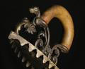
Granny's ironby AlbireoComment: Nice lighting makes this stand out from the background. Not sure how well it fits the Pieces title though, as almost all of the object is visible. |
| Photographer found comment helpful. |
| 10/06/2004 03:14:55 AM |
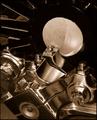
SteelCloudby DJLubaComment: Wonderfull image. I love the silky sheen of the cranks, (is that the right word?). Focussing a DOF are spot on. Fits the challenge very well. The colour sets if off very well. I think if anything I would have tried cropping more of he dark area at the top, perhaps as far down as just above the unpainted main bearing. Very well done. |
| Photographer found comment helpful. |
| 10/06/2004 03:10:39 AM |
Architectural Study of a Domeby nico_blueComment: Beautiful detail and colour. You did very well to pick this out from the whole scene. The sky really brings out the tones of the stone. The shadows are nice and deep and the highlights are not over exposed. Very well done. |
| Photographer found comment helpful. |
| 10/06/2004 03:02:21 AM |
Spreading the Butterfly's Wingsby mocabelaComment: Very moody shot. You picked out the detail within the whole image well. I think the DOF is about right, keeps the attention in the middle of the frame. There's a lot of people who say don't use a border in the challenges but I like it in this case. Well done. |
| Photographer found comment helpful. |
| 10/06/2004 02:59:16 AM |
Atlas Revisitedby kdkaboomComment: Well exposed shot, (pardon the pun). Kept the detail in the shadows as well as the more lit areas. Good depth of field and tones are nice. I might have tried to loose the (whatever it is that is hiding the statues legs). I realise its part of the statue but if possible a lightly higher viewpoint? But then you wouldn't have all the circle in.... oh well nice image anyway. |
| Photographer found comment helpful. |
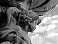
| 10/06/2004 02:54:43 AM |
Beauvoir Fountainby dipaulkComment: To be honest I'm not sure how well this fits the challenge, Parts, Hmmm. Its a very good shot anyway, well lit, the highlights, the composition and the movement of the water. Nice one, some people may not think its appropriate for the challenge, we'll see. |
| Photographer found comment helpful. |
| 10/06/2004 02:51:23 AM |
Vase of Colorsby yael27Comment: A very simplistic idea but very well represented. The lighting is good and the angle within the frame coupled with the twisiting effect of the coloured (what are those anyway) sticks? It makes a bright and interesting image. |
| Photographer found comment helpful. |
Home -
Challenges -
Community -
League -
Photos -
Cameras -
Lenses -
Learn -
Help -
Terms of Use -
Privacy -
Top ^
DPChallenge, and website content and design, Copyright © 2001-2025 Challenging Technologies, LLC.
All digital photo copyrights belong to the photographers and may not be used without permission.
Current Server Time: 04/12/2025 08:11:38 PM EDT.