| Image |
Comment |
| 10/28/2004 01:19:13 PM |
Rural Fieldsby Judith PolakoffComment: The implied lines are not as obvious in this shot as in some of the others but they are there. It looks as of the image has been oversharpened, or is that some other intentional process? What makes this shot for me is the colours and the lighting, which both combine to give the shot depth. The fence posts and the tracks lead you into the shot, the patches of light and shade break up the middle ground so it doesn't look boring or empty, by then you are into the trees and the far trees on the hillside. Good work a six from me. |
 Photographer found comment helpful. Photographer found comment helpful. |
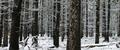
| 10/28/2004 01:13:27 PM |
Mountain Forestby Links 2 3 4Comment: Nicely cropped, implied lines or actual lines??? I still like it. The foreground is a bit cluttered, I don't know if you could have taken the shot from another viewpoint with less clutter? I six from me, well done. |
| Photographer found comment helpful. |
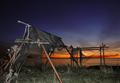
| 10/28/2004 01:10:55 PM |
Crossing the horizonby gudbjargarsonComment: I may be wrong but this looks like a slwo sync shot? The foreground is a bit stark and washed out by the flash for my taste. I realise you were probably trying to get a balance between that and the background. Of course I could be totally wrong here. Anyway the effect is still there. The sunset is fabulous. Well spotted, I gave it a six. |
| Photographer found comment helpful. |
| 10/28/2004 01:06:31 PM |
Road to the Other Sideby LokiComment: More trees, they are an obvious subject. I'm not complaining though, this is very well done. The painted, glowing effect makes it stand out. Obvious implied lines. The only thing for me that detracts from the shot is the spacing of the first tree on the left, is not the same as the others and the space around it keeps drawing my eye away from the rest of the image. Not your fault I know, unless you grew the trees, which I doubt. I gave it a six, well done. |
| Photographer found comment helpful. |
| 10/28/2004 01:01:26 PM |
Roofby BooZonComment: I just love the pure simplicity of the shot. It is said tht you shouldn't cut you photo in half like this but I think it works here. The cloud is perfectly placed, again in middle where its not supposed to be. The colours are sumptuous, great depth of field. Its an inspiration for photography as pure art. I'm going to up my score to a seven, the first time I've done that, well done. |
| Photographer found comment helpful. |
| 10/28/2004 12:56:09 PM |
Beauty Pageantby KylieComment: A very interesting shot. Implied lines yes. Not being able to see the front of the last car is anoying, I suspect its to crop out background distraction? The background is still slightly distracting, the partial wording on the sign could have been removed I think? I like the angle at which its framed. I like tighly cropped shots that fill the frame but I think this is a little to tight and I find it slightly frustrating that I can't see as much as I would like to. A six though, thanks for that,well done. |
| Photographer found comment helpful. |
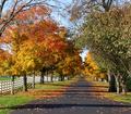
| 10/28/2004 12:51:17 PM |
Fallby PoobaComment: You will probably loose marks for the shot being so small, larger does have more impact. However the colours are wonderful, the lighting is good, directional giving texture and depth to the shot. Its well enough framed. Perhaps I would not have included the first shadow across the road? It looks a bit odd because we can't see the tree that's making the shadow, well only part of the top. The implied lines are obviouly there, that road seems to go on for ever! Rows of trees are an obvious topic but this is very well shot and composed so I give it a six, well done. |
| Photographer found comment helpful. |
| 10/28/2004 12:46:03 PM |
Front Lineby admart01Comment: OK, not the best entry for this challenge I've seen but I've always said its the lighting that can make or break a shot and you have good lighting here. Imagine how dull this shot would have been if the sun had just been high in the sky. Implied lines, yes, the line of the cloud, the path and the poles of course. It could possibly have been improved by cropping tighter on the path and poles and loosing some of the space on the right, I know the tree is there but.... Also I'm not sure the runner adds anything to the shot either. A nice 6 though. Good job. |
| Photographer found comment helpful. |
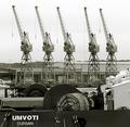
| 10/28/2004 12:40:51 PM |
overcast day at harbourby whiteroomComment: I love the symmetry and the obvious implied lines. I like the tones used and I like the simplicity of the shot. Or should I say the almost simplicity because what I don't like is the boat / ship in the foreground cluttering things up and partly obscuring the dock wall and cranes on the other side. Also having the skyline almost exactly across the midpoint of the shot is not a good idea. It also cuts the cranes in half. I'm not sure if any of these things was within your control, (I wasn't there), but if they were that's how, in my opinion, the shot could have been improved. Its still worth a six though, well done. |
| Photographer found comment helpful. |
| 10/27/2004 11:57:54 AM |
City Diversby leafComment: There are some implied lines in this shot, its well framed and I like the angle it show at. I scored all the shots then came back to comment later. On second viewing I wondered if I'd picked it just for the 'comedy' element. But on second thoughts the figures do add interest and it is well shot. Good work. |
| Photographer found comment helpful. |
Home -
Challenges -
Community -
League -
Photos -
Cameras -
Lenses -
Learn -
Help -
Terms of Use -
Privacy -
Top ^
DPChallenge, and website content and design, Copyright © 2001-2025 Challenging Technologies, LLC.
All digital photo copyrights belong to the photographers and may not be used without permission.
Current Server Time: 04/12/2025 11:16:12 AM EDT.