| Image |
Comment |
| 02/02/2005 01:22:33 PM |
the greyest of all blue skiesby kelweisComment: Great shot, but the border makes it look like clip art, in my opinion. There's a lot of "artifacts" around the post & sign, which is from overcompression - the file size is only about 18K, but it can be up to 150K. Great effort though, i still like it a lot. |
| 02/01/2005 05:46:39 PM |
Corks to Threadsby AJFIComment: Great idea - is that really an old medicine bottle? It certainly is old! The light is very harsh, and the reflections & strong shadows steal the spotlight from the subjects (no pun intended!) I've found that reflecting the light off a piece of white foamboard helps, or putting paper or fabric in front of it softens and reduces glare. Thanks for being creative on your subject choice! |
 Photographer found comment helpful. Photographer found comment helpful. |
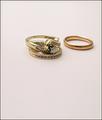
| 02/01/2005 05:42:04 PM |
Mine.. and Mom's...Generationsby sfarrell23Comment: Nice shot of very different rings! The composition is a little odd to me - i would have placed them further down in the frame, because they seem like they're floating in air. Pleasing picture, otherwise. |
| Photographer found comment helpful. |
| 02/01/2005 05:32:26 PM |
In Timeby tolovemoonComment: This is an interesting take on the challenge, and I appreciate the creativity. The mottled background is very distracting - it almost camoflagues the plant. |
| 02/01/2005 05:26:57 PM |
|
| Photographer found comment helpful. |
| 01/27/2005 05:52:36 PM |
Old walkway to a new pierby carotop111Comment: I really like the serenity you captured by the excellent use of negative space & a pallete of greys. I think you rely too much on the title to relate it to the challenge, but that doesn't make this any less of a great photo. 8 |
| Photographer found comment helpful. |
| 01/27/2005 05:47:33 PM |
Sparesby lawlessComment: Great idea! The highlights on the new screws are a little glaring & makes it difficult for me to want to look for very long, but it surely emphasises the new vs. the old! |
| Photographer found comment helpful. |
| 01/27/2005 05:45:33 PM |
Bata Hi / Bata Byeby messerschmittComment: I'm having a hard time telling which one is old and which is new. Oh, duh, the one on the left that's not laced & tied is new. Overall, this doesn't wow me, but I like the sepia tone. 6 |
| Photographer found comment helpful. |
| 01/27/2005 05:42:32 PM |
Linear Generationsby banmornComment: Very cool! I love how the lines of the 2 bldgs. meet, and the blue & white coloring. Stunning! |
| Photographer found comment helpful. |
| 01/27/2005 05:41:29 PM |
|
| Photographer found comment helpful. |
Home -
Challenges -
Community -
League -
Photos -
Cameras -
Lenses -
Learn -
Help -
Terms of Use -
Privacy -
Top ^
DPChallenge, and website content and design, Copyright © 2001-2025 Challenging Technologies, LLC.
All digital photo copyrights belong to the photographers and may not be used without permission.
Current Server Time: 04/15/2025 04:57:42 PM EDT.