|
|
|
Showing 111 - 120 of ~553 |
| Image |
Comment |
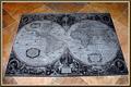
| 10/02/2005 01:59:08 PM | Going Globalby RulerZigzagComment: << Critique Club >>
Initial Impression:
Very flat & the colors aren't very eye-catching. Average.
Composition:
This is not a thrilling presentation. My response to it is, "Yup, there it is." The map is extraordinary, and I can tell from your comments that you wanted to share this wonderful object, but I don't get any sense of [i]your[\i] artistic vision from this photo.
Color/Tone:
The color of the background floor is not appealing to me, personally, but that's my problem. It looks like you've done a great job of capturing the true colors - there's no cast to it that I can tell.
Focus/Exposure:
Focus is excellent - exposure is fine, except for the light in the lower left hemisphere, which is a little distracting - I'm guessing that's a ceiling light? or maybe the flash?
Title:
Nice alliteration, and relates perfectly to the challenge & the subject.
Meets the Challenge:
Yes, it meets it exceptionally well.
Summary:
Like I said - average shot, mostly due to the unexciting composition. Possibly a lower angle, or from directly above it, or a tighter shot of the map would have been more interesting? |  Photographer found comment helpful. Photographer found comment helpful. |
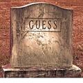
| 10/01/2005 04:04:33 PM | Guess The Final Destination......by JOHNBOY1970Comment: << Critique Club >>
Initial Impression:
"Man, that's huge!" Humorous, interesting color, looks like a poster to me (for some reason)
Composition:
It's not exactly thrilling - the tombstone is kind of just right there in front of you. Also, as people commented, the white stripe at the bottom is a little off-putting, but it seems more like an error in cropping, rather than a conscious choice. Otherwise, you placed the subject nicely in relation to the other sides of the photo.
But then, the power of the shot isn't in the composition, I think. It's in the large-sized presentation of the gravestone, with it's unusual name, tied humorously to the challenge with the title. I don't think a different angle would have been better, and would probably have hurt your photo.
Color/Tone:
I'm torn about the coloring. At first, I kind of recoiled at the brownish rust tone, but the more I look at it, the more it grows on me. It has a sort of dusty, "died-with-his-boots-on" Western cowboy feel to it... which could be another destination Of course, that has no connection to the challenge, but so what? I think you're color choice has probably made this more interesting than it would have been if you had gone for a more realistic look.
Focus/Exposure:
You did a great job on both - the tombstone is in crisp focus, and you can see all sorts of grimy detail.
Title:
Like I said earlier, you did a nice job tying the name of the decased to the challenge through the title. Very well done.
Meets the Challenge:
Well, we're all heading to the grave, that's for sure. I think it meets the challenge extremely well.
Summary:
As a commenter said, it's has a nice graphic quality to it. I won't lie and say I love it, but apart from the white stripe at the bottom, there's nothing really to fault it, either. It's a clever, solid shot, made extra special by the humor you found (in death, you sicko!) | | Photographer found comment helpful. |
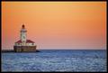
| 09/29/2005 05:19:03 PM | Lighthouse on the Hillby ShutterPugComment: << Critique Club >>
Hi, I'm Ted, and you have the dubious honor of receiving my very first critique as a member of the CC. Congrats!
Initial Impression:
Great colors, well-composed & meets the challenge topic well.
Composition:
The framing of the shot is perfection: I love that the water, land & sky each take up an approx. 3rd of the shot, with the lighthouse positioned using the rule of thirds -- mmmm, wonder why? ;) I disagree with the commenter who suggests that the foreground needs some interest - the slight texture of the waves is plenty interesting to me, and does not distract from the eye-catching red of the building. Which leads me to...
Color/Tone:
You have presented some deep, vivid colors, here. The sapphire blue of the water, the deep greens of the foliage and the bright punch of red all add up to an image that indeed, as one commenter praised, looks like a postcard. I think you may have taken the saturation one little tiny step past the optimal, but certainly not to the detriment of the overall presentation. I say this because there are little bits of red (lighthouse) showing through the trees that are really, really noticable, and I think that may be why "the trees look a bit funny," as a commenter noted. Also, another reason for funny looking trees may be the...
Focus/Exposure:
To my eyes, the focus is not exactly sharp - it seems just the tiniest bit soft, especially in those pesky trees. Since there are no post-processing notes, I'll suggest doing a little bit of unsharp mask to sharpen the image, although you may have done it already. As for the exposure - no complaints, only praise! You've captured great detail of the waves in the water and the rocks on the coastline - even in the branches of the "soft" trees.
Title:
This may be a controversial aspect of my critiques, but having a degree in English Lit., I feel the title is an important part of the presentation. Otherwise, why bother to have a title at all? Your title is servicable - it certainly describes the photo well enough. And it does have a little assonance with the repetitive 'hu' sound (HOUse, -HIll), and the cadence is pleasant to the ear.
Meets the Challenge:
Well, yeah it does! Like I said above, the water/land/sky division of the frame, and the placement of the lighthouse, brilliantly follow the rule of thirds.
Summary:
This is a a colorful, inviting & simply beautiful photo. I found it to be one of the best in the challenge. Great job! | | Photographer found comment helpful. |
| 09/27/2005 07:15:42 PM | | | Photographer found comment helpful. |
| 09/27/2005 07:14:40 PM | | | Photographer found comment helpful. |
| 09/27/2005 07:13:21 PM | Overachiever by scalvertComment: This is great! Hilarious idea, perfectly executed - Is this a genuine Scalvert or some other clever DPCer? | | Photographer found comment helpful. |
| 09/27/2005 07:09:57 PM | Girlsby bucketComment: I like this a lot - the coloring & lighting are great, and I like the DOF w/the slight blur on the sign. The slightly menancing stare is intriguing - there's a mysterious story being told here, and it's very compelling. Well done. | | Photographer found comment helpful. |
| 09/27/2005 07:06:18 PM | | | Photographer found comment helpful. |
| 09/27/2005 07:05:42 PM | Playing here...by PalaiteComment: I like the leading lines and how you've taken a "mundane" subject & made it so visually interesting. Bump to a 9 |
| 09/27/2005 07:05:07 PM | |
|
Showing 111 - 120 of ~553 |
Home -
Challenges -
Community -
League -
Photos -
Cameras -
Lenses -
Learn -
Help -
Terms of Use -
Privacy -
Top ^
DPChallenge, and website content and design, Copyright © 2001-2025 Challenging Technologies, LLC.
All digital photo copyrights belong to the photographers and may not be used without permission.
Current Server Time: 04/12/2025 11:28:21 AM EDT.
|