| Image |
Comment |
| 06/01/2007 07:27:20 AM |
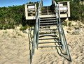
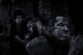
pathway to upwardby whiterookComment: The light is way too direct and harsh and the brush is busy to the point of being distracting. I like the low angle but am not too sure about the tilted horizon. |
 Photographer found comment helpful. Photographer found comment helpful. |
| 06/01/2007 07:25:09 AM |
|
| Photographer found comment helpful. |
| 06/01/2007 07:24:37 AM |
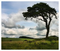
Aloneby surfinbirdComment: I'd have cropped with more sky and less foreground. Not by much, but I find the immediate foreground distracting. |
| Photographer found comment helpful. |
| 06/01/2007 07:23:21 AM |
|
| Photographer found comment helpful. |
| 06/01/2007 07:21:48 AM |
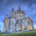
Cathedral of St Paulby genghisComment: Very pretty. I like the colors and the almost pencil drawing quality of this. I would like to see a little more contrast on the building, though. Very nice. |
| Photographer found comment helpful. |
| 06/01/2007 07:20:28 AM |
Please Stopby btrinhComment: Too dark (in more ways than one) but it captures the sentiment. |
| 06/01/2007 07:19:42 AM |
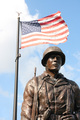
untitledby MarioAngelComment: I would have increased the contrast and saturation of the flag in post. It is too low contrast here IMO. |
| Photographer found comment helpful. |
| 06/01/2007 07:18:08 AM |
|
| Photographer found comment helpful. |
| 06/01/2007 07:16:16 AM |
|
| Photographer found comment helpful. |
| 06/01/2007 07:14:03 AM |
|
Home -
Challenges -
Community -
League -
Photos -
Cameras -
Lenses -
Learn -
Help -
Terms of Use -
Privacy -
Top ^
DPChallenge, and website content and design, Copyright © 2001-2025 Challenging Technologies, LLC.
All digital photo copyrights belong to the photographers and may not be used without permission.
Current Server Time: 04/12/2025 04:12:25 PM EDT.