|
|
|
Showing 171 - 180 of ~260 |
| Image |
Comment |
| 11/03/2005 09:33:05 AM | Pink Little Flowerby annahComment: Greetings from the Critique Club:
The challenge was Image Grain and your image certainly meets the challenge brief, as the comments and your score demonstrates.
Technical:
Execution is spot on. Despite the introduction of grain into your photo, you have managed to retain the finer details. The use of selective desaturation gives more impact. I noted that you put editing details in comments, a useful and helpful addition for other people who look at the shot, although I still haven't found yada, yada, blah in PS...I've been looking for ages:)
Composition:
It is an infuriating composition, hands are cut off at the knuckles on one hand, wrist on the other and there is no head...but it works well! The positioning of the flower to the right of picture also fits perfectly.
Personal:
As I have just stated, this infuriates and also intrigues. The eye is drawn round and round the shot, always fixing on the flower. The sepia works beautifully with the flower - which appears not to show grain? -and the colour of the flower is great. Your overall score was good, but I would have expected it to finish in top 3. Congratulations and keep at it. Hope this has helped and was constructive for you.
Steve |  Photographer found comment helpful. Photographer found comment helpful. |
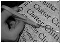
| 11/03/2005 09:15:50 AM | ...Cutting Through Noisy Clutter...by gurlwithapenComment: Greetings from Critique Club:
The object of the Image Grain challenge was to use grain/noise to enhance or be an integral part of the photo. This has been done with your entry so as to meet the challenge.
Technical:
You have not put any of the steps or processes used to obtain this shot, so I will have to try to work out what you did. It would appear that you have applied grain using PS or a similar programme. There is over graining in the bottom right hand corner where the technique was applied too lavishly, other than that the overall effect on the paper looks acceptable. The flash used has cast heavy shadows around the fingers. Depth of field seems fine, perhaps too shallow as the scissors and hand are not quite in focus, but your focus is from the middle to the back area of the photo.
Composition:
Perhaps a little too tightly cropped, but this has not affected the impact of the shot. The focussing issue has harmed your overall score for this challenge.
Personal:
I like the concept of the shot and execution is well done. Had the hand and part of the scissors been sharper in focus, I believe this would have scored a lot better. I think the problem with the grain in the bottom right is possibly due to overuse of the process you used to create the grain or is an artifact of saving for web. Had I voted for this shot I would have given you a 6, without the items already mentioned I would have upped it to 7 or 8. A good effort and underscored by voters, yet you know that it is the voters that count at DPC. The skin tone on the hand, being soft in focus, looks almost like it has been Neat Image'd. I hope this has been constructive and will help you for future challenges.
Steve | | Photographer found comment helpful. |
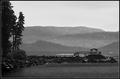
| 11/02/2005 12:17:31 PM | Tranquilityby rjksteschComment: Greetings from Critique Club.
A good landscape scene in B&W.
B&W seems to have been the best medium to use for this challenge and you have chosen a photogenic scene for your entry.
Composition.
A nicely composed shot that would have done very well in a landscape challenge but falls slightly short in the Image Grain challenge, a fact that is evident in the scoring. The grain is evident in the hills in the background, but not so evident in the foreground. The border works well and is not obtrusive. There is a Zen-like quality to your shot which would work well in a straight landscape. Perhaps tighter cropping on the deck and 'pergola' would have accentuated the grain in this part of the photo. I cannot fault the composition, just the grain that evident.
Technical.
Your technique looks fine, but the extra sharpening of the rocks may have destroyed the grain that was inherent in the original. You did not lose anything in sizing and saving for web, which I assume you did, although it is not stated.
Overall.
I like the feel and stucture of your entry, it slightly missed the overall grain effect in the foreground. B&W was the right choice and I imagine the original would look great on anyone's wall. There is a real Japanese feel to this photo. With more grain evident in the foreground your score would have been higher.
Steve | | Photographer found comment helpful. |
| 11/02/2005 11:52:39 AM | Rustic Solar Lanternby BrianRComment: Greetings from the Critique Club.
As an entry to the Image Grain Challenge, it certainly meets the requirements. The concept is a good and saturating to give a yellow channel lifts it from a standard B&W image to something more.
Technical.
The use of added noise has worked well, especially in the glass around the yellow light and B&W was the right way to go for maximum impact. However, the solar panels seem to have taken on a life of their own and are not consistent with the rest of the photo. Perhaps this artifact is due to saving for web.
Personal.
I like the crop, and feel more background would have destroyed the impact of the photo. The use of the rust/brown colour for the lamp lifted it beyond a straight B&W shot. The difference in the grain on the grass and that of the lamp glass makes it stand out in the terms of meeting the challenge and attracting votes. The strange effect on the solar panels definitely hurt your scores. What could have been a 7, has been knocked down to 5, perhaps 6 due to this.
A worthy effort that suffered from saving for web. This could be an area that you could look at, refine or rethink for future challenges.
Steve | | Photographer found comment helpful. |
| 11/02/2005 11:28:04 AM | Delicate Conditionby jpochardComment: The concept is good, altho it is a fairly standard setup. This genre of photos will always find a place in portfolios.
Your execution is good, the lighting is a touch harsh across the vest top and top of the 'bump', but these are notoriously hard to light as they tend to dominate the shot:) I like the facial lighting, background and body poses, but there is a bit too much grain and the focus is slightly off. Neither of these are too serious to make major impact on scoring, however DPC members do like sharp shots.
I would have scored this a six, almost a seven. | | Photographer found comment helpful. |
| 10/26/2005 12:34:48 PM | delicateby rhipsterComment: You put this in the wrong challenge, it is a great photo and fits Delicate exactly anyway, I'm gonna give you a 10 :) | | Photographer found comment helpful. |
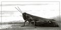
| 09/24/2005 11:58:32 AM | curious visitorby MsMiaComment: I like the bug, I like the composition and the B&W, but that frame has to go. It is spoiling a great shot. Keep doing what you are doing, just don't get any ideas about entering challenges!!
Good work, I will keep an eye out in the future. | | Photographer found comment helpful. |
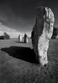
| 09/05/2005 07:41:07 AM | Megalithicby nordicComment: My favourite place!! Well captured with overdoing the effects. | | Photographer found comment helpful. |
| 08/30/2005 12:35:45 PM | | | Photographer found comment helpful. |
| 08/30/2005 12:33:52 PM | Down hillby DufusComment: So different from all the other nude shots, an artistic capture. Well Done, another 9
Steve | | Photographer found comment helpful. |
|
Showing 171 - 180 of ~260 |
Home -
Challenges -
Community -
League -
Photos -
Cameras -
Lenses -
Learn -
Help -
Terms of Use -
Privacy -
Top ^
DPChallenge, and website content and design, Copyright © 2001-2025 Challenging Technologies, LLC.
All digital photo copyrights belong to the photographers and may not be used without permission.
Current Server Time: 04/12/2025 09:45:41 AM EDT.
|