|
|
|
Showing 161 - 170 of ~260 |
| Image |
Comment |
| 11/04/2005 11:41:13 AM | Painted Skyby PhilosComment: Greetings from the Critique Club:
This was your entry into the 'Delicate' challenge. I will discuss faults, tecnical errors and overall view later. My biggest problem with this photo is that it conjures up images of square pegs and round holes:)
Technical:
It is technically A1. You have provided every piece of information anyone could want. Not sure but that cigarette glow could have affected your exposure and made it a tad over exposed by at least a millionth of a second!
Composition:
I can't fault the composition can I? However, it is a pity there was a patch of weeds? whatever by the reflection of the first windmill, Without this and all reflections on the water clear...wow, now that would have been the ultimate photo. I guess the weed was static and not floating past, if it was floating past then it was lax of you to take the shot when you did. Marks will be deducted in future.
Overall:
This is a seriously stunning photo. But it is time you left the windmills alone for a while as everyone knows they are your photos. I think it was ribbon material, but you really must give up smoking!!
Steve |  Photographer found comment helpful. Photographer found comment helpful. |
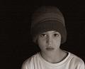
| 11/04/2005 11:18:01 AM | Delicate Soulby joynimComment: Greetings from the Critique Club:
This was your entry into the 'Delicate' challenge and appears to meet the brief for the challenge. As there is no information on settings and processing, I cannot comment accurately on how you got this photo to entry level without a certain amount of guesswork.
I am going to start with critical issues, there is a colour cast on the left cheek and jaw of your subject. I was going to say that the focus appears slightly soft, but judging by the eyebrows, there are signs of the image being sharpened. This suggests that the original was out of focus and sharpening rescued it but still left it soft. There is noticeable grain and I assume you used on camera flash which has lifted the exposure on the nose and round the mouth. Faces are really hard to light, and almost impossible using on camera flash.
Okay, now it's time to be kinder, the tight crop works very well as does the wispy hair. The subject looking down conveys innocence and as a childs skin is usually soft looking, it does give that delicate impression.
Overall it is a good portrait that captures what childhood is all about. The score is about where I would have placed the photo and I note that other commentors state a softness in focus. I hope this is helpful and constructive.
Steve | | Photographer found comment helpful. |
| 11/04/2005 10:50:26 AM | Shadowlightby RasmusComment: Greetings from the Critique Club:
Your first challenge entry with a reasonable score and a few comments. Let's take a deeper look and see where we go.
Technical:
The square format works well as does the lighting. The horizontal line across the photo does not look level, but this could be an optical illusion as I have measure it and it is very slightly out, but not enough to notice. The shot looks like it has been converted to negative, but you have stated that this was caused by using curves. You have cropped too tightly on the candle and removed a section of the shadow which does detract from the overall effect. Next time, less tight cropping and you will note an improvement in both end result and score.
Composition:
As already stated, too tightly cropped. This is a composition fault as well as a technical fault. Other than this, there is not anything else wrong.
Overall:
This photo has potential, but some of it has been killed by the cropping and the negative effect. Yet the negative effect is also what makes the photo stand out. I think what bothers me more about the negative effect is the candle wick, it becomes the focal point of the photo and looks like it was added later. This is just an artifact of the process. I really like the flame and its shadow. Your photo score in the range I would have expected and with less tight cropping would have possibly gone 5+. Good work and I hope to see more of your entries in the future. I hope this is helpful and constructive for you.
Steve | | Photographer found comment helpful. |
| 11/04/2005 10:31:04 AM | Friends are Everythingby denlinkbarmannComment: Greetings from the Critique Club.
A first challenge entry in the 'Light on White' challenge and a worthwhile score, but I think it just misses the challenge brief.
Technical:
I am surprised by the lack of shutter speed you achieved using ISO 200, and 18mm with an aperture of f4.5. From the angle I would have expected 1/200th at least as you were exposing into the sky, this normally ups the shutter speed dramatically. It would be interesting to know the actual lens used, but I am guessing at 18-55mm kit lens? possibly the Mk 1.
By upping the contrast you have bleached out the sky detail and also the trees at the base of the photo. This hasn't effected the subjects too much, although the girl's upper arms have blended with the sky. I also note there is some artifact in the top corners? Possibly branches overhead or even vignetting of your lens at its widest setting...were you using a lens hood?
Composition:
I like the ratio of the subjects to the background and the way they come into frame from the bottom left towards the centre. The subjects look well posed although the guy doesn't look quite as comfortable as the girl...but that is to be expected.
Overall:
It is a good photo with the setup appearing to be well thoughtout and staged. The title fits the picture, but the picture doesn't quite fit the challenge. The dark clothing does not convey light on white, in fact, the light has been obtained just by upping contrast and I would suggest brightness. It is hard to be over critical or harsh with this shot cos it just oozes happiness and fun. It scored about where it should have, maybe even a little generously as DPC votes are normally fickle about meeting challenges. As a first entry, I can see you improving in the future as you learn the whims of voters. However, keep that essense of fun, I hope this is helpful and constructive.
Steve |
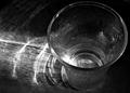
| 11/04/2005 10:08:44 AM | Fragile Glass/Lightby justin_hewlettComment: Greetings from the Critique Club
Having studied your entry for Delicate Challenge, I feel that a lighter weight glass would have conveyed the delicate impression more suitably. The chosen tumbler is a bit on the heavyweight side and this is accentuated by your choice of angle, looking onto the rim. Perhaps a different angle would have given the impression of a more delicate glass.
The use of on camera flash has blown an area at the base of the glass, but this is not too intrusive.
The conversion to B&W works well with the reflections of the light through the glass onto the wood. This had an added effect of highlighting the grain, although I don't know if this was intended or accidental, but it looks fine. Focus on the rim is sharp and you have a pretty good DOF.
I would like to have seen the droplets feature more prominently in this photo, but the composition is good with the main subject situated to the right of the photo. I think this scored about right in the challenge and had the glass been more 'delicate', it could have upped the score to 5+. Nevertheless, a good entry and although lower than your usual scores, not too bad considering the low voting in this challenge. Hope this is helpful and constructive for you.
Steve | | Photographer found comment helpful. |
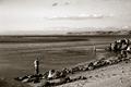
| 11/03/2005 12:03:01 PM | A Cast Awayby OlyuziComment: Greeting from the Critique Club:
This is a good photo that could have said so much more. The sepia effect works, but on what? I want to see what that fisherman has caught, if anything.
The grain works well in the lower section of the picture, but the sky seems more in need of colour. I don't know what your processing steps were, but obviouxly you converted from colour to B&W or sepia. I think the main problem is that the shot falls between to two genres, it is neither landscape nor portrait. As a landscape it would work better as a straight colour shot with saturation, those cliffs jutting out into the sea are great. The man on the spit shows as just a pixelated form. Could a close crop of either the one fisherman or perhaps almost a panoramic with both fishermen in have worked better?
I like grain in a sepia/B&W shot, but it didn't quite work this time, the subject just aren't large enough. I don't want to sound too harsh, but it doesn't grab me. I think it scored about right for the challenge, but has the potential to have scored better. Hope this has been helpful and constructive.
Steve | | Photographer found comment helpful. |
| 11/03/2005 11:31:15 AM | She Wore Red Shoesby Herblacklist12Comment: Greetings from the Critique Club:
This could have been a really interesting capture, I like the way the dog is walking into the frame from the top. However, this can't rescue this photo from where it finished in the challenge.
Any clarity of focus has been lost in the addition of noise/grain and also the small size of the entry just boosts the imperfections. Because the size is small the grain seems disproportionate and dominates the whole photo. It also seems to be partially desaturated, again this just confuses the viewer.
I know this must seem like a vendetta against your photo, but your usual results are so much better and I am sure you know that this was a mistake. We all make them, my entry for Delicate bombed out. I am sure some of the artifacts were caused when saving for web, but size really does matter when submitting an entry for a challenge.
Hope this wasn't too critical and was in some way constructive. I know your next entry will be back to normal standards.
Steve | | Photographer found comment helpful. |
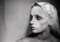
| 11/03/2005 11:10:15 AM | "Until Death Did We Part"by tmorninglory96Comment: Greetings from the Critique Club:
The challenge, Image Grain, was to use grain or noise to enhance your photo. Yoy did this well.
Technical:
The added grain looks pretty good on the background. Can't quite work out the pattern on the background, perhaps flowery curtains? There are blown out highlights on the nose and forehead which do detract from the dark look, had this been kept darker it would have added to the overall effect. I am guessing that a certain amount of burning was done around the eyes, cheek bones and neck. In my opinion the neck and shoulders area have been over burned and the result is almost a dirty look, rather than a shadowy look.
Composition:
Nicely composed with subject(daughter) being positioned to the right...makes you wonder what she is looking at approaching from the left. I can't find any faults with composition, the 'veil' fits well as does the brief glimpse of a dress on the shoulder. This reminds me of the French Revolution type picture.
Personal:
Apart from the things I mentioned earlier, there is a lot going for this photo, maybe worth a reshoot. Try to even up the exposure on the neck and shoulder with the face, avoiding those blown highlights and this is a winner. The whites of the eyes could be lifted slightly. All in all a fair result for what could have been a really high scorer. Hope this is helpful and constructive.
Steve | | Photographer found comment helpful. |
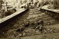
| 11/03/2005 10:34:30 AM | Dead Man's Curveby SJCarterComment: Greetings from the Critique Club:
The challenge was Image Grain and the use of grain or noise to enhance your photo.
Technical:
Thanks for including your steps for processing. I have spent some time studying this shot and something bugs me about the overall effect, whether it is too much grain, sharpening or Neat Image, I'm not sure. The trees at the top look too sharpened, as do the bones on the sleepers.
Composition:
It has a real old feel with the sepia toning and the tilting angle of the tracks. It does a good job leading the eye, past the bones and along the sweeping track. Nothing really to comment on with your setup and execution.
Personal:
I would like to see what the shot looked like with less grain and sharpening. It could be a little darker to bring the trees into the picture. However, the lighter top end of the shot does create an old world feeling. The bones are a nice touch. It is certainly more effective having the horizon tilting in the direction of the curve and the title is very apt. A worthy entry which was let down by the artifacts already mentioned, perhaps most of these are due to saving for web. If so, then you have suffered in your final score. As submitted I feel you scored around about the right mark. Hope this proves helpful and constructive.
Steve | | Photographer found comment helpful. |
| 11/03/2005 09:57:58 AM | Stefanby bbrightComment: Greetings from the Critique Club:
The brief for this challenge, Image Grain, was to use grain or noise to enhance the shot. This you did, thereby meeting the challenge.
Technical:
It would have been nice to see the steps used to create this shot. But I am guessing you already had the grain/noise from using ISO 1600, perhaps a little more added in PS or a similar programme? The eyes appear to be the point of focus. Converting to B&W does add a certain appeal, however I think this could have worked as well in colour. I am not sure if it is the darkness of the shot or slightly off focus that makes the face appear on the soft side. Maybe you didn't use USM?
Composition:
The positioning of your subject works very well. Also the near square format with prudent cropping makes this a competent photo.
Personal:
I like most of what you did with this shot, but it looked a tad on the dark side for my taste. I do like the lighting on this, I don't know if you used off camera flash or reflectors but the lighting is even with no harsh shadows. The score appears just below what I would have expected, with it being nearer the higher end of the 5 or even 6. I hope this helps and is constructive.
Steve | | Photographer found comment helpful. |
|
Showing 161 - 170 of ~260 |
Home -
Challenges -
Community -
League -
Photos -
Cameras -
Lenses -
Learn -
Help -
Terms of Use -
Privacy -
Top ^
DPChallenge, and website content and design, Copyright © 2001-2025 Challenging Technologies, LLC.
All digital photo copyrights belong to the photographers and may not be used without permission.
Current Server Time: 04/13/2025 03:06:50 AM EDT.
|