|
|
|
Showing 151 - 160 of ~260 |
| Image |
Comment |
| 11/06/2005 08:48:18 AM | Orchidby sabphotoComment: Greetings from the Critique Club:
'Orchid' is your entry into the 'Light On White II' challenge. As you mention in your comments, you were actually shooting this for the Delicate challenge and I think it fits that challenge better, however:
Technical:
You have used maximum size and this helps a lot in a challenge. The crop is not too tight and the image has not been overly sharpened which would have made it really overpowering. The background could be anything, there is no hint of any texture, but then the challenge did ask for a white background. Focussing and DOF are good with the centre of the orchid being the focal point.
Composition:
Subject leads in from bottom right corner to a central format image using portrait setup. The cropping works well, there is a satisfying white border on the sides. With no shadows, there is an unnerving starkness about this image, possibly because the colours of the flower are so striking.
Overall:
I like the shot, but I don't think it quite fits the challenge and hence the lower than normal score. There is nothing terribly wrong, nothing that deserves harsher critique. I think you are well aware that you have misjudged the challenge and therefore faced a lower score when entered in a different challenge, would have attained a much higher score. I hope this is helpful and constructive.
Steve |  Photographer found comment helpful. Photographer found comment helpful. |
| 11/06/2005 06:24:34 AM | Morning Treatby davidus428Comment: Greetings from the Critique Club:
Morning Treat was your entry for the 'Light On White II' challenge and it fits quite well into the given brief.
Technical:
Your focus is spot on, as is the DOF which just starts to blur out when it gets to the plate. Lighting is superb, the shadows by the egg and also the plate are wonderful. Had the lighting been any harsher, it would have killed the image. It is a shame you haven't included any of the processing steps used as these really help other photogs reproduce similar effects. And they help when doing a critique as we can follow your steps.
Composition:
This is the only down side of your image, to me and it is only my opinion, the corn does nothing for the image. It makes the image cluttered. I like the positioning of the egg and plate. Many would have been tempted to not include the plate and then crop tightly, your idea works better.
Overall:
Taking the image as a whole, I think it scored about right due to the inclusion of the corn. The corn introduces yellow into the picture and seems to dominate what is a super soft image (not focus). The plate and flower in the top right corner is pure genius and would have a much greater impact if it weren't for the corn. I know I gone on about the corn, but it jars, it dominates and spoils a wonderful image. Try reshooting it, reproducing the original steps, but leave out the corn. I think you will agree then that without the corn you would have had a high scoring image that matched your other high scorers. I would like to see the reshoot:) I hope this is helpful and constructive.
Steve | | Photographer found comment helpful. |
| 11/06/2005 02:55:37 AM | Kittersby bs-photosComment: Greetings from the Critique Club:
Kitters was your entry for the 'Delicate' challenge or should that be 'DeliKat'.
Technical:
A square format image using the maximum allowable size, always a good start. Nicely picked highlight in kitten's eye and luckily she didn't look at you or you would have had massive red-eye! The background is too cluttered and image looks tightly cropped. Of course this is the only possible crop you could use as the subject needs to be centre of attention. I am not sure where you used colour balance or blur? Was it too sharply focussed? DOF is good considering your aperture used.
Composition:
My biggest problem with Kitters is the blandness, your composition is fine, except for the table leg and camera bag in the background. It is the colour that lets the image down - Kitters seems to blend into the carpet and while a very attractive kitten, this image doesn't really do her justice.
Overall:
A good effort, Kitters was very good to keep still for you. You have captured her very well, she is well focussed. Why not try to reshoot and find her a more contrasty background. Practice and patience are what you need to capture good animal portraits. The score is on the low side, but reflects much I have mentioned. Move onwards and upwards, back towards those 5's. I hope this is helpful and constructive.
Steve | | Photographer found comment helpful. |
| 11/06/2005 02:20:01 AM | White Pumpkinby Postgate1Comment: Greetings from the Critique Club:
The challenge was Light On White II, your entry appears to be the wrong way round:)
Technical:
As you haven't posted your processing steps, I will have to try to guess what you may have done. I believe that apart from the obvious and somewhat overpowering under lighting, you also used on-camera flash as there two small highlights on the raised area of the front of the pumpkin. Sharpening is not evident, so either you didn't use any or were very frugal with it and as a result the focus seems just a tad off on the stem. This should have been the focal point of the image as it is where the eye is drawn automatically. It is a shame the under lighting is overpowering the bottom section of the picture as it makes the top of the pumpkin look a lot darker than it really is. The background looks like a sheet as there a couple of creases on the right of the image, these do detract from the overall image and will be marked down.
Composition:
It appears as though you have cropped for a centrally weighted balance to your image and while this is not a bad thing, placing the image more to the right, with blank area to the left would have lifted the overall image.
Overall:
A good effort that was let down by the lighting, which appears to be a single household bulb, slightly yellow tint, shining from below through the background material. The lighting is very concentrated under the pumpkin, and fades off very quickly towards the top of the photo which has given a grey, rather than white, background. I think this is the reason it scored at the lower end of your previous efforts and I'm afriad I have to agree with other voters that this is about where it belongs. It is not a disaster, but there is a lesson to be learnt...which is what this is all about. Why not try to set it up again and take some more shots with adjustments to the lighting. I hope this is helpful and constructive.
Steve |
| 11/06/2005 01:57:31 AM | Miniby livitupComment: Greetings from Critique Club:
The challenge was Light On White II and you provided exactly what was asked for with this entry. However it meets the challenge brief in two ways, the literal sense - a light on white - and a light coloured object on a white background.
Technically it is very crisp and clean. Not a great DOF used, but it has the desired effect, there was no need to have the whole torch in focus as it is prefectly obvious to the viewer what it was. Also, had you used a deeper DOF you would have brought the background material more into focus and destroyed the softness of the material. Shooting an object like a Mag-Lite using strobes or any other kind of lighting will always give the highlighted area on the body, yet you managed not to blow it out.
The composition will be disliked by some voters due to it being centred rather than Rule of Third, which seems to be vogue at the moment. Using an object like a torch means you can't avoid leading the eye towards the centre of the image. The colour of the torch gives it a hint of an advertising image, which is no bad thing.
My overall impression is of a simple, clean image that meets the challenge head on. I like the way the torch comes into focus so the writing is sharpest. Using Neat Image has produced a smooth look and it is not over sharpened. A worth entry that should, IMO, have scored 5+. I hope this is helpful and constructive.
Steve | | Photographer found comment helpful. |
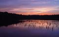
| 11/05/2005 11:09:19 AM | Ecosystemby aaronwaveComment: Greetings from Critique Club:
First entry into a challenge and a 5.9 score...not a bad start.
Technical:
You did not post your processing steps, so I will have to try to guess what you have done. The shutter speed and ISO suggest that you have either contrasted the image or saturated it to get the darkness and colour, and it worked. Perhaps there is a hint of USM/sharpening also, but it has not been overdone. Also, there is a touch of grain/noise showing which might affect how this prints up at full size.
Composition:
A good composition using 50/50 technique and this work nicely with the reflective quality of the water. A well balanced image, clean and striking.
Overall:
There are a few landscape photogs here who will need to watch their laurels! A good, clean and colourful scene. The 50/50 format allows the water to reflect the sky beautifully. You were approaching the limit of your camera here with the noise/grain beginning to show, but it doesn't spoil what is a good image. It is a different angle on the delicate challenge and I agree that Nature is more delicate than many believe. I look forward to seeing more in the future, this is good start and will get better. I hope this is helpful and constructive.
Steve | | Photographer found comment helpful. |
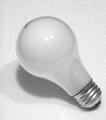
| 11/05/2005 10:28:09 AM | lite on whiteby photoventurerComment: Greetings from the Critique Club:
Light on White challenge entry and yep, it is a light on white.
Technical:
A good square image using the maximum size allowed. Focussed for the top of the bulb and DOF hangs on to the screw fitting of the bulb. Lighting appears to be from on-camera flash and has left two bright spots on the glass of the bulb. It is very hard to avoid this without using off camera flash or studio setup. A simple, but effective setup.
Composition:
The simplistic setup means that the positioning of the subject is crucial because that is all there is. The bulb starting from the bottom right corner, leads the eye towards the centre of the image. A lot of people frown on centrally placed subjects, mainly because someone told them about the Rule of Third...it is quite refreshing to see a centre weighted image.
Overall:
A light bulb on polystyrene/styrofoam. Not the most imaginative image nor the only one to use the idea for this challenge. The misspelling of light in the title could well have cost some higher votes. It might seem picky, but the title is so important and I know, that 'lite' is the US way of spelling. The shadow under the bulb is a little harsh, but there isn't much wrong with image. It is a competent, clean image that didn't hit too many touchy spots with the voters. Sometimes simple just doesn't work when it comes to votes, so it's a case of learn and move on. I hope this is helpful and constructive.
Steve | | Photographer found comment helpful. |
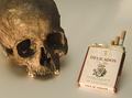
| 11/05/2005 10:04:14 AM | Delicate Habitsby alegugaComment: Greetings from the Critique Club:
This is your entry into the Delicate challenge and at first I had to smile as I have been trying to quit those evil things!
Technical:
You haven't included any information or editing details with this image, so I will have to try and guess what steps you may have taken to get the finished result. To start I think you have cropped this quite tightly and used side lighting plus an on camera flash? The side lighting has created a long pale shadow on your background. This does not detract from the overall effect though. The side lighting appears to be a table lamp or similar as it has given the image a 'nicotine stained' brown tint. Focusing is bang on with good DOF. A very good technical image.
Composition:
The tight crop cuts out any blank or negative space. Although some will say the backgrund is dark, I think it fits the theme here. The eye is lead around the photo.
Overall:
A harsh, ironic look at one of the worse habits many have, and treated in a humorous way. The focus is excellent, but the one thing that jars for me is the shadow under the skull. The cigarette packet is a neat twist as I assume the name 'Delicados' means delicate...not a very apt name for something that can kill you in the most painful ways!! Most voters would miss such a subtle hint as to the title and I think this could possibly have accounted for the under 5 score. I would put it in the 6 to 7 bracket. I hope this is helpful and constructive.
Steve |
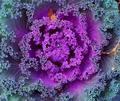
| 11/05/2005 07:16:46 AM | untitledby micluinenburgComment: Greetings from the Critique Club:
The challenge was to take a photo that would convey 'Delicate' to the viewers and voters. In a strange way this ornamental cabbage just about does that. You have not included any information on processing, so I can't comment on how it may have altered the original. I am guessing that this is near enough straight out the camera, perhaps a bit of sharpening was used.
My biggest problem with your shot is the size, although not really small, it is not using the maximum permitted - 640x640. To create an impact, you need to get your photos to 640x640 and 150k to do well in challenges, you will suffer if you enter small photos. The cropping is very tight, but I assume that was to eliminate the soil that is just visible in the top right of the shot. Also, clean up the subject before shooting, the dead leaves do not add anything to the shot. The spot of water in the centre is distracting and either focus right in on it or get rid of it before taking your picture.
I like the fractal-like patterns created by the leaves and also the colouring, especially where the purple veins run into the green/blue. For a first effort this scored well and I am sure if you use size properly next challenge you will do well. I hope this is helpful and constructive.
Steve | | Photographer found comment helpful. |
| 11/05/2005 06:42:46 AM | Virginityby alihComment: Greetings from the Critique Club:
The challenge was 'Delicate', you had to take a photo that conveyed your idea of delicate to the viewers and voters. Virginity, as in your title could be classed as delicate, however it doesn't work for me. Regardless of my opinion, let's discuss the photo.
Technical:
Depth of field is good, it covers most of the items included in the setup. For on camera flash, everything has been exposed well, with no blown highlights. The condom packet looks to be of a reflective material and you did well not to bleach it out as it is the closest item to the camera, hence the flash. You have adhered to the Rule of Third and the use of portrait format was the right one for this photo. There is no information on any processing you did, so I would have to assume that there was minimal or none except for saving for web. Perhaps a little sharpening was used also.
Composition:
Rule of Third used with portrait format. Composition is a bit too cluttered and it takes a bit of time to work out what was going on. An open and empty packet would have worked better IMO, unless of course the subject of the title remained intact.
Overall:
Too busy, less items would have conveyed the message a lot quicker to the voters and hence your score would have been higher. Most voters do not spend much time trying to work out the message, they make a choice very quickly. The focus on the condom packet is spot on and the red underwear - 'G-string?' - is really eye catching and I hope that wasn't worn with the pink bra :) Not a bad attempt for a first challenge entry and I am sure you will move on and upwards from here. Try to keep your backgrounds as simple as possible, your lighting, focus and composition are fine. I hope this is helpful and constrcutive.
Steve |
|
Showing 151 - 160 of ~260 |
Home -
Challenges -
Community -
League -
Photos -
Cameras -
Lenses -
Learn -
Help -
Terms of Use -
Privacy -
Top ^
DPChallenge, and website content and design, Copyright © 2001-2025 Challenging Technologies, LLC.
All digital photo copyrights belong to the photographers and may not be used without permission.
Current Server Time: 04/13/2025 03:20:28 AM EDT.
|