|
|
|
Showing 101 - 110 of ~260 |
| Image |
Comment |
| 06/20/2007 11:29:20 AM | |
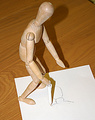
| 05/16/2007 10:10:56 AM | I Can Draw Myself!! (1970)by SteveJComment: Thanks for all the comments. The basic idea was to have a rough and ready image, not too slick. The reason being the woody, normally used by artists drawing with a pencil, discovers that he can pick up the wooden pencil and draw himself. Sort of like the artists tools becoming the artist, so the wooden table just the overall wooden elements...including the paper! |
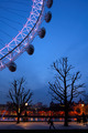
| 05/11/2007 01:00:13 PM | Night Time Strollby jaysonmcComment: Jayson, I gave you 7 and thought it was a different take on the Eye. Rather than trying to capture the whole thing, you got a photo that shows it in context with its surroundings. I am surprised it didn't score higher, but that is DPC for you! Well done. |  Photographer found comment helpful. Photographer found comment helpful. |
| 05/08/2007 01:07:23 PM | They grow up so fastby MelethiaComment: I liked this a lot, wildlife is one of my favourite subjects. In fact, I am taking my camera to work tomorrow (Wednesday) cos we have lots of new babies. Last count was three, four and six Canada Geese Goslings, one Coot and a persistent Heron. There are a pair of Egyptian Geese, but they have never bred here yet.
Well done, Deb, and keep enjoying what you do!! | | Photographer found comment helpful. |
| 05/07/2007 07:17:27 AM | Steeplechaseby andrea22_alsComment: Hi, from The Critique Club,
Triptych throws up so many different ideas and styles.
Composition is nicely balanced and the clincher for me is the last shot of the three where his foot hits the water. There are a couple of issues that I will touch on in the technical section, but a good attempt for a Triptych.
Technically, I feel the overall group of shots lacked that final sharpness to make them jump out of the photos. Bringing the hurdler closer and using a shallower DOF would have blurred the background. As one commenter stated, it has the feel of a film strip, one way over this would have been to use thicker borders.
Overal conclusions, I like the stop action feel and with wider borders and sharpening a little more would have given this real WOW factor. Now that voting has finished, you might consider using the original to try some PP, experiment with different borders, saturation and sharpness. A good entry and due to the minor issues, I think it finished in about the right place in the challenge. Be sure to post any modifications you do to it. Well done. | | Photographer found comment helpful. |
| 05/07/2007 07:01:05 AM | Sundownby darnokComment: Hi, from the Critique Club,
Triptych throws up some good photos and tell some good stories.
Composition is pleasing, but I feel you missed an opportunity by using a single exposure and dividing it. Perhaps with slight rearranging of the elements it would have worked better.
Technically it is well taken photo with good lighting. The graduated sky looks great and the clouds give it an extra element. The choice of image sizes gives a nice balance with the borders and I think the white line in the borders works.
Overall, I think it slightly misses the true meaning of a Triptych which is usually three individual images combined to make a story. This is why I suggested perhaps moving elements into a different order. The tower element would have been better as the first part and then the other two as they appeared, but this is just my opinion, by doing this it would taken away the obvious fact that this was created from just one exposure. However, I feel it scored at about the right point in the challenge, it is a compotent submission with some nice details. Well done. | | Photographer found comment helpful. |
| 05/07/2007 06:50:37 AM | WEby NameNickComment: Hi, from the Critique Club,
Tritych throws up some interesting photos and always shows a lot of imagination. And, I tend to agree with LuDeLush's comment which suggests to love triangle, whether or not this was intentional, it makes an statement!
Composition, a nicely composed Triptych, well balanced and each element works as a stand alone item, but combined they work well together.
Technically, well focussed and the lighting really helped draw all three shots together. The sizing of each element makes easy viewing.
Overall, the more I study your submission, the more stories pop into my head. Is it a love triangle? Are the males Dr Jekyll and Mr Hyde, split personalities, due to their similarities? The lighting is the key I think, whether this was a conscious effort on your part, or just fortuitous, it makes a strong statement. Two men, one lit green, the other lit red and the girl lit equally by both colours and there is just a hint of menace that comes through. I liked this submission and was surprised that it didn't score higher and place better. It was a pleasure to be able to critique this for you, Thanks! |
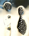
| 05/05/2007 01:12:25 PM | Small bubble tunderby katemullerComment: Hi, From the Critique Club,
The Bubbles Challenge was an invitation to go wild with abstract 'art'? and you did!
Composition is good, but I find the blue/purple object at top right a little distracting as I try to work out what it is. It is probably something quite easily explained, but it jarred with me.
Technically, I thought this was a great demonstration of the Canon 100mm Macro lens. Focus is sharp, colours are vivid and eye catching. I really like the swirling variations of the bubbles.
Overall, I like this shot a lot, but the area I mentioned earlier does distract from the overall impression, I hope you will explain it to me later. A good abstract leaves you going around and round the picture until you start to visualise your own ideas for the shot. I like it, but it infuriates me at the same time. It scored well and deserved it, but there was that little niggle that stopped it being a winner for me, so I guess it finished at about the right score. Well Done, and go for it with abstracts! | | Photographer found comment helpful. |
| 05/05/2007 12:59:08 PM | random bubblesby LlamboComment: Hi, from The Critique Club,
The Bubbles Challenge leaves an opportunity for abstract submissions, and your photo fits well into this category.
Composition is great, at first it appears to be a centre focussed shot until the eye is drawn around the picture by the randomness of the bubbles, hence your very apt title.
Technically, there is not much to pick fault with apart from the vertical lines/hairs? in the top left group of bubbles. However, there is little you could have done to alliviate this problem, you have to go with what you have at the time.
Overall impressions: At first it is too easy to bypass this photo, but then it catches the eye. The bubbles appear as diamonds in clusters and what at first seems to be a B&W picture, takes on a different image. Also, are these really bubbles or, first look, earrings? I like this a lot a feel that it should have got a slighhtly higher score, but I think that as earlier stated, the first impression brought fast votes and not many took the time to consider your shot. Well Done for a splendid shot and I look forward to seeing more challenge entries from you. | | Photographer found comment helpful. |
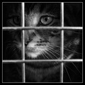
| 03/06/2007 12:10:22 PM | I hate cages.by HaneckComment: A comment from the Critique Club:
First, the technical side. Centralised shots are often panned but this works well. The DOF is spot on with the bars of the cage nicely out of focus and the cat sharp on the eye. B&W works well with this, but I think the border is a little distracting.
Composition: Centre subject has to be strong, and this is, the eye is drawn to the eye of the cat which seems to state imprisonment. I am not a great lover of Borders and would prefer to see this shot without a border.
Overall: I didn't really like this at first glance, it was just another pet closeup. Then I started looking deeper and there is a sadness reflected by the B&W. Maybe a tad oversharpened, but a powerful image that is reflected in the score. A well constructed photo that I fear has been down voted cos it is B&W and of a pet. A good shot and worthy of its position. | | Photographer found comment helpful. |
|
Showing 101 - 110 of ~260 |
Home -
Challenges -
Community -
League -
Photos -
Cameras -
Lenses -
Learn -
Help -
Terms of Use -
Privacy -
Top ^
DPChallenge, and website content and design, Copyright © 2001-2025 Challenging Technologies, LLC.
All digital photo copyrights belong to the photographers and may not be used without permission.
Current Server Time: 04/12/2025 11:25:04 AM EDT.
|