| Image |
Comment |
| 08/05/2002 09:42:00 AM |
Door to the Pastby lmhrComment: I really like the red and the wood texture. If you got even closer would it be even better? |
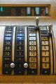
| 08/05/2002 06:56:00 AM |
Cash onlyby chakkobboComment: an angle other than straight on might have been more interesting |
| 08/05/2002 09:31:00 AM |
|
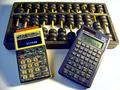
| 08/05/2002 09:29:00 AM |
Religionby MartinComment: I find the pixelization distracting on an otherwise well composed photo. Did yu shoot it at a high resolution and resize it for submission or are you shooting this low-res? |
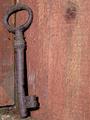
| 08/05/2002 09:19:00 AM |
Key to the pastby shortredneckComment: I find the wood too similiar in color and texture to provide a good background. I'd like a higher contrast. |
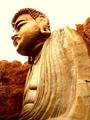
| 08/05/2002 09:50:00 AM |
Everlasting Beautyby BaldurComment: If you increased the saturation on the foliage, it might make the statue stand out in contrast even more. |
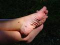
| 08/05/2002 07:00:00 AM |
Before His Timeby TomNTexasComment: looks like a kid's foot that's been in water. Are you sure you meant it for this challenge? |
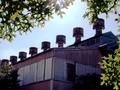
| 08/05/2002 09:25:00 AM |
Remnantby KarenBComment: I wish the colors of the building weren't so dull 5 |
| 08/05/2002 09:54:00 AM |
|
| 08/05/2002 09:33:00 AM |
Eros and Psycheby AleciaComment: your whites are white and blacks black. The photo shows the sculpture well. |
Home -
Challenges -
Community -
League -
Photos -
Cameras -
Lenses -
Learn -
Help -
Terms of Use -
Privacy -
Top ^
DPChallenge, and website content and design, Copyright © 2001-2025 Challenging Technologies, LLC.
All digital photo copyrights belong to the photographers and may not be used without permission.
Current Server Time: 04/06/2025 09:50:10 PM EDT.