| Image |
Comment |
| 07/06/2005 08:54:34 AM |
Slinkyby idnicComment: Relevance to challenge (2): 0.5-there is only almost a circle in this picture.
Color/Lighting/Exposure (2): 1 - I like the glowing effect, a darker background might have made that stand out even more.
Sharpness/Picture Quality (2): 1-could use some sharpening
Composition (2): 1.5
Creativity/Originality (2): 2 - Interesting picture.
|
 Photographer found comment helpful. Photographer found comment helpful. |
| 07/06/2005 08:50:44 AM |
Crop Circle of Buttonsby kaelvaComment: Relevance to challenge (2): 2
Color/Lighting/Exposure (2): 1-nice black background, subject stands out well.
Sharpness/Picture Quality (2): 0.5-small
Composition (2): 0.5-contrived, but you get half a point for the patience to set this up.
Creativity/Originality (2): 1
|
| Photographer found comment helpful. |
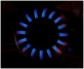
| 07/06/2005 08:47:25 AM |
Circle of Fireby HiSpaceComment: Relevance to challenge (2): 2
Color/Lighting/Exposure (2): 1
Sharpness/Picture Quality (2): 2
Composition (2): 1
Creativity/Originality (2): 2
|
| Photographer found comment helpful. |
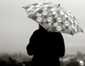
| 07/06/2005 08:44:31 AM |
Wet Circlesby roadrunnerComment: Relevance to challenge (2): 1- Circles are present but not prominent
Color/Lighting/Exposure (2): 1.5- nice silhouette (see composition)
Sharpness/Picture Quality (2): 2
Composition (2): 1 - try cropping the sides and the top to remove some sky and produce a more pleasing balance between light and dark. Cropping the right side midway between the umbrella sections would have removed the bright spot in the lower right is distracting, then cropping the left side till the figure is on the right 3rd of the picture would have helped. Cropping the top down till you can still tell its an umbrella but places the horizon a little higher along the lower third gridline might help.
Creativity/Originality (2): 2-I like it. it made me look.
|
| 07/06/2005 08:33:45 AM |
CD Circlesby radharamComment: Relevance to challenge (2): 0.5 - I don't see any circles, only ellipses.
Color/Lighting/Exposure (2): 0.5 - dull and plain
Sharpness/Picture Quality (2): 0.5 - whole picture is small and needs sharpening
Composition (2): 0.5 - Well centered, maybe a higher angle would have helped.
Creativity/Originality (2): 1 - Interesting concept, brighter and sharper might make a good stock photo. |
| Photographer found comment helpful. |
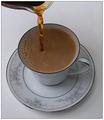
| 07/06/2005 08:29:32 AM |
First Circle of the Dayby DeniseBernadetteComment: Relevance to challenge (2):0.5, not a two simply because at this angle the circles are ellipses.
Color/Lighting/Exposure (2): 1 - I would lhave liked to have seen what this looks like with warmer darker lighting, maybe not putting cream in the cup would have made it darker and warmer as well.
Sharpness/Picture Quality (2): 2 - very nice, everything is sharp and in focus
Composition (2): 1.5 - I like the line of the coffee being poured on the left third, I think the whole thing might have been a little better positioned if the cup was on the lower third and maybe more of the pitcher in the picture as well if you would have moved the whole crop higher.
Creativity/Originality (2): 1.5 - I like it.
|
| Photographer found comment helpful. |
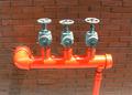
| 07/06/2005 08:21:10 AM |
Stand Pipeby nruterComment: Relevance to challenge (2): 1 - Cirlces are present but not dominant
Color/Lighting/Exposure (2): 0.5 - Lighting/shadows are harsh and distract from the photo. The bright orange of the pipes doesn't blend well with the other colors
Sharpness/Picture Quality (2): 1.5
Composition (2): 0.5 - downward angle on the wall feels awkward, a tighter crop might have a better feel.
Creativity/Originality (2): 0.5 - The bright orange of this pipe is eyecatching but otherwise not very exciting.
|
| Photographer found comment helpful. |
| 07/05/2005 01:47:17 PM |
Beau 1280x768.jpgby netdudeComment: Thanks for the comment Jutilda. Beau is in fact not a full Aussie, but and Aussie/Beagle mix. He is not the usual "blue" merl either, but instead a White/Black/Gray merl, although if you look hard enough you might see some blue/brown on his ears. The neat thing is, he has a full length tail and its all black with a white tip...the beagle dna had to take over for the tail since most aussies don't have one. His other eye is definitely brown though.
Originally posted by Jutilda:
This holds special appeal to me. I have two Aussies - and one has the bi-eyed (one brown and one blue) coloration that comes with the merling process.
This is just terrific. I love the rich coloration and crop you did. Great expression. He's either really tired, or just resigned to the fact that he has to be a model! hee hee |
|
| 07/04/2005 08:45:50 PM |
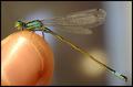
Inzektby PanoComment: wow....points for difficulty. great shot, very sharp. |
| Photographer found comment helpful. |
| 07/04/2005 08:28:27 PM |
Lambisby ChinabunComment: Nice background color. A little more DOF would have got a higher score from me. |
| Photographer found comment helpful. |
Home -
Challenges -
Community -
League -
Photos -
Cameras -
Lenses -
Learn -
Help -
Terms of Use -
Privacy -
Top ^
DPChallenge, and website content and design, Copyright © 2001-2025 Challenging Technologies, LLC.
All digital photo copyrights belong to the photographers and may not be used without permission.
Current Server Time: 04/07/2025 06:16:19 AM EDT.