|
|
| Image |
Comment |
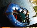
| 12/15/2002 10:07:32 AM | Collapsing Blueby bobgaitherComment: For the Critique Club:
Composition: This is a really challenging angle. One is obliged to assume it was deliberate (the dock at the very bottom is level with the frame), and then one is equally obliged to say that in this reviewer's opinion, it didn't come off. Even turning one's head, it is doesn't work for me as the water is at yet another angle. The shadows in the water are a bonus.
Technical: The photograph is well focused, and the colours are well caught. There are some blown-out areas on the boat which detract, but they were probably impossible to deal with given the range of exposures required across the image.
Challenge: The boat is definitely blue! Message edited by author 2002-12-15 15:08:21. |
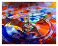
| 12/15/2002 10:00:07 AM | Pac-Man bluesby MagsCoyoteComment: For the Critique Club:
Composition: This is a straightforward photograph of a computer screen displaying Pac-Man. There is a shadow on the lower right, which is presumably a representation of a shoulder over which we are supposed to be watching the game. The more square framing would have been prefered, I think.
Technical: The screen is in focus and the display is clearly what it is, with no glare.
Theme: Both the colour and the sentiment match the Blue requirements.
Overall: This is little more than a photograph of someone else's art. The attempted POV is supposed to add value but, unfortunately, the shadow in the lower right does not have enough definition for the viewer to be sure that it was deliberate. Not a bad idea for the challenge, but I think the execution was flawed. |
| 12/11/2002 03:24:00 AM | Lacy in Blueby MarshaComment: From the Critique Club.
Composition: This is a well-framed half-length portrait. Strong lines from the arms lead the viewer to the interesting face which is, in turn, well framed by the hands and her hair.
Technical: Focus seems perfect, and the lighting -- which could have been a real problem given the shininess of her jacket -- is carefully handled. The black background works and is appropriate.
Theme and Overall: It is hard to fault this for the "Blue" challenge -- her jacket is blue, her lips, eye shadow and fingernails are blue, the bracelet highlights blue pieces, and there are blue sheens in her hair. I agree with one of the commenters that her expression could have been beeter, but that's not a real distraction.
Overall, this is a very satisfying portrait |
| 12/10/2002 03:37:10 AM | Highway to blue sky countryby jimsappComment: Hi, Jim. This is on behalf of the Critique Club.
Composition: A simple shot showing a highway leading through snow-capped mountains, made superior by the choice of portrait orientation rather than landscape. As the title suggests, this is blue sky country, and your compositional choice of 2/3rds sky evokes that feeling well. To remove the highway completely (as has been suggested) would clearly take away an important element of the story being told. I would however, like to see the removal of the light coloured area to the right of the highway that distracts and pulls the eye the wrong way; and I probably would have cropped out the intersection at the very bottom.
Technical: It is a long distance shot and therefore focus is not really an issue. You seem to have captured the light quite well. Whether or not a polarizing filter would have "improved" the image is, I think, open to question.
Overall: This doesn't have any WOW factor for me, doesn't hit me in the eye as an interesting piece. However, I believe you have well captured the mood that you probably were looking for and therefore I think it should be counted a success.
Jak |
| 12/09/2002 03:11:18 AM | Blow Itby KonadorComment: I think this really needs a deeper DOF to make the image effective. |
| 12/09/2002 03:04:16 AM | |  Photographer found comment helpful. Photographer found comment helpful. |
| 12/08/2002 07:44:28 PM | |
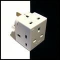
| 12/08/2002 07:32:18 PM | Power Cubedby ManicComment: I would have liked to have have seen the back end of the socket line up with the black/white divider in the same way as does the front end. An interesting macro that suggests a number of further possibilities. |
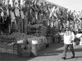
| 12/08/2002 07:28:49 PM | Market Streetby MiekaComment: I'm rather surprised at the B&W choice (but then again, I tend towards very colourful images). Were the colours distracting? | | Photographer found comment helpful. |
| 12/08/2002 07:25:45 PM | | | Photographer found comment helpful. |
Home -
Challenges -
Community -
League -
Photos -
Cameras -
Lenses -
Learn -
Help -
Terms of Use -
Privacy -
Top ^
DPChallenge, and website content and design, Copyright © 2001-2025 Challenging Technologies, LLC.
All digital photo copyrights belong to the photographers and may not be used without permission.
Current Server Time: 04/09/2025 03:30:31 AM EDT.
|