| Image |
Comment |
| 01/18/2005 08:50:29 AM |
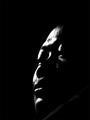
The Godfatherby quzailanComment: Very expressive use of black and white and lighting. I don't have a strong feel for its thematic implications. |
| 01/18/2005 08:48:59 AM |
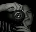
Paparazziby leifurComment: An interesting photo with neat tone but not much sense of the connotation of the "Paparazzi." |
| 01/18/2005 08:47:55 AM |
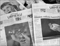
Citizen Kaneby greslizzzComment: Iknowthe movie well but don't get the picture and it is not visually appealing |
| 01/18/2005 08:46:36 AM |
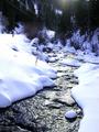
A River Runs Through ITby Frank BeckmanComment: Again,it looks like a creek to me.The front part is appealing and nicely done considering the light but theflare and trees are confusing and distracting. |
 Photographer found comment helpful. Photographer found comment helpful. |
| 01/18/2005 08:44:59 AM |
|
| 01/18/2005 08:44:03 AM |
CASTAWAYby grainman9Comment: I'm not sure what I am seeing or what I should be feeling.Neitherthe flower or background help me focus or know. |
| 01/18/2005 08:42:49 AM |
The Roseby gtp1164Comment: Kind of acliche photo but nicely rendered with wonderful central petals and appealing right side. Interesting choice of color. |
| 01/18/2005 08:41:20 AM |
"Interiors" - Directed by Woody Allenby vaguiloComment: I like what's done with the light but picture pulls me between exterior which is distracting and interior.The focus on table and chair is not quite enough of interior for me. |
| Photographer found comment helpful. |
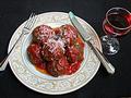
| 01/18/2005 08:39:29 AM |
Meatballsby gedisaComment: A nice, clean picture which would make a good food advertisement. I like thecomposition but I don't think both utensils were neededand the fork leaving the image is a small problem for me.Nice use of colors. |
| Photographer found comment helpful. |
| 01/18/2005 08:37:19 AM |
The Maskby WinterbergComment: I like the varied tones of blue a lot. Iwish the mask itself had been larger or more interesting given the movie and the space at bottom which is nicely blue but a little distracting. |
Home -
Challenges -
Community -
League -
Photos -
Cameras -
Lenses -
Learn -
Help -
Terms of Use -
Privacy -
Top ^
DPChallenge, and website content and design, Copyright © 2001-2025 Challenging Technologies, LLC.
All digital photo copyrights belong to the photographers and may not be used without permission.
Current Server Time: 04/09/2025 03:30:55 PM EDT.