| Image |
Comment |
| 11/12/2004 08:33:53 PM |
Januaryby WinterbergComment: Great color. The composition is too symentrical for me. I want to reach out and move the King over in front of the pawn a bit more. I would more the rook and frosted pawn over toward the right edge and back. |
| 11/12/2004 08:31:47 PM |
Decemberby PaigeComment: Interesting photo. The reflection make it look like two bulbs suspended in the air. I like the editing. Nice job. |
 Photographer found comment helpful. Photographer found comment helpful. |
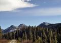
| 11/12/2004 08:29:20 PM |
Octoberby TressiderComment: I like the road. I would crop the sky down a bit. Having so much sky minimizes the mountains for me. Nice lighting - light in the foreground and background with the midranges darker adds an interesing twist. |
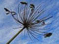
| 11/12/2004 08:26:59 PM |
Novemberby sfaliceComment: The angle of the shot and the simplicity of the image work very well. I would crop up from the bottom left corner a bit. Nice job. |
| Photographer found comment helpful. |
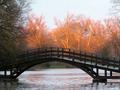
| 11/12/2004 08:25:07 PM |
November – “Stratford, Ontario, Canada”by rileyComment: This is a beautiful photo. Great contrast of light and dark, especially having the dark in the foreground. The color in the water, reflecting the color of the lighting in the trees is brilliant. Excellent photo. |
| Photographer found comment helpful. |
| 11/12/2004 08:23:30 PM |
Betty Crocker's Februaryby toddheadComment: Great idea and motif of the heart images. The framing with all the white space to one side does not work for me. I do like the concept and the colors. |
| Photographer found comment helpful. |
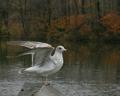
| 11/12/2004 08:21:47 PM |
Novemberby TooCoolComment: Stunning photo! I would desaturate the colors of the background; they distract from the main image. Everything else is perfect. The weathered wood and the muted colors of the bird are splendid. Very nice! |
| Photographer found comment helpful. |
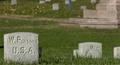
| 11/12/2004 08:15:51 PM |
May 2005by agrimaceComment: I like the idea and the angle of this photo. I would like the main headstone to take up more of the frame - what an interesting name. I would like all the rest of the headstone engravings to be out of focus. The far background colors distract. I would crop them out. I like the grays and greens. |
| Photographer found comment helpful. |
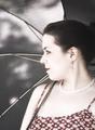
| 11/12/2004 08:13:24 PM |
April Showersby jmleliiComment: This image appeals to me, but I would like to see the subject looking the other way since it is for the month of April and I tend to think of spring months as getting ready for what lies ahead. Great hint of pinks/maroons in the skintone of your subject picking up the color of the fabric and the lips. The dappled light through the umbrella also hints of spring since is is muted and not shining with the intensity of summer. Beautiful photo. |
| Photographer found comment helpful. |
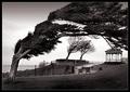
| 11/12/2004 08:09:03 PM |
September Hurricanesby KonadorComment: Nice values. Other than the trees, especially the one in the foreground, everything else seems so still. Interesting contrast of all the strong vertical images and then the movement of the trees. It works nicely for me. |
| Photographer found comment helpful. |
Home -
Challenges -
Community -
League -
Photos -
Cameras -
Lenses -
Learn -
Help -
Terms of Use -
Privacy -
Top ^
DPChallenge, and website content and design, Copyright © 2001-2025 Challenging Technologies, LLC.
All digital photo copyrights belong to the photographers and may not be used without permission.
Current Server Time: 04/12/2025 09:08:13 AM EDT.