| Image |
Comment |
| 03/24/2007 10:30:18 AM |
|
| 03/24/2007 10:28:03 AM |
NOOOOOOOOO!!!by Blue MoonComment: this is a good idea, well composed and executed. i think it would have worked equally well without the fingers, or with a more fully submerged hand. as it stands, it looks almost as if the fingers are wading, not frantically reaching. |
 Photographer found comment helpful. Photographer found comment helpful. |
| 03/24/2007 10:24:28 AM |
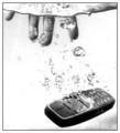
Lost Connectionby h2Comment: i love his expression, and the delicate way he's cradling his phone - as if he think's it's by some fault of his grip that his call was dropped. |
| Photographer found comment helpful. |
| 03/24/2007 10:22:48 AM |
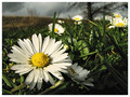
She just HAD to peek....by msdoubletroubleComment: lighting that day appears to have been great. i like your choice in subjects. while it may have precluded a spontaneous photo-op, i think you could have really made this photo pop even more by selecting more colorful clothing, and showing more grass. |
| Photographer found comment helpful. |
| 03/20/2007 05:59:38 AM |
out for a skate...by ralphComment: woah. cool effect. your photo has an unmistakable painting quality, which i'm curious how you managed to achieve. |
| 03/20/2007 05:58:05 AM |
The Tempestby bubeltrubelComment: great shot! most entries seem to automatically meld grain with monotone, but here you demonstrate great use of grain with color! my pick for a ribbon. |
| Photographer found comment helpful. |
| 03/20/2007 05:54:29 AM |
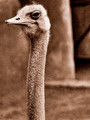
Mr. Long Neckby DsealeComment: your contrast color and grain really make pop an otherwise mundane subject! the aesthetic seems to lend the ostrich a wise, contemplative aura. |
| Photographer found comment helpful. |
| 03/20/2007 05:51:36 AM |
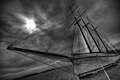
Empire Sandy by StrikeslipComment: wow. fantastic composition, and the grain really adds a visceral grit to your photo. i love the occluded sun working through the clouds, and it's positioned perfectly against the vessel. my pick for a ribbon! |
| Photographer found comment helpful. |
| 03/20/2007 05:49:51 AM |
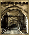
Ruins of a Dying Art.....by NikonJebComment: i love the contrast and your use of grain - many submissions in this category appear washed-out, the impact sacrificed for grain rather than enhanced by it. however, your composition could be more engaging - what am I looking at? where are you leading my eyes? |
| Photographer found comment helpful. |
| 03/20/2007 05:48:14 AM |
Bad day on the north 40.by seeComment: what a cool subject to photograph. it seems as though you sacrificed saturation and vibrancy, leaving grain superimposed on a washed-out photo. also, im curious about your choice in sepia-tone: this setting seems like it would have a really pleasing color palette! |
| Photographer found comment helpful. |
Home -
Challenges -
Community -
League -
Photos -
Cameras -
Lenses -
Learn -
Help -
Terms of Use -
Privacy -
Top ^
DPChallenge, and website content and design, Copyright © 2001-2025 Challenging Technologies, LLC.
All digital photo copyrights belong to the photographers and may not be used without permission.
Current Server Time: 04/07/2025 06:09:33 AM EDT.