| Image |
Comment |
| 10/22/2005 04:50:00 PM |
Strömforsby RupertComment: Ah - the upside-down shot! Very nice. I especially like the "lilypads in the sky".
The only thing I see that could possibly improve it is if the water had been a bit more still. |
 Photographer found comment helpful. Photographer found comment helpful. |
| 10/22/2005 04:48:31 PM |
Sports car businessby TOYComment: Nice work - You have a great concept in this photo. I think you could have made it even more effective by tightly cropping in on the sunglasses. |
| Photographer found comment helpful. |
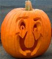
| 10/20/2005 11:24:33 AM |
Halloween Already?by AkashaComment: Nicely carved pumpkin! I think it would do a lot better in a different challenge, though.
I do like the way the pumpkin fills the photo. Not sure what to suggest to improve it. Perhaps less direct lighting or a different (solid?) background?
Nice work! |
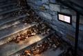
| 10/20/2005 11:21:01 AM |
Leafy Stairsby KaupsComment: I like the eerie-ness of this photo. I think it would do better in a different challenge, though. In fact, if it had been converted to B&W, increased in contrast, and given some grain, it might have done well in the Image Grain challenge!
Looking at the photo on its own merits, though... I like the composition a lot. Also, its softness gives it almost a painterly effect! I don't know if this was intended, but I like it a lot.
Nice work - just wrong challenge. |
| Photographer found comment helpful. |
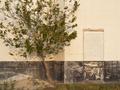
| 10/20/2005 11:16:13 AM |
Go Astros!by DelfeyeComment: OK, this photo makes me go "What?!" because I have no idea what the connection is between the photo and the title given to it.
If I just give some advice to improve the photo, though:
First, I'm not sure what the subject of this photo is. Is it the tree? Is it the door? Is it the pile of sand? Nothing stands out in it. It would be better if the photo was composed with bringing out the subject in mind.
Second, there's very little depth to it. The tree looks almost as flat as the wall behind it. I think using a wide angle lens setting and stepping closer if you wanted to make the distance look the same would improve that (I'm under the impression that a telephoto was used here).
Finally, consider taking the photo at a time of day when the light is a bit more interesting. From the shadows, this looks like it was taken in the early afternoon. Mornings and late afternoons/early evenings tend to bring the most flattering light.
Hope this helps. Good luck! |
| Photographer found comment helpful. |
| 10/20/2005 11:08:26 AM |
Who is the champ here?by lolor275Comment: Not a bad photo, but it might do better in a different challenge. I'm missing the "What?!"
Also, I'm missing the connection between the title and the picture. Are we supposed to pick the champ between the two men? Or among the people who are racing (this looks like a race track)?
To improve the photo in general, perhaps offset your subject slighly. The vertical pole in the mid-left is a bit distracting, too. Perhaps cropping it out, or somehow using it to help frame your image?
Just some thoughts... |
| Photographer found comment helpful. |
| 10/20/2005 11:04:11 AM |
One too Manyby DefyTimeComment: Wow - I didn't see the lopsided liquid in the shot glass the first couple of times I looked at this. I was missing the "What?!"
Nice concept, and nice photo. I think if the lopsided liquid was a bit more apparent in this photo, it would be better for this challenge. Perhaps if a plain shot glass was used, and not one with a picture obscuring its contents. |
| 10/20/2005 11:01:08 AM |
fallenby petdog4020Comment: Nice contrast and use of grain here. I think you probably meant to enter this in the Image grain challenge, not in "What?!", because I don't see the "What?!" here.
General suggestions to improve the photo: it might have been good to find a more interesting pile of leaves to use here. This may have made a better color photo. The problem I see with it is that it seems to look a little flat. Perhaps increasing the depth of field would make it better? Also, I might be mistaken in this, but I think telephoto lens settings tend to flatten pictures, and wide angle settings tend to increase depth. You may want to play around with this, too. |
| Photographer found comment helpful. |
| 10/20/2005 10:43:39 AM |
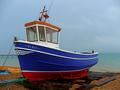
deal trawlerby newty1Comment: Nice photo - I like the rich saturation of the boat against the less-saturated background. Makes it really pop off the page - or screen, in this case.
I think it really does belong in a different challenge, though. I'm not seeing where the "What?!" is here. |
| Photographer found comment helpful. |
| 10/20/2005 10:41:53 AM |
Wildcats Fanby phinbobComment: Very adorable photo - I love it! Unfortunately, I'm not seeing where the "What?!" is.
This is a great picture - nice composition and lighting. Great expression on the little girl's face. I don't know what to suggest to improve it. It just needs to be in a different challenge. |
Home -
Challenges -
Community -
League -
Photos -
Cameras -
Lenses -
Learn -
Help -
Terms of Use -
Privacy -
Top ^
DPChallenge, and website content and design, Copyright © 2001-2025 Challenging Technologies, LLC.
All digital photo copyrights belong to the photographers and may not be used without permission.
Current Server Time: 04/12/2025 09:04:17 AM EDT.