| Image |
Comment |
| 10/27/2005 02:14:50 PM |
White CDby plimComment: Great concept! Too bad it's the basic editing challenge - it would look even better if you could have gotten rid of that text around the center and the line in the background. Is that a sheet of paper? I found that "Magic tape" works fairly well in hiding lines like that. Not perfect, but better than nothing. |
 Photographer found comment helpful. Photographer found comment helpful. |
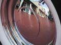
| 10/27/2005 02:11:33 PM |
Reflectionsby THEOLDGEEZERComment: I like this photo - it's a nice example of a creative reflection. I think it's better suited to a different challenge, though. Nice use of filling the frame! |
| Photographer found comment helpful. |
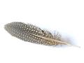
| 10/27/2005 02:09:53 PM |
Feather Lightby redtigerComment: A different idea I hadn't thought of for this challenge... nice concept! I think it would be even better if there was no shadow behind the feather. |
| Photographer found comment helpful. |
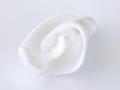
| 10/27/2005 02:08:43 PM |
Empty Shellby AzCKellyComment: I like this shot a lot. Nice, gentle lines, and no harsh shadows. Well done! (It also looks more like something to eat to me than a shell. A curl of white chocolate or ice cream, perhaps? Nah... I must just be hungry!) |
| Photographer found comment helpful. |
| 10/27/2005 02:04:48 PM |
|
| Photographer found comment helpful. |
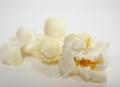
| 10/27/2005 02:03:55 PM |
Dragon Talesby zapgrafxComment: Hahaha - that's funny! When I saw it in the thumnail, I thought it was scoops of vanilla ice cream. Nice concept! Might work even better with greater depth of field and some soft overhead light to eliminated the shadow. |
| Photographer found comment helpful. |
| 10/27/2005 02:02:16 PM |
Purfect Petby chik0325Comment: Nice, tight cropping and great expression on the cat's face. This one may be better suited for a different challenge, because I think the face is a bit too dark, but the photo itself is a really nice one. Good job! |
| Photographer found comment helpful. |
| 10/27/2005 02:00:21 PM |
Confederation Bridgeby anshalin1Comment: Beautiful photo! Nice use of leading lines and perspective. I think it might be better suited for a different challenge because the bridge itself is a dark gray. But the shot itself is great. |
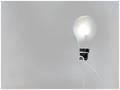
| 10/27/2005 01:58:23 PM |
Lighter Than Lightby JHComment: Hehehe - I like the humor in this. Nice concept! It might be even better if your background was very white (with no shadow), but then again, your bulb might lose the "lit" look then. |
| Photographer found comment helpful. |
| 10/27/2005 01:54:31 PM |
basking in the sunby docpjvComment: Nice concept! While nothing here is a pure white, it still fits the challenge quite well. Perhaps it would be just a bit better if your bear was more in the right of the frame, so that he could be "looking" into the empty left of the frame. Other than that, I like it! |
| Photographer found comment helpful. |
Home -
Challenges -
Community -
League -
Photos -
Cameras -
Lenses -
Learn -
Help -
Terms of Use -
Privacy -
Top ^
DPChallenge, and website content and design, Copyright © 2001-2025 Challenging Technologies, LLC.
All digital photo copyrights belong to the photographers and may not be used without permission.
Current Server Time: 04/12/2025 09:28:08 AM EDT.