| Image |
Comment |
| 09/07/2004 01:44:58 AM |
|
 Photographer found comment helpful. Photographer found comment helpful. |
| 09/07/2004 01:42:08 AM |
|
| Photographer found comment helpful. |
| 09/07/2004 01:37:07 AM |
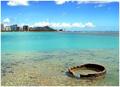
Gone Swimmingby OlyuziComment: The sunshade looks great, but the bottom of the picture is too dark. Perhaps playing around with the contrast would have saved it. Great idea, though. |
| Photographer found comment helpful. |
| 09/07/2004 01:34:49 AM |
|
| Photographer found comment helpful. |
| 09/07/2004 01:33:21 AM |
|
| Photographer found comment helpful. |
| 09/07/2004 01:31:39 AM |
The Munich Olympic stadiumby aKiwiComment: Is that the sun setting in the background? That could have been brought out a bit better, perhaps. I would crop away the left fifth or so (most of the buildings) to concentrate more on the shape that's interesting. And maybe also crop a bit from the bottom ... hmm that might make it a bit too abstract, but would be worth a try.
It's also a tad too dark for me, sunset or not. |
| Photographer found comment helpful. |
| 09/07/2004 01:27:29 AM |
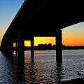
Old Ironsidesby soccerdadComment: Nice subject, but it looks a bit too dark to me, and the horizon is also tilted a bit (the tilted buildings on the left look extremely weird ;). Perhaps lessening the contrast would improve the "dark" problem, and might also give you some detail in some of the areas that are practically all black. It might also be worth a try converting the image to greyscale and playing around with the contrast then. |
| Photographer found comment helpful. |
| 09/07/2004 01:24:01 AM |
Historic ‘Niagara On the Lake”by rileyComment: Nice picture, except for two things: the part of the building touching the top of the frame, and the over-saturated colors. The blur in the trees on the right also looks a bit strange, looks like you did some editing in the sky.
But apart from that, that's exactly the picture I would expect on the hotel's website or in a promo folder. |
| Photographer found comment helpful. |
| 05/23/2004 12:31:40 PM |
|
| 05/23/2004 12:25:34 PM |
|
Home -
Challenges -
Community -
League -
Photos -
Cameras -
Lenses -
Learn -
Help -
Terms of Use -
Privacy -
Top ^
DPChallenge, and website content and design, Copyright © 2001-2025 Challenging Technologies, LLC.
All digital photo copyrights belong to the photographers and may not be used without permission.
Current Server Time: 04/08/2025 08:21:38 AM EDT.