| Image |
Comment |
| 07/26/2004 06:58:23 PM |
|
| 07/26/2004 06:55:58 PM |
Dangerous Personality Conditionby Faye PekasComment: Cool picture, and good graphic work. I especially like what you did with the title. I'd have preferred no border, or perhaps a border that was the same color as the right side. |
 Photographer found comment helpful. Photographer found comment helpful. |
| 07/26/2004 06:54:52 PM |
Demotic Pagan Choirby hfngotphotoComment: I'm not sure where to start here, but I'd at least like to know why you chose not to anti-alias your bottom text... but did on the top... |
| 07/26/2004 06:50:13 PM |
Drain Pipe Creatures by scalvertComment: Well, this one just stopped me in my tracks. Finally, a cover that's completely buyable as a real band name and a professional graphic layout. Easily a 10. Great job. |
| Photographer found comment helpful. |
| 07/26/2004 06:46:50 PM |
Dead Poets' Childrenby Dr.ConfuserComment: I'd like the focus of the photo to be the graves -- seeing the trees as the sharpest object is a bit distracting. As for your graphical editing, you should turn on anti-aliasing on your text, as it'll help make everything fit together better. |
| Photographer found comment helpful. |
| 07/26/2004 06:45:28 PM |
Digby Peters Cameronby SammieComment: I buy it -- good job :) The line spacing and horizontal tabbing on your title throws me off a bit. Work on the graphical editing part. |
| Photographer found comment helpful. |
| 07/26/2004 06:43:58 PM |
Deep Pink Cloudsby pitsamanComment: Definitely a neat picture, but a little safe for the challenge if you ask me. I don't feel like the border is really adding to the picture. For me, it's actually taking away from it. |
| Photographer found comment helpful. |
| 07/26/2004 06:41:34 PM |
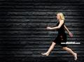
Devine Physical Controlby arnitComment: Love the composition. I'm a little undecided on the focus of the girl. Great layout in post-processing. |
| Photographer found comment helpful. |
| 07/26/2004 06:39:18 PM |
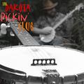
the Dakota Pickin' Clubby joebokComment: Best and most believable band name I've seen yet, with a good picture to match. I love the focus, but I wish the background were a bit softer (as opposed to grainy). I also think you may consider no color at all in the picture, as the jeans/hat are a bit distracting. |
| Photographer found comment helpful. |
| 07/26/2004 06:35:23 PM |
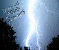
Diehard Power Chargersby TikicharmComment: Since you've chosen to use text as part of your final composition, I've got no choice but to judge you on it... word art just isn't working as a CD cover this decade. The photo itself is very difficult to focus on with the water droplets everywhere. |
Home -
Challenges -
Community -
League -
Photos -
Cameras -
Lenses -
Learn -
Help -
Terms of Use -
Privacy -
Top ^
DPChallenge, and website content and design, Copyright © 2001-2025 Challenging Technologies, LLC.
All digital photo copyrights belong to the photographers and may not be used without permission.
Current Server Time: 04/17/2025 04:17:09 PM EDT.