| Image |
Comment |
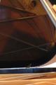
| 11/02/2004 05:12:06 AM |
Music is reflection...by kimybradyComment: Took me forever to actually see what it was. Way out of focus makes it look like you took it with your camera-phone. Lots of distracting elements left even if it had been in focus. Either it's an attempt at the brown ribbon or you need to try a bit harder I think. |
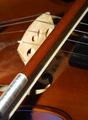
| 11/02/2004 05:06:41 AM |
Sweet Violinby BigMoComment: Not bad, but the burned out / overexposed lower left side is hurting the image. Also the focus seems off because it's not on the the most dominant part - the light wood. I think had been better either with that in focus or a deeper DOF. I think I want to see a bit more of it too - less tightly cropped. It's a 5 from me. |
 Photographer found comment helpful. Photographer found comment helpful. |
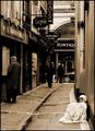
| 11/02/2004 04:52:44 AM |
Any spare change...? by BrookiedComment: Very nice. The sepia tone, the contrast between rich and poor, right down to the facial expression. My top pick this round. |
| Photographer found comment helpful. |
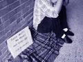
| 11/02/2004 04:20:19 AM |
Photographic Poverty?by SteveJComment: Well a bit of humour was needed in this challenge as well I guess, but as a Nikon owner I must say that you lack more than money.. :-) |
| Photographer found comment helpful. |
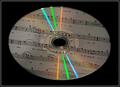
| 11/01/2004 10:26:23 PM |
Conception, Creation, CDby wkoffelComment: The notes saves you on this one. I feared we were going to see more discs in this challenge than we actually did, but sanity prevailed overall. Not very interesting though and the centered composition is just a bit too much in my face. |
| Photographer found comment helpful. |
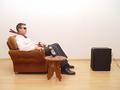
| 11/01/2004 10:23:28 PM |
Relaxing with my Yamaha SubWooferby aKiwiComment: Ah, how refreshing with a bit of humour. It does however look a bit too staged to be a really good image, but points up for idea and execution. |
| Photographer found comment helpful. |
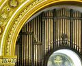
| 11/01/2004 10:21:10 PM |
Arches and Pipes IIby banmornComment: Interesting composition, but the arch seems a bit oversaturated - stealing focus from the pipes. This would have fit the "parts" challenge too I guess. 5 from me. |
| Photographer found comment helpful. |
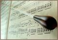
| 11/01/2004 10:18:32 PM |
The Conductors Batonby trainComment: Nice effort and the composition is ok, although I do get the feeling the baton in question seems glued to the paper, the orientation looks forced. The light source seems to be placed to close to the subject washing out colour and detail down to the left. The light areas draws the eye away from the subject a bit and it seems a bit unnatural that it comes from below. |
| 11/01/2004 10:14:07 PM |
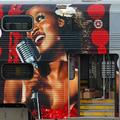
Jazz on wheelsby Pep VentosaComment: I like this one, but it bothers me a bit that it's basically a picture of a picture, although it's mounted on a train. Not saying it's not ok by any rules or so, it just brings the last point in the general direction of the original artist..
Perhaps someone entering or leaving the train would have made the door / scale more obvious? |
| Photographer found comment helpful. |
| 11/01/2004 10:10:32 PM |
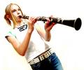
Daily Practiceby bobdaveantComment: Very nice composition. I think her posture is a bit staged, as if she's trying to say "get on with it - take the picture already". Some of the yellow tones, especially in the background could be desaturated I think. One of my top picks still - good effort! |
| Photographer found comment helpful. |
Home -
Challenges -
Community -
League -
Photos -
Cameras -
Lenses -
Learn -
Help -
Terms of Use -
Privacy -
Top ^
DPChallenge, and website content and design, Copyright © 2001-2025 Challenging Technologies, LLC.
All digital photo copyrights belong to the photographers and may not be used without permission.
Current Server Time: 04/07/2025 06:15:51 AM EDT.