| Image |
Comment |
| 11/10/2004 03:28:39 AM |
The Missionby redmoonComment: hi, david. :)
i was just poking through some of your recent photos and had to comment on this one because when i saw it i said, "ooooh." literally. outloud, alone in the house, just me and the cats. so i thought you should know. i like it a lot. i'd buy the postcard if i saw it somewhere. |
 Photographer found comment helpful. Photographer found comment helpful. |
| 03/23/2004 03:52:28 PM |
doorwayby jailbirdComment: i'm not entirely sure what i'm looking at here. it feels very abstract. |
| 03/23/2004 03:49:30 PM |
|
| 03/23/2004 03:46:55 PM |
tinesby ursulaComment: this is a nice job of making an everyday subject interesting. |
| Photographer found comment helpful. |
| 03/23/2004 04:33:44 AM |
Time Is Moneyby zmaerdComment: great composition. can't imagine how you set that up. i'm a bit confused/distracted by what looks like bright reflections across the image, though. |
| Photographer found comment helpful. |
| 03/23/2004 04:31:07 AM |
Once in a blueby ivashComment: simple, great color. it's interesting how the shape of the image as a whole looks asymmetrical because of the angle of the lines. |
| Photographer found comment helpful. |
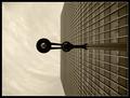
| 03/23/2004 04:13:10 AM |
Time to Look and Learnby agwrightComment: great setup. the repetition and perspective are excellent, and the man works as an ultimate focal point as my gaze is drawn into the image. |
| Photographer found comment helpful. |
| 03/23/2004 04:11:22 AM |
Parallel Universeby cabaComment: i'm completely intrigued by this. really great work; it definitely holds my attention. if anything, i'd like to see a slightly more dynamic background. the shadow on the leftmost of the three center 'lines' is a little distracting, whereas the colors on the rightmost one are beautiful. it glows. |
| Photographer found comment helpful. |
| 03/23/2004 04:08:28 AM |
Vertical Viewby ManicComment: the rotation works well on this. great use of lines, color, light. very strong work. |
| Photographer found comment helpful. |
| 03/23/2004 04:06:38 AM |
Silhouetteby Jamie2772Comment: i like this. i think it would be strengthened if the shadows were a bit darker, but not so much that the subtlety gets lost. |
| Photographer found comment helpful. |
Home -
Challenges -
Community -
League -
Photos -
Cameras -
Lenses -
Learn -
Help -
Terms of Use -
Privacy -
Top ^
DPChallenge, and website content and design, Copyright © 2001-2025 Challenging Technologies, LLC.
All digital photo copyrights belong to the photographers and may not be used without permission.
Current Server Time: 04/08/2025 06:50:59 AM EDT.