| Image |
Comment |
| 08/16/2005 07:06:10 AM |
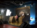
WQ6O5172.jpgby Gil PComment: No, it was built By Elliott Smith and Designed by Steeve Henry for Produkt house |
| 08/05/2005 07:13:06 AM |
A Shocking Professionby kjenningsComment: since you're wondering why you got some low scores... I would rate this image a 4. here's why:
The image is technically fine but obviously shot at the wrong color temp.. ty-raps are white and are showing orange on your shot.
Compositionally, the image is very busy with not directional dynamics there are no clear points of interest.
lastly there is no perspective and this create an absolute flatness which is obviously not the case as the materials are stacked. |
 Photographer found comment helpful. Photographer found comment helpful. |
| 08/05/2005 07:00:07 AM |
G35 -2by res0m50rComment: Shooting cars is a difficult challenge, and there are several rules to be followed, particularly in order to get "motion"
Idealy, the car needs to be shot with the nose either pointing to left of the frame, this gives a sense of speed. if the car is pointind the other way (right) then it gives a sense of "parked power" and is generally shot at a lower angle (tire height) It's really great fun to shoot cars and I think that you did quite nicely.
here is a link to a shot of a "maquette" for a BMW canada jod that was done later, the "maquette" is shot/lit in exactly the same way as the car will be when the real car comes to the studio.
//www.pbase.com/gilp/image/27004375
Keep it up...car photo is a HUGE business (which we don't do!) |
| Photographer found comment helpful. |
| 07/06/2005 03:58:12 AM |
Over exposureby Gil PComment: No, no ring light....I almost bought one a year ago, but now, since I have a FF camera and use almost exclusively a 70-200, it would be useless.
I use a 6' octodome which I place right behind me and just bleach the scene. |
| 06/29/2005 10:23:53 AM |
|
| Photographer found comment helpful. |
| 06/27/2005 09:55:31 AM |
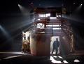
Wall of lightby GoldBerryComment: I just discovered this image, GREAT shot.
very artsy and somewhat provocative, love it.
Technically very powerful use of light and miraculous use of the blinds...with no "zebra effect".
constructive comment: the only thing that "bugs" me is the shadow of the hair...perhaps some cloning out to make the hair seem more "in place". |
| Photographer found comment helpful. |
| 06/01/2005 10:12:49 AM |
Amandaby CalliopeKelComment: Decent and happy image BUT I feel there is too much dodging on the eyes. |
| Photographer found comment helpful. |
| 05/30/2005 04:25:11 AM |
This Ole House by kevrobertsonComment: As an LD myself, I can see the relevance of this shot to the topic, Really great capture and really perfect masking of the 5K. congrats on your placing! |
| Photographer found comment helpful. |
| 05/09/2005 05:01:41 PM |
Tulipby nidanComment: I think the negative space is a real plus here, it really adds to the whole artwork, in my opinion vivid colors benifit greatly from larger negative space and this is a great example. |
| 05/03/2005 04:17:35 PM |
Maryby Gil PComment: I had never even noticed all these comments...wow, thank you all! I apologize for never having responded...I just posted and forgot to check for comments... thank all very much. |
Home -
Challenges -
Community -
League -
Photos -
Cameras -
Lenses -
Learn -
Help -
Terms of Use -
Privacy -
Top ^
DPChallenge, and website content and design, Copyright © 2001-2025 Challenging Technologies, LLC.
All digital photo copyrights belong to the photographers and may not be used without permission.
Current Server Time: 04/07/2025 05:29:04 AM EDT.