| Image |
Comment |
| 03/07/2004 08:59:17 PM |
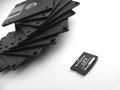
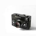
Advancement of Technologyby AFViperComment: nice comparison. i am not sure the crooked angle is necesary. perhaps a little high contrast.... or too much burning on the whites. |
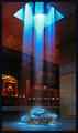
| 03/07/2004 08:58:39 PM |
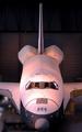
Glowing Enterpriseby brewinjComment: hmm allright, not too interesting lighting... very bright on the front, then just flat for the rest... decent DOF |
 Photographer found comment helpful. Photographer found comment helpful. |
| 03/07/2004 08:57:59 PM |
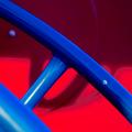
for funby pcodyComment: decent colors, the red does seem a little oversaturdated... nice abstract crop |
| Photographer found comment helpful. |
| 03/07/2004 08:57:24 PM |
|
| Photographer found comment helpful. |
| 03/07/2004 08:57:09 PM |
|
| Photographer found comment helpful. |
| 03/07/2004 08:56:49 PM |
|
| Photographer found comment helpful. |
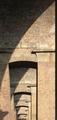
| 03/07/2004 08:56:18 PM |
Design for Godby oskarComment: wow.. now that's a church. whites are blasted out.. nice sky color |
| Photographer found comment helpful. |
| 03/07/2004 08:55:43 PM |
|
| Photographer found comment helpful. |
| 03/07/2004 08:55:26 PM |
ontario centerby loudzgamerComment: seems a 'little' blurry or soft. perhaps too tight of a crop on the left side and on the top. |
| 03/07/2004 08:55:04 PM |
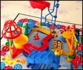
"Buiding a Better Mouse Trap"by tfarrell23Comment: welllll.. lots of colors anyhow. i think the flower print cloth is distracting from what your 'real' image is off. a bit soft.. or blurry.. isn't sharp sharp... |
| Photographer found comment helpful. |
Home -
Challenges -
Community -
League -
Photos -
Cameras -
Lenses -
Learn -
Help -
Terms of Use -
Privacy -
Top ^
DPChallenge, and website content and design, Copyright © 2001-2025 Challenging Technologies, LLC.
All digital photo copyrights belong to the photographers and may not be used without permission.
Current Server Time: 04/16/2025 01:42:51 AM EDT.