| Image |
Comment |
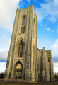
| 06/04/2006 10:36:00 AM |
House of faithby marvinComment: Nice image, almost works. But I would have adjusted to let the front be straighter, and the back canted. This gives the feel that its a leaning tower... it could be, but I have no clue. everything else seems fairly ok. |
 Photographer found comment helpful. Photographer found comment helpful. |
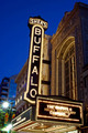
| 06/04/2006 10:34:42 AM |
Buffalo's Brightest are back!by photogrlComment: Not sure of the architecture I am supposed to be looking at. The sign itself is canted which distracks as well as the bright street light. If you had a closer image of the window design and the carvings around it, this image would have done better. |
| 06/04/2006 10:32:33 AM |
Temperanceby RKTComment: intresting idea. little more constratiness, and maybe a slight angle so its not head on. but nice overall. |
| Photographer found comment helpful. |
| 06/04/2006 10:31:49 AM |
Southern Sunby tonyvComment: Kinda nice lighting, the yellow is a little flat for me. Should be fuller framed to show off mroe the the architecture. |
| Photographer found comment helpful. |
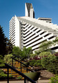
| 06/04/2006 10:30:48 AM |
1976 Olympic Villageby ceyvalComment: Novel idea, but the out of focus handrails in the front distract from the image. Showing more of the image in frame and less of the surounding extras, would have make this a stronger image. does not clearly show architecture in my view. |
| Photographer found comment helpful. |
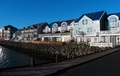
| 06/04/2006 10:29:38 AM |
New "Old" housesby GunnsiComment: the water is a distraction. should have shot closer and harder angle, or higher and more sky. the sky colour is nice, but the focus should be the buildings, upping the saturation of the buildings and lowering it for the sky should make this more apealing. Yet, it doesn't really show architecture, it just shows some buildings. |
| Photographer found comment helpful. |
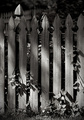
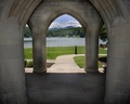
| 06/04/2006 10:28:21 AM |
Supportby karmatComment: Doesn't really show architecture of anything here. the stonework itself is drab and boring. but a nice image all the same. Just a touch constrast on the stonework would transform it a little better. but still won't meet the challenge. |
| Photographer found comment helpful. |
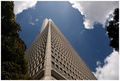
| 06/04/2006 10:27:16 AM |
Transamerica Pyramidby sjonniComment: Portait enstead of landscape. Show me more of the building. The sky clouds, vegitation all look good. but the building itself lacks strong intrest. |
| 06/04/2006 10:26:25 AM |
_ _ _ _ _ _by electinaComment: Depth of field for this is icky, could use more contrast, and doesn't really show architecture. to me it looks like a bunch of empty chairs. |
| Photographer found comment helpful. |
| 06/04/2006 10:25:30 AM |
|
| Photographer found comment helpful. |
Home -
Challenges -
Community -
League -
Photos -
Cameras -
Lenses -
Learn -
Help -
Terms of Use -
Privacy -
Top ^
DPChallenge, and website content and design, Copyright © 2001-2025 Challenging Technologies, LLC.
All digital photo copyrights belong to the photographers and may not be used without permission.
Current Server Time: 04/07/2025 06:30:15 AM EDT.