| Image |
Comment |
| 06/04/2006 10:52:41 AM |
From past to presentby BruBComment: interesting, but the blown out highlight at the top is a major distraction for me. I would have error on the side of under exposure. |
| 06/04/2006 10:51:53 AM |
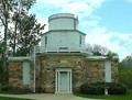
Observatoryby CEJComment: really flat and unblanced white. Adjust the white balance and maybe a little saturation and constrast. |
 Photographer found comment helpful. Photographer found comment helpful. |
| 06/04/2006 10:51:02 AM |
perspectiveby garlicComment: Get rid of the person, and this would have been better, and also whatever that white thing is on the floor next to the door. Very distracting. Overall, its nice. |
| 06/04/2006 10:50:27 AM |
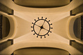
Looking Upby LERtasticComment: don't care for this at all. Looks like a poorly drawn paintshop image. The prespetive is almost interesting, but the image itself is two even. Needless to say, this could be totaly true of this design, but, just looks fake to me. |
| Photographer found comment helpful. |
| 06/04/2006 10:49:09 AM |
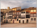
15th Centuryby lsmartComment: two differnt types of architecture. But there is to much ground. Get closer in to the subject and this would be a stronger image. |
| Photographer found comment helpful. |
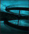
| 06/04/2006 10:48:21 AM |
round & roundby arngrimurComment: This is pretty neat. But don't care for the prespective. and not really clear on the archtectural structure. |
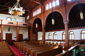
| 06/04/2006 10:47:46 AM |
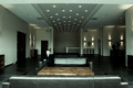
181 Years of Sundaysby idnicComment: Almost interesting. Show less of the room and more of the architecture. The over blown lights from outside are also a distraction throughout the image. |
| Photographer found comment helpful. |
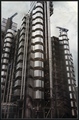
| 06/04/2006 10:47:05 AM |
Lloyds Buildingby phayanakComment: Really interesting. play with the levels more to give a stronger impact. but very nice overall. |
| Photographer found comment helpful. |
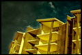
| 06/04/2006 10:46:33 AM |
Old Glory...by ACheltonComment: Very cute, fairly well executed. a little flat, but well done over all. |
| Photographer found comment helpful. |
| 06/04/2006 10:45:58 AM |
Modernby BrianRComment: Don't really care for this at all. Looks poorly photoshoped, and is blurry to boot. Maybe you should have not tryed to alter the colours and this might have done better. |
| Photographer found comment helpful. |
Home -
Challenges -
Community -
League -
Photos -
Cameras -
Lenses -
Learn -
Help -
Terms of Use -
Privacy -
Top ^
DPChallenge, and website content and design, Copyright © 2001-2025 Challenging Technologies, LLC.
All digital photo copyrights belong to the photographers and may not be used without permission.
Current Server Time: 04/12/2025 10:06:31 AM EDT.