| Image |
Comment |
| 06/28/2006 05:31:52 AM |
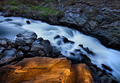
"There's Gold Up in Dem Hills"by CutterComment: Personaly, I don't care for these type of shots. with the water looking like foam or smoke or cloud or whathave you. It is not an image I really care for, looking at the other elements as well. For soem reason it really doesn't hold my attention. and the 'gold' looks added on in pp. Doesn't sell the image for me. |
 Photographer found comment helpful. Photographer found comment helpful. |
| 06/28/2006 05:29:54 AM |
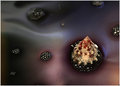
Deadly Combinationby steffyldComment: Fun idea. Could have been pulled off in a number of ways. Here I think you need more contrastiness and up the saturation a bit. Maybe a little lower of a n angle also would work better. |
| Photographer found comment helpful. |
| 06/28/2006 05:28:39 AM |
It's Raining Bad Luckby carpentsComment: Im thinking black raindrops or confettie or something. it needs a Visual effect to show 'It's' Raining. other wise this is more along the lines of 'Is it' Raining.
Also, doesn't give me the feel that he is indoors. The lighting suggests outdoors. Even though the doorway looks inside. |
| Photographer found comment helpful. |
| 06/28/2006 05:26:09 AM |
|
| Photographer found comment helpful. |
| 06/26/2006 03:04:55 PM |
Lavaby smilebig4me1xComment: The flashlight seems to have created an overpowering highlight on things. A little distracting.
Everything else seems to work very well. Although maybe a little tighter crop.. not much.. just a little. |
| Photographer found comment helpful. |
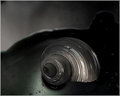
| 06/26/2006 03:03:26 PM |
Sea of Mistby smilebig4me1xComment: This is really fun, it draws me in and wants me to look deeper in. Keep the positioning, but maybe a little tighter crop would make this even more dramatic, The shapes on the shell with light and colour are intresting. Maybe throw something more colourful in front for it to reflect off of and create an illustion of colour within the shell. |
| Photographer found comment helpful. |
| 06/04/2006 11:18:07 AM |
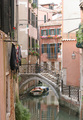
Old Veniceby bjallenComment: intresting image, but not cluear on the architecture that is to be the focal point. |
| 06/04/2006 11:04:07 AM |
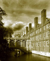
The Millby ArtanComment: Very nice image. The colour is a smidge unrealistic to me, but overall.. very nice job. |
| Photographer found comment helpful. |
| 06/04/2006 11:03:36 AM |
Since 1831 ADby arminComment: Nice antiqueing. truely gives an old photo feel. I think this was executed very well. Would have to say the best one yet. |
| Photographer found comment helpful. |
| 06/04/2006 11:02:54 AM |
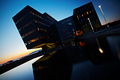
After closing hoursby LalliSigComment: Don't care for the angle. Otherwise this would have been one of the higher scoring. Nice lights and reflection, things seem to balance... just the angle is not condusive to showing off the architecture. |
| Photographer found comment helpful. |
Home -
Challenges -
Community -
League -
Photos -
Cameras -
Lenses -
Learn -
Help -
Terms of Use -
Privacy -
Top ^
DPChallenge, and website content and design, Copyright © 2001-2025 Challenging Technologies, LLC.
All digital photo copyrights belong to the photographers and may not be used without permission.
Current Server Time: 04/12/2025 10:06:32 AM EDT.