| Image |
Comment |
| 01/04/2010 11:33:53 AM |
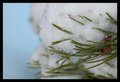
The snow will soon be goneby Dan_rComment: Nice idea. I am surprised how much weight is being supported. The direct flash hinders the possibility of vivid colour and clarity. I wonder if this was brought in a lot more, perhaps focusing more on the drop and cropping most the rest of the snow off and pushing the sat how it would have looked. |
| 01/04/2010 11:32:27 AM |
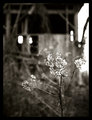
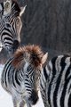
Beauty and Decayby colorcarnivalComment: The old-style of this image is slightly appealing. The composition and contrasts are ok, though perhaps could have been pushed a bit more. |
 Photographer found comment helpful. Photographer found comment helpful. |
| 01/04/2010 11:31:36 AM |
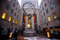
The Commuteby Five_SeatComment: This is interesting though the center composition does nothing for me. Yet I read your title and notice the gentleman walking. This image is more about the stature/sculpture then the guy walking. Overall it is an ok snapshot but just does nothing for me. |
| Photographer found comment helpful. |
| 01/04/2010 11:30:30 AM |
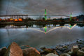
Lion's Gate Bridgeby manavgComment: This is kinda nice. The colours of the green on the supports and the white on the suspensions are nice. However the fire orange and electric poles create a strong distraction. I am on the fence about the foreground items, Though I think if it was cropped off to show only the bridge and reflection it would have stood a lot stronger. |
| Photographer found comment helpful. |
| 01/04/2010 11:28:55 AM |
Baby in the middleby RiderGalComment: Kinda cute image. Though The top unbalances the bottom and distracts my eye. I see with your title your concept, however for me it did not work well to balance the frame. Perhaps a landscape view would have been more beneficial. |
| Photographer found comment helpful. |
| 01/03/2010 09:52:17 AM |
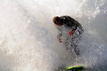
Break Thruby cabaComment: I love taking these types of shots. However for me, this one just doesn't give me a strong sense of wow. Sure there is a huge wave or churned water all around the rider. But the board looks flat and the rider looks about ready to bail. For me there is not enough clarity of image/story. Perhaps if there was more contrast to create drama in the water it would offer something extra. |
| Photographer found comment helpful. |
| 01/03/2010 09:38:40 AM |
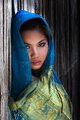
Veiledby denboteComment: A nice clean portrait, the colours work well and I like the element of her leaning against the fence there. However for me, for a free-study it just does not do enough. I am missing the wow factor that blows me away. |
| Photographer found comment helpful. |
| 01/03/2010 09:34:03 AM |
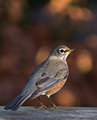
Just passing throughby vawendyComment: I enjoy the background as well as the clarity of line on the feathers. However it appears he is a bit out of focus or that it drops off rather quickly. I would have hoped for a sharper more clear view of the whole bird and not just the tips of the wings. |
| Photographer found comment helpful. |
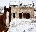
| 01/03/2010 09:33:00 AM |
The Orleans Stone Houseby jimboneComment: This could be a cute image for horse lovers. The scene is pleasant enough. However it does not pop or scream at me. It is nice but not extraordinary. |
| Photographer found comment helpful. |
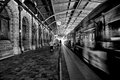
| 01/03/2010 09:31:33 AM |
2:58by Covert_OddityComment: The center alignment of the clock for me is distracting. I understand it is where you got your title but there is no real understanding or appeal to the average viewer as to why. At least not to this viewer. The motion of the train is interesting and I wonder if I am seeing a reflection of the other wall or seeing through the train. I think there is a lot of possible character here just it was not brought out for me. |
| Photographer found comment helpful. |
Home -
Challenges -
Community -
League -
Photos -
Cameras -
Lenses -
Learn -
Help -
Terms of Use -
Privacy -
Top ^
DPChallenge, and website content and design, Copyright © 2001-2025 Challenging Technologies, LLC.
All digital photo copyrights belong to the photographers and may not be used without permission.
Current Server Time: 04/12/2025 11:18:33 AM EDT.