|
|
| Image |
Comment |
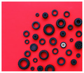
| 03/12/2007 06:22:10 AM | Radialby lynnmarieComment: this is really cute, and deserves to score highly. I love the choice of subject matter (make a great addition to any toy-orientated stock library), the black against the red is very striking (though looks a bit of a discoloured pink to the left), the wheels themselves spatial placed in a very pleasing manner, and it's all just very funky. well done!
A Weighted Scoring System √ĘĄ¬Ę; composition + technical 3/3, challenge 1/1, post processing results 1.5/2, ooooh factor 3/3, originality 1/1 = 9.5 (rounded to a nice round 10!) |  Photographer found comment helpful. Photographer found comment helpful. |
| 03/12/2007 06:03:37 AM | Mini Cooper 2004: Wheels & Lightsby 777STANComment: i'm thinking of cinderella and the ugly sisters; no matter of shoe horning is going to make this fit the challenge. the car is a wonderful yellow, and it does have circular features; it seems a lost opportunity not to capture a close-up of one of them and fill the rest of the frame with the yellow. forgetting the challenge, it's a cute picture of a cute car; the distortion in the perspective positively enhances the cars cheeky character thereby giving it personality. the background is a bit plain and nondescript, and the (what appear to be) midgets over the left wing are a bit odd - like parents beaming at their especially large and fat baby.
A Weighted Scoring System √ĘĄ¬Ę; composition + technical 1.5/3, challenge 0.25/1, post processing results 1/2, ooooh factor 1.5/3, originality 0.5/1 = 4.75 (rounded to 5) | | Photographer found comment helpful. |
| 03/12/2007 04:21:09 AM | Swooshby glodaComment: strangely excited about this shot. very new bloc party album cover about it. the lights, especially at the back of the roundabout, are a little bit too diffused / fluffy / undefined for my own personal liking (i find thin traces of car lights a bit more dynamic), but otherwise good stuff. Great angle, and the elevated position of where the shot was taken is very effective. really cool.
A Weighted Scoring System √ĘĄ¬Ę; composition + technical 1.5/3, challenge 1/1, post processing results 1/2, ooooh factor 2.5/3, originality 0.5/1 = 6.5 (rounded to 7) | | Photographer found comment helpful. |
| 03/12/2007 03:40:54 AM | Karmelby TheTobyComment: This should, I suspect, get at least a top 20. Must admit, when I saw the thumbnail I figured it for a ribbon, but it's let down slightly by the busy background, the quality of the lighting from the overcast skies, and the gap between the rings in the top left (might have been less so if cropped a little off the top to make it more widescreen?). however, it's still a great very likaable picture; the red of the spirally thing is nice and bold, the models posture and dress sense is very rock 'n' roll and has personality, and it's quite pleasingly contrasty.
A Weighted Scoring System √ĘĄ¬Ę; composition + technical 2/3, challenge 1/1, post processing results 0.5/2, ooooh factor 2/3, originality 1/1 = 6.5 (rounded to 7) |
| 03/12/2007 02:35:57 AM | Colourful Tubesby OmniComment: very lovely bright colours, and a good striking image. the apparent randomness of the straws is very appealing in a natural kind of way. the only complaint is that though i see the circles, the most prominent thing about the image is how ones eyes are drawn into the middle of the shot in a flying at light speed kind of way. still, very gorgeous stuff.
Dave's Weighted Scoring System √ĘĄ¬Ę; composition + technical 2.5/3, challenge 0.5/1, post processing results 1.5/2, ooooh factor 3/3, originality 0.5/1 = 8 | | Photographer found comment helpful. |
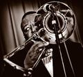
| 03/12/2007 02:02:02 AM | grooveby ThingOneComment: Super-groovy! there's much to admire and like from this shot. the colours are very fitting in terms of period, the depth of field (blur in the foreground) adds much life to the shot indicating movement and makes it feel totally unstaged or posed. i love the angle, crop and the burning around the frame. the only detracting element is the guys eye (too much area of white and the ball looks faintly feline) and i'm in two minds whether i like that he's looking so far to his right. i like that it does convey a personality of shyness from you the photographer, but it also gives a nonchalant attitude like "i'm too cool for this gig"... still, minor grumble and otherwise it's a cool cat of a photo.
Dave's Weighted Scoring System √ĘĄ¬Ę; composition + technical 3/3, challenge 1/1, post processing results 2/2, ooooh factor 2.5/3, originality 0.5/1 = 9 | | Photographer found comment helpful. |
| 03/11/2007 11:34:40 PM | Secretby ltlmschrisssComment: an elegantly stylish image; especially like the use of the desaturation which i find to be very effective. has something very cover of a book thing about it - would probably be a fairly successful stock photo. only slight reservation is that it feels a tad too tightly cropped, and might have in fact benefitted from a black frame. and also not sure if it really says "circle" prominently enough. Otherwise very likeable though.
My New Scoring System √ĘĄ¬Ę; composition + technical 2/3, challenge 0.5/1, post processing results 2/2, ooooh factor 2.5/3, originality 0.5/1 = 7.5 (or 8) | | Photographer found comment helpful. |
| 12/20/2006 12:28:23 PM | a violent youthby posthumousComment: really love this photograph - deeply not surprised to find it near the bottom of the pile though (people have really limited imagination). you should get some satisfaction from the five 10s, which are all well deserved. the blur, level of noise, and the colours being restricted to reds, browns and whites are very effective, creative and lovely. a good cat capture. | | Photographer found comment helpful. |
| 11/12/2006 09:48:20 PM | Untitled No. 236by redmoonComment: these are actually fireworks. no, really. it was the end result of an accidental capture (no actual post photo cropping involved). i liked it. figured it would be as well received as a puppy poo in a boot, but i thought, what the hell. |
| 09/12/2006 11:57:04 PM | Fallenby sadiebirdComment: the line between what's been softened and what's been sharpened is too obvious from the pixelisation and the thin cyan line along the top edge of the trunk, and unfortunately distracts attention quite quickly. the composition also feels a bit weak in that the portion of tree you've shown feels flat and uninspiring. My New Scoring System √ĘĄ¬Ę; composition + technical 1/3, challenge 1/1, post processing results 0.5/2, ooooh factor 1/3, originality 0.5/1 = 4 |
Home -
Challenges -
Community -
League -
Photos -
Cameras -
Lenses -
Learn -
Help -
Terms of Use -
Privacy -
Top ^
DPChallenge, and website content and design, Copyright © 2001-2025 Challenging Technologies, LLC.
All digital photo copyrights belong to the photographers and may not be used without permission.
Current Server Time: 04/07/2025 06:11:21 AM EDT.
|