| Image |
Comment |
| 08/23/2006 04:22:48 AM |
The Witch's Familiarby ltlmschrisssComment: this is a great picture; the colour changes both creative and suitably scary (though i bet he's a cutie really)! i love the detail and the sharpness of the eye, and it certainly fits the challenge. 8. |
 Photographer found comment helpful. Photographer found comment helpful. |
| 08/23/2006 04:14:38 AM |
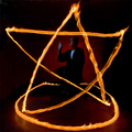
Invocationby graphicfunkComment: my goodness, this is incredible! mind wonders and is frankly boggling at how you achieved this stunning gorgeous mad photograph. technically is without flaws; and there is so much to appreciate from this. the fire is obviously striking, but so is the red background glow, and the serene monk-like posture of your guy. this gets a 10, easily. |
| Photographer found comment helpful. |
| 08/23/2006 04:09:44 AM |
Hey! You're Not a Rabbit!by TransitComment: this is too cute not to give a ten, which i did. the set up is creative, and works better than a rabbit would, i should think. the moggy in every respect is adorable; the way his head is popping up, the flatness of the ears, the slightly gormless expression of the eyes... the only slight flaw is that the white balance feels a bit out; the colours don't quite feel natural or don't feel unnatural enough to be a certain stylistic touch... but it's minor, and the moggy is the obvious star here. 10 |
| Photographer found comment helpful. |
| 08/23/2006 04:05:47 AM |
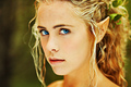
Mystical Gaze by LalliSigComment: i voted this a very easy 10. it's a really gorgeous ethereal photograph, and a really subtle, successful take on the challenge. your model is obviously stunningly pretty, which helps carry off and make more authentic / believable those triffic elfish ears. the focus on the startingly blue eyes feels natural, and the depth of field is just perfect. the colours are bright, bold and almost illuminating. a superb striking portrait. |
| Photographer found comment helpful. |
| 08/23/2006 02:01:26 AM |
Blue Stupid!by charliebakerComment: people have a tragic lack of a sense of humour. i almost weeed myself when i saw this. last? that's insane; you've captured the nature of the challenge perfectly; and the sacrifices made on the other challenges (missed the pea one) just to set this stonker of a conceptual piece should not have gone unnoticed.
And "Monochromatic abstract study in blue, part III" would have made a glorious title. |
| Photographer found comment helpful. |
| 08/22/2006 11:46:09 PM |
My camera, the Party Animalby bragurComment: ok, 36th is a respectable finish out of 140+ entries, but crikey, it so deserved a ribbon, and definitely a much higher score. i'm pleased you got 44 eights, nines and tens, but you wonder how many voters gave the shot the time it deserved for the many great qualities to shine through. this is a photograph so rich in character.
ha! just saw you're the guy who did the gone shopping photo, which was even more of an injustice! keep up the fantastic work! |
| Photographer found comment helpful. |
| 08/22/2006 12:19:06 AM |
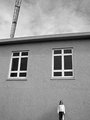
first day of schoolby jmogensenComment: just stumbling through your portefolio to find this wonderful, simple yet stylishly minimalistic image. there is a wonderful sense of scale, and the greyscale coupled with the grain just fits the mood and style of the building really nicely. great stuff! |
| Photographer found comment helpful. |
| 08/21/2006 12:53:23 PM |
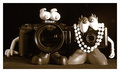
"Old Tyme Camera Family Portrait"by jmosherComment: hmm, what makes the nikon more manly than the canon, eh? it's actually a really cute photo, and the sepia tones really does give the feel of an old style photo of a happy couple, which is bizarre when you consider the potato head elements. this is a really fun photo, though this also makes me nostalgic for my old S50, which got stolen. wonderful little thing it was. anyway, this is a cute, fun photograph. technically, pretty good though there is somthing odd happening around the right-most arm. maybe too much sharpening??? |
| Photographer found comment helpful. |
| 08/21/2006 11:38:50 AM |
"The Fab" Kodak CX6330by kh82791Comment: the setting doesn't really justify the fabulousness of the camera. the reflective surface on the bottom is a nice touch, but we don't really see enough of the bottom reflection to justify its presence. also, the cloth sheet is too grey (white balance issue maybe?) to really make a big impact (and it's also a bit exposed along the bottom edge on the right). a sheet of white glossy photo paper might have worked a bit better. and i don't think you would have suffered by flipping the picture, so it's the right way round. the strap is a distraction too. sorry. 4. |
| Photographer found comment helpful. |
| 08/21/2006 11:33:00 AM |
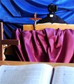
My Camera Can Tell Others the Story of Jesus. So Can Yours!by gotthoffnungComment: i'd rather it didn't! i have enough trouble getting it to take the pictures i want, let alone give me guidance on spirituality! of the challenge, this is one of the more madly creative ones out there (if you ignore the one dressed as a baby). kudos and acknowledgement of a job well done is due regarding the effort gone into the set-up. but really, it's just too weird for words. technically, there's very little to criticise; i'd like the camera / vicars head be a little sharper, but other than that, it's fine. nice bright bold colours of the fabrics is really appealing visually. how it conducts a sermon is just bewildering. 5. |
Home -
Challenges -
Community -
League -
Photos -
Cameras -
Lenses -
Learn -
Help -
Terms of Use -
Privacy -
Top ^
DPChallenge, and website content and design, Copyright © 2001-2025 Challenging Technologies, LLC.
All digital photo copyrights belong to the photographers and may not be used without permission.
Current Server Time: 04/13/2025 07:36:08 AM EDT.