| Image |
Comment |
| 10/20/2005 01:32:48 PM |
walk this wayby jonnieComment: nice shapes, well observed. the title helps give it character. tones in water are nice, but i think the composition would be improved if it were slightly less centred |
 Photographer found comment helpful. Photographer found comment helpful. |
| 10/20/2005 01:30:56 PM |
Reflections in the Harborby LokiComment: compositions just about perfect; but i would like perhaps to see the crop a little less tight on the right. the reflected light has a beautiful velvety texture and the shapes and angles of the buildings complement each other |
| Photographer found comment helpful. |
| 10/20/2005 01:29:14 PM |
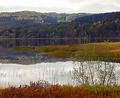
Reflecting on Natureby Ice-Tea-1983Comment: nice composition, nice colours, but it seems the light is only on the background hills, not lighting the foreground, giving quite a flat photo. Would be greatly improved with better light |
| Photographer found comment helpful. |
| 10/20/2005 01:27:19 PM |
Ran Agroundby donnievComment: i think...the boat model is inside the window, and church and building are reflected. right? its an interesting idea, and i like the the different elements competing for focus, but this does make the composition a little cluttered. |
| Photographer found comment helpful. |
| 10/20/2005 01:24:13 PM |
boatingby margaretalindenComment: you've captured the delicate reflections of the water in a nice abstract composition. i'd like to see if the composition becomes more dynamic at a slant (?)
oh, and that OOF bit on the right really bugs me ;) |
| 10/20/2005 01:17:16 PM |
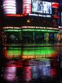
Urban Oasisby Car54Comment: i really like the use of the reflection in the composition, but i'm still not convinced about the centred comp. i think perhaps tthe crop is too tight on each side, makes it seem a little squashed. Colours are good, well exposed for night. weird headlines lol |
| Photographer found comment helpful. |
| 10/20/2005 01:14:17 PM |
Reflecting on the waterby dgarcia42Comment: beautiful composition and reflection, with the subject well separated from the background. Howeevr the lighting seems very dull, which make the photo seem flat w/out much contrast (particularly w. background) |
| 10/20/2005 01:11:42 PM |
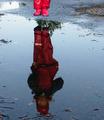
Splish/Splashby mijakComment: i like the way you see all the reflection but only her feet, but the midjump position gives a disjointed feel, rather than successfully implyiny the coming splash. I would prefer a less tight crop at the bottom, so her head is on the third |
| Photographer found comment helpful. |
| 10/19/2005 10:22:19 AM |
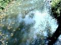
Fall Reflectionsby photogenixComment: I really want to see this fullsize to appreciate the birds :(
Nice composition following the rule of thirds, but the crop is ever so slightly too tight at the top imho. I wish the dof was greater so the foreground ripples werent OOF. The birds make a great line separating the top + bottom |
| Photographer found comment helpful. |
| 10/19/2005 10:19:14 AM |
River copy 2by Crafty SueComment: the floating leaves in the top left and reflected leaves in bottom right complement each other, but there seems to be a haziness and the colour seems a bit off, and a bit too light. Perhaps it would be improved with boosting saturation and darkening slightly |
| Photographer found comment helpful. |
Home -
Challenges -
Community -
League -
Photos -
Cameras -
Lenses -
Learn -
Help -
Terms of Use -
Privacy -
Top ^
DPChallenge, and website content and design, Copyright © 2001-2025 Challenging Technologies, LLC.
All digital photo copyrights belong to the photographers and may not be used without permission.
Current Server Time: 04/12/2025 11:00:35 AM EDT.