| Image |
Comment |
| 10/21/2005 12:56:34 AM |
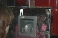
firetruck vanityby DonaldComment: she seems to be pulling a face, which spoils the photo somewhat. lighting is quite flat, imho. composition is good, but because of the lighting colours are dull. |
 Photographer found comment helpful. Photographer found comment helpful. |
| 10/21/2005 12:54:47 AM |
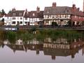
Reflections on Past Timesby mexicoComment: nice idea, but i'm not sure of the almost centred composition - not very dynamic, makes the photo a little stagnant. i would try cropping much lower at the top, so the riverboat becomes a more integral part of the image, and the composition becomes more interesting. Try this again on a sunnier day, because the lighting is very flat |
| Photographer found comment helpful. |
| 10/21/2005 12:51:17 AM |
Sunny Side Upby Tommy 2 ToneComment: nicely composed still life, but i'm not sure about any wow factor.. the yellow tones in the 'white' of the egg are weird, but i ddont think they're a problem. lighting on the cracked egg is good, but seems a little flat on the eggs around |
| 10/21/2005 12:49:27 AM |
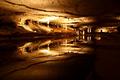
Reflections of Kenadayby KivetComment: i think the low DOF has worked effectively here, but the foreground (reeds) is a bit dull and not 100% sharp. However, the composition is spot on and fits the challenge fine. |
| Photographer found comment helpful. |
| 10/21/2005 12:47:24 AM |
Reflection Poolby WannaBe_80zComment: wow...nice location
the slighttly off-centre composition works well, amd the tones are perfect except of course the couple of blownout areas. the reflection has been captured brilliantly, with a nice smooth feel. the slight diagonals from left to right help support the composition. |
| 10/21/2005 12:44:32 AM |
scaffoldingby YevgenytheredComment: i think the reflection is just the top right corner bit, in which case it doesn't really seem to enhance the photo at all, and is just there to give a link to the challenge. Having said that, the rest of the photo is really nice. i like theabstract shapes and patterns on the ground, and the B+w works really well to bring out the tones. the two diagonals brring the composition together effectively |
| Photographer found comment helpful. |
| 10/21/2005 12:04:43 AM |
Reflecting Dominoesby armandusComment: a sharp, clear photo with good tones, but i'm not sure why you composed it like this. i mean, its clearly set up, but i dont see your aim in terms of shape, what makdes a good composition...etc |
| 10/20/2005 11:58:27 PM |
Bridge to Nowhereby greslizzzComment: the tall format is interesting, but i personally would prefer it slightly squatter. the composition is good, drawing your eye to the bridge and mist behind, but i don't like the green hue, espesially round the trees. The foreground river is a good leading line, but could be cropped a little higher |
| Photographer found comment helpful. |
| 10/20/2005 01:41:02 PM |
View from a Glass Doorby trobergeComment: i really like the quirky way there are 2 images, which look similar but one is quiet + still, the other has action and people. is it really a reflection though, or is it a distirted view straight thru the glass.? |
| Photographer found comment helpful. |
| 10/20/2005 01:35:53 PM |
Light Sunsetby -Kwi-Comment: i relaly like the two evening scenes complement each other, and the way they don't fight for attention, but that theres a kind of gradient where one fades out and other becomes more clear I'd prefer the wine glasses to not be there, because they're not an ontegral part of the composition but just get in the way.
muted colours are perfect. very nice image overall |
Home -
Challenges -
Community -
League -
Photos -
Cameras -
Lenses -
Learn -
Help -
Terms of Use -
Privacy -
Top ^
DPChallenge, and website content and design, Copyright © 2001-2025 Challenging Technologies, LLC.
All digital photo copyrights belong to the photographers and may not be used without permission.
Current Server Time: 04/12/2025 11:12:43 AM EDT.