|
|
|
Showing 191 - 200 of ~339 |
| Image |
Comment |
| 05/21/2006 09:31:57 AM | St. Joseph'sby DanSigComment: You've got a good composition here, but because of the harsh lighting there's not a lot of contrast, and the sky is very washed out. It could have been helped by a graduated filter, or, if it had been advanced editing, combining two RAW exposures, to keep some detail in the sky.
I hope you don't mind, I had a play around in PS elements wth it. I was struck by the impact of the almost symmetrical shapes of the buildings, and the dynamics of the outline. Although I'm not really into digital art, this one was screaming out to be made into a high-contrast graphic.
So, just for a bit of fun (hope I havent tainted the integrity of the photo :P):
 edit: duh, forgot how to post thumbs for a second thereMessage edited by author 2006-05-21 13:32:39.
 |  Photographer found comment helpful. Photographer found comment helpful. |
| 05/21/2006 09:15:44 AM | Delightfully Psychotic Cyclistsby MelethiaComment: I have to admit it was a very hard challenge. Like many entries, yours is very strong on many photographic levels, but lacks a bit on the "movie" side - there's very few entries where the title really sounds like a film I might go and see.
In relation to the challenge, a bit of a stretch
In relation to the photo in its own right, you've caught a good moment with clear faces visible, each bringing their own character with those comical expressions. The tight composition with square composition works well, making it very action-packed. Colours are strong, shame the focus is a lttle soft. A lot of potential - you should definitely go out again til you've perfected the art :) | | Photographer found comment helpful. |
| 05/21/2006 09:05:49 AM | Mission San Jose, founded 1720by MelethiaComment: Sorry to get to this so late - I'm aware you've reedited as per everyone else's advice, but I've tried not to read the other comments til i've left my own..
My first impressions are that you've found a great POV to give a really photogenic composition, but that the lighting/editing make it look a little blander, detracting from its potential. The non-symettry of the curves, leading you down to the main doorway work really well, echoed by the shadows on the ground doing the same thing, but I still feel the doorway is a bit too central - I'd maybe crop it a bit tighter at the bottom.
In terms of editing, it needs a bit more 'punch' - more contrast, work on curves etc. Depending on the location, it may be really photogenic in early morning/evening, where you'd get soft but distinct shadows, warm colours and lose the washed-out feel. Message edited by author 2006-05-21 13:06:53. | | Photographer found comment helpful. |
| 05/17/2006 05:35:07 AM | N-eye-Konby swallaceComment: its n-ick-on not n-eye-kon
pffft foreigners :P
j/k, its a good photo. I like the rough texture and tones, but there seems to be a slight blue cast to it as a whole | | Photographer found comment helpful. |
| 05/15/2006 06:52:19 AM | | | Photographer found comment helpful. |
| 05/15/2006 06:37:40 AM | | | Photographer found comment helpful. |
| 05/15/2006 04:20:26 AM | | | Photographer found comment helpful. |
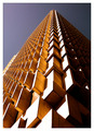
| 05/14/2006 12:18:03 PM | Up, up and awayby ericwooComment: ~trading post~
This is a great photo, ,and i think you've composed it perfectly, with the different angles and the slight off-centredness of the main corner. The colours of the sky and building complement each other well, but the sky seems a little dark, and flat.
Personally I'd prefer a touch less contrast on the building, so that the bottom front is not so blown-out.
Congrats on the placing, and an awesome photo for the challenge, | | Photographer found comment helpful. |
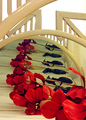
| 05/14/2006 12:10:30 PM | Silk Flower Rhythmby chaliceComment: trading post
I'm not really sure what i'm looking at here... and this puts me off a little. I get that its mirrors, with a repeated reflection, but I still keep trying to figure out how the metal bars all fit in...lol I think it works compositionally, but I personally get distracted by trying to figure out what's what.
The rhythm of the repetition works well, but I get a kind of clinical feel from it, I think from the greens of the sheets, and the metal bars.
It is quite busy, I think it may work better with a lower angle, and cropping out the bars in the top half so that it is simpler, and the reflections recede further into the distance. | | Photographer found comment helpful. |
| 05/11/2006 11:59:01 AM | Every Day Rhythmsby tngrndreamComment: ~trading post~
I think this would have made a much more interesting composition had you focussed on just a section, maybe a quarter of this view, to make it more of a study of the patterns & curves rather than a set of dinner 'things'. The lighting seems good, but could maybe do with a touch more contrast to bring out the colours, or maybe hue/sat.
The idea suits challenge fine, but I think the square-on centred format makes it a touch static. | | Photographer found comment helpful. |
|
Showing 191 - 200 of ~339 |
Home -
Challenges -
Community -
League -
Photos -
Cameras -
Lenses -
Learn -
Help -
Terms of Use -
Privacy -
Top ^
DPChallenge, and website content and design, Copyright © 2001-2025 Challenging Technologies, LLC.
All digital photo copyrights belong to the photographers and may not be used without permission.
Current Server Time: 04/13/2025 04:38:25 PM EDT.
|