|
|
|
Showing 171 - 180 of ~339 |
| Image |
Comment |
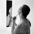
| 06/01/2006 10:56:25 AM | my daily shaveby DanSigComment: I really like the cleanness of the composition, with the white background, and the clarity/sharpness in both the reflection and the foreground figure. I like how the position and shape of the mirror means that there's almost 2 facets of "you" visible - with attention drawn to the tattoo in the f/g, and then the view of your face in the mirror to give you an identity.
Lighting is very good, no harsh shadows but everything softly lit really well. To be honest, I completely missed the knife to start with, but its a good element.
The only thing I'd suggest if you were reshooting is possibly to try and get the mirror straighter - because the background is plain white, you don;t have a wall to give context to the perspective, which is a bit weird. Other than that, really nice crisp shot, good score, well done. |  Photographer found comment helpful. Photographer found comment helpful. |
| 06/01/2006 10:36:19 AM | Cannon Coverby MelethiaComment: Sorry to get to you a little late
This is a really good woody shot, and a great humorous idea for the theme. The lighting is really impressive as it fits in perfectly with the background .
Composition is strong, and fits the square crop well.
There does seem to be a little soft bit at the bottom, on woody's legs and the base of the lenscap, which is the only thing that bothers me
Other than that, very good score/placing - well done :) | | Photographer found comment helpful. |
| 06/01/2006 02:10:44 AM | Pottedby KelliComment: Sorry to get to you so late,
I'm not sure how this works as a Still life - its not an arranged composition (or if it is, you can't tell from the crop). Having said that, its a good floral, even with the difficult exposure conditions - with such a bright background, you've done well to expose the flowers well.
I think all it boils down to is that the majority of voters will have not considered it a still life. Sorry, but I don't really have anything to add to what everyone else has been saying | | Photographer found comment helpful. |
| 06/01/2006 02:00:09 AM | Mmmmmmmmm - Still Lifeby timfythetooComment: Sorry i'm so late to get to you,
This is a very creative take on the theme. Lighting is very good, all soft and subtle, without any harsh shadows.
The one thing that I would suggest is a darker background, and maybe a touch more contrast on the image. | | Photographer found comment helpful. |
| 06/01/2006 01:19:14 AM | Asian Contemporary Still Lifeby chaliceComment: Sorry to get to you so late,
I really like the arrangement of the still life, with the chopsticks echoing the shape of the wooden utensils, and the composition of the different circles together. I'm not sure about the flowers - they fit contextually, but the rest is very geometric and they don't seem to fit anywhere particularly.
I'm not sure about the window being there - it seems to contrast a little too much with the rest - its very cool in colour, compared with the warmer tones of the foreground, and I think this makes it look as though the wb is off overall.
Lighting is good, its lit well enough but still remains subtle.
I think this would have been better had you kept the same basic arrangement, but placed it somewhere without busy surroundings like the window, and either skipped the flowers or incorparted them into the composition more. | | Photographer found comment helpful. |
| 06/01/2006 01:11:23 AM | Ha! Ha! You Lose!by tngrndreamComment: Sorry to get to you so late.
I really liked this one - its very cleanly composed, and a great idea, but theres something about the exposure on the coke piles that doesnt sit with me - possibly the odd bit of blown highlight, or oversharpening, or something, I'm not sure :S
Obviously if you could have got the black/white division, and the respective beackgrounds cleaner, that would have been great, but I know that can be v hard. It also seems as though the left woody is slightly overexposed. | | Photographer found comment helpful. |
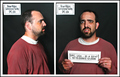
| 05/29/2006 03:05:43 AM | Busted!!!by timfythetooComment: This is a great double exposure, very creative and technically very good despite the difficulties of the double exposure, especially wrt lighting. The expressions are priceless.
The only criticism really is the skewed label in the top left of the left half. OTher than that, its pretty much perfect imho.
| | Photographer found comment helpful. |
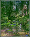
| 05/23/2006 12:06:19 PM | Hoh Rainforest.jpgby DrAchooComment: woah....now THAT is beautiful. There's so much detail, and the lighting is divine. Straight in my favourites :) | | Photographer found comment helpful. |
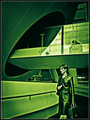
| 05/23/2006 10:27:53 AM | Future Womanby JPRComment: This was the only 10 I gave out in the challenge - extremely slick, futuristic image, with an almost illustration/graphic feel, but without looking overPPed
well done | | Photographer found comment helpful. |
| 05/22/2006 01:14:32 AM | Looking through the mirror...by KelliComment: critique trading
I gave this a 5 in the voting - it's a very well captured moment, the composition of the 2 faces is strong, and it really shows the hairdresser in her element which is the most important thing of an environmental portrait, but you've obviously struggled with enough light, and the high ISO/low shutterspeed has made it quite blurry/grainy, so the quality isn't as good as the content. I think this was the main reason it didn't score any higher.
| | Photographer found comment helpful. |
|
Showing 171 - 180 of ~339 |
Home -
Challenges -
Community -
League -
Photos -
Cameras -
Lenses -
Learn -
Help -
Terms of Use -
Privacy -
Top ^
DPChallenge, and website content and design, Copyright © 2001-2025 Challenging Technologies, LLC.
All digital photo copyrights belong to the photographers and may not be used without permission.
Current Server Time: 04/13/2025 04:31:42 PM EDT.
|