|
|
|
Showing 161 - 170 of ~339 |
| Image |
Comment |
| 06/01/2006 02:00:09 AM | Mmmmmmmmm - Still Lifeby timfythetooComment: Sorry i'm so late to get to you,
This is a very creative take on the theme. Lighting is very good, all soft and subtle, without any harsh shadows.
The one thing that I would suggest is a darker background, and maybe a touch more contrast on the image. |  Photographer found comment helpful. Photographer found comment helpful. |
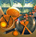
| 06/01/2006 01:19:14 AM | Asian Contemporary Still Lifeby chaliceComment: Sorry to get to you so late,
I really like the arrangement of the still life, with the chopsticks echoing the shape of the wooden utensils, and the composition of the different circles together. I'm not sure about the flowers - they fit contextually, but the rest is very geometric and they don't seem to fit anywhere particularly.
I'm not sure about the window being there - it seems to contrast a little too much with the rest - its very cool in colour, compared with the warmer tones of the foreground, and I think this makes it look as though the wb is off overall.
Lighting is good, its lit well enough but still remains subtle.
I think this would have been better had you kept the same basic arrangement, but placed it somewhere without busy surroundings like the window, and either skipped the flowers or incorparted them into the composition more. | | Photographer found comment helpful. |
| 06/01/2006 01:11:23 AM | Ha! Ha! You Lose!by tngrndreamComment: Sorry to get to you so late.
I really liked this one - its very cleanly composed, and a great idea, but theres something about the exposure on the coke piles that doesnt sit with me - possibly the odd bit of blown highlight, or oversharpening, or something, I'm not sure :S
Obviously if you could have got the black/white division, and the respective beackgrounds cleaner, that would have been great, but I know that can be v hard. It also seems as though the left woody is slightly overexposed. | | Photographer found comment helpful. |
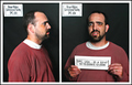
| 05/29/2006 03:05:43 AM | Busted!!!by timfythetooComment: This is a great double exposure, very creative and technically very good despite the difficulties of the double exposure, especially wrt lighting. The expressions are priceless.
The only criticism really is the skewed label in the top left of the left half. OTher than that, its pretty much perfect imho.
| | Photographer found comment helpful. |
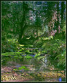
| 05/23/2006 12:06:19 PM | Hoh Rainforest.jpgby DrAchooComment: woah....now THAT is beautiful. There's so much detail, and the lighting is divine. Straight in my favourites :) | | Photographer found comment helpful. |
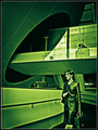
| 05/23/2006 10:27:53 AM | Future Womanby JPRComment: This was the only 10 I gave out in the challenge - extremely slick, futuristic image, with an almost illustration/graphic feel, but without looking overPPed
well done | | Photographer found comment helpful. |
| 05/22/2006 01:14:32 AM | Looking through the mirror...by KelliComment: critique trading
I gave this a 5 in the voting - it's a very well captured moment, the composition of the 2 faces is strong, and it really shows the hairdresser in her element which is the most important thing of an environmental portrait, but you've obviously struggled with enough light, and the high ISO/low shutterspeed has made it quite blurry/grainy, so the quality isn't as good as the content. I think this was the main reason it didn't score any higher.
| | Photographer found comment helpful. |
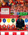
| 05/22/2006 01:06:27 AM | Keeper of the Gameby timfythetooComment: trading post
I love the composition of this, with the prizes and game framing him; and the pose works well- kinda in between candid and a very posed portrait. The colours work well to give context to the fun, colourful fair. Contrasting with that the guy's expression shows him as a normal guy, who has a life outside of his work.
You could do with some more lighting on the guy, but I guess you couldn't help that. | | Photographer found comment helpful. |
| 05/22/2006 12:58:10 AM | happy fishermanby DanSigComment: critique trading post
You've captured the subject in his environment well, but it would be a lot stronger imo if he was looking at the camera - would make it more portrait-ey and less candid-ey. Black and white suits, but the composition is very busy, and he doesn't stand out that well from the b/g. I'm not sure what you could have done about that, other then severe dodge/burn, or maybe kept some colour (not sure what the colours were like though)
Other than the busyness, the composition is well arranged, and suits the square crop. Lighting is good on the subject, but a lot of the right-hand side is in shadow.
I didn't get round to this in voting, but comparing to those I did vote on, would probably have voted a 6. I think the score is fair - you've met the challenge well but the busyness & candidness detracts, so isnt as powerful as some of the higher scoring ones. | | Photographer found comment helpful. |
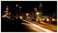
| 05/21/2006 11:39:44 AM | Twinkle, Twinkleby ericwooComment: Sorry to get to it so late - I started a comment a few days back but never finished it.
This is a very crisp, strong cityscape. The car trails work well as a leading line, and the small aperture has worked wonders with the lights!
The area of darkness in the bottom left makes the composition a little unbalanced (but I didn't really notice it til the second time I looked at it). Conversely, the brighter area of streetlights on the right hand side works well as a compositional element right on the third. | | Photographer found comment helpful. |
|
Showing 161 - 170 of ~339 |
Home -
Challenges -
Community -
League -
Photos -
Cameras -
Lenses -
Learn -
Help -
Terms of Use -
Privacy -
Top ^
DPChallenge, and website content and design, Copyright © 2001-2025 Challenging Technologies, LLC.
All digital photo copyrights belong to the photographers and may not be used without permission.
Current Server Time: 04/15/2025 04:46:24 AM EDT.
|