| Image |
Comment |
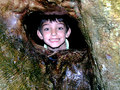
| 07/05/2006 09:27:37 AM |
Stuckby KelliComment: I love the composition here and his expression, but the lighting is very harsh. I'd also prefer a little more DOF so that the texture on the treehouse was in focus throughout.
Another suggestion might be to have had his hands visible on the ledge, to give a more "trapped" feel rather than "peeking through" Message edited by author 2006-07-05 13:28:48. |
 Photographer found comment helpful. Photographer found comment helpful. |
| 07/05/2006 09:13:25 AM |
Mickey to the Rescueby nards656Comment: Reading through what you've said, it seems as though you have achieved what you set out to do very well.
The colours and the watery reflections give create the "going into a fire" atmosphere, and the composition seems very balanced. However, if I had seen this in the challenge I doubt I would have voted it high, as I don't really "get it" without the explanation. |
| Photographer found comment helpful. |
| 06/26/2006 07:30:11 AM |
Stair shadowby MelethiaComment: Like I said, I absolutely love this photo, it really jumped out at me in the thumbnails page when voting, and I gave it a 9 (no 10s in this challenge for me). Should have done better I reckon, but its the kind of photo that can easily be underrated here.
fwiw, I really like the desat outtake, but not as much as this one.
The framing and composition seems to be perfectly balanced. The interplay of the diagonal shadows and the stripes of colour works really well, echoed by the solid black of the f/g staircase. The white steps on the bottom right of the frame add some depth to the composition.
Great find, takes a photographer's eye to see it and to fully exploit the potential. Your best entry I've critiqued so far in my books, even if it doesn't have the highest score.
ETA: wouldn't be quite the same without those lovely earthy tones Message edited by author 2006-06-26 11:31:01. |
| Photographer found comment helpful. |
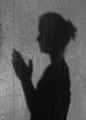
| 06/26/2006 07:10:26 AM |
Almost Bedtimeby tngrndreamComment: I like the idea of creating an atmosphere just through a shadow, but I think its a little bland as it is. Most of the photos in this challenge that were just a shadow on a flat surface I think needed something more to add some depth.
The texture of the wood works well, but it seems as though the dof is too narrow, leaving the righthand side a tad OOF.
Also, I'm not sure how to improve this, but the posture seems a little posed. |
| 06/26/2006 07:00:36 AM |
|
| Photographer found comment helpful. |
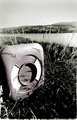
| 06/25/2006 03:10:29 PM |
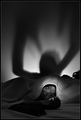
Lifesaving ringby kirsty_mcnComment: Originally posted by Louis:
The bottom of the photo has some kind of unsettling border. I don't know why it's there, but it probably should have been cropped out, because it detracts from this wonderful picture. I also see something along the right edge, and also less so along the left edge. |
Thats a random border from printing in the darkroom, some of the enlargers gave that kinda rough border which sometimes worked well but I agree needs to be cropped out here |
| 06/19/2006 01:37:40 AM |
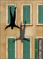
Extreme Shadow Puppets by NobodyComment: woah, I never thought it might be real! I was thinking the model had jumped from the ground, and it was flipped.
Great shot, well done |
| Photographer found comment helpful. |
| 06/19/2006 01:36:04 AM |
Stair shadowby MelethiaComment: In my top three - I thought one of these studies might be yours
Will try and critique properly later |
| Photographer found comment helpful. |
| 06/18/2006 02:33:20 PM |
|
| Photographer found comment helpful. |
| 06/18/2006 12:45:51 AM |
|
| Photographer found comment helpful. |
Home -
Challenges -
Community -
League -
Photos -
Cameras -
Lenses -
Learn -
Help -
Terms of Use -
Privacy -
Top ^
DPChallenge, and website content and design, Copyright © 2001-2025 Challenging Technologies, LLC.
All digital photo copyrights belong to the photographers and may not be used without permission.
Current Server Time: 04/13/2025 06:05:20 AM EDT.