| Image |
Comment |
| 09/11/2005 12:59:02 AM |
|
 Photographer found comment helpful. Photographer found comment helpful. |
| 09/11/2005 12:50:47 AM |
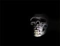
Dead & Lostby marvinComment: Surely dead, but I must agree that 'Lost' does not strike me too well.. perhaps the darkness is supposed to convey this?
I have a feeling that your image did not suffer as much on technical merit as it may have on whether viewers thought it fit the challenge or not.
As far as shooting advice is concerned, I would simply suggest filling the frame a bit more so that the skull took up a larger portion of the picture - there is some wasted black space at the bottom and top - cropping this off (or getting in closer) would improve the photo a bit, in my opinion. |
| Photographer found comment helpful. |
| 09/11/2005 12:47:49 AM |
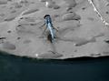
Dragonfly & Lilypadby ArpeggioAngelComment: Surely a nice capture considering how fast and often these things must move! I've tried photographing live insects with wings.. and it's DEFINITELY not easy.. and to have to watch out for gators too! I would've probably turned around and looked for something else.. ;)
Anyway, on to th e photograph. I think the selective desaturation on the lilypad looks a bit odd, and am wondering if that has anything to do with the patchiness in the bottom left corner? Since this is an advanced editing challenge, I would've considered cloning that patchiness up so that it matched well with the rest of the water. With the lilypad, perhaps a slight desaturation (or change in lightness?) would've worked better.
The detail on the dragonfly is certainly good, so you did well there.
A nice shot either way, but just some food for thought above. :) |
| Photographer found comment helpful. |
| 09/11/2005 12:30:03 AM |
dolce e legatoby bicrayComment: Well composed (pardon the pun), though there are a few things that I imagine would make an immediate difference in the photo. Firstly, the aperture could be closed down a bit in order to get the composer in better focus - the large aperture used here has left a good deal of the picture with a sort of out-of-focus feel. If you were trying to only focus on the hands, it's not quite noticeable enough.
Also, the range of light in this photo includes lost detail in the shadows as well as the highlights - though it may not have been feasible, a bit of white cloth over the window (or whatever light source) may have avoided the blown highlights (relatively important here) and let you catch some details in the shadows (not quite as important here).
Still a solid effort though :)
- Courtesy of the Critique Club |
| 09/07/2005 06:11:47 PM |
Draganizer-copy.jpgby sheapodComment: To be honest, I like the treatment. I wouldn't say that it really speaks grunge to me, but the colors and textures really seem to come alive here where they don't in the first. Perhaps de-emphasizing (blur? something else?) the ground would add to the impact, but still a drastic improvement as is. |
| Photographer found comment helpful. |
| 09/05/2005 10:42:45 AM |
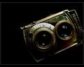
BW film developerby birgirComment: Wonderful shot, though (how many times have you heard this one so far?) could be a bit larger. |
| Photographer found comment helpful. |
| 09/05/2005 10:41:46 AM |
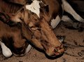
Mamiyaflexby annahComment: Beautiful tones on a certainly-aged subject, though I'm not sure what your reason was for cutting it off at the right side of the frame. |
| Photographer found comment helpful. |
| 09/05/2005 10:39:49 AM |
Summer's End — Sunriseby Bear_MusicComment: If this isn't a robt, then someone has kidnapped him and daringly placed the horizon in the middle. Either way, beautiful sky and reflection. |
| Photographer found comment helpful. |
| 09/05/2005 10:37:28 AM |
Separate Spaceby dahkotaComment: I like the parallel between the bats and skin color, though I presume you've already noticed that - it rounds off a very interesting picture.. black and white, man and woman, young and old(er), casual and dressy, skinny and fat, and they are both looking away from each other - even seemingly occupied by different types of thoughts. The bats serve to further divide the image and accentuate everything for me. 10 and a new favorite. |
| Photographer found comment helpful. |
| 09/05/2005 10:33:50 AM |
Memories of Ralphby SeanachaiComment: Great conceptual image. I even like the fact that the text is upside down, as it makes it appear less of an advertisement. I like that the background sort of lacks in contrast whereas the foreground does not, immediately drawing our attention to the hand and [even moreso] the slide. 10 from me. |
| Photographer found comment helpful. |
Home -
Challenges -
Community -
League -
Photos -
Cameras -
Lenses -
Learn -
Help -
Terms of Use -
Privacy -
Top ^
DPChallenge, and website content and design, Copyright © 2001-2025 Challenging Technologies, LLC.
All digital photo copyrights belong to the photographers and may not be used without permission.
Current Server Time: 04/18/2025 12:13:51 PM EDT.