|
|
| Image |
Comment |
| 05/18/2004 10:38:53 PM | Nothing left to bite.by bobdaveantComment: Do people really eat their nails to this extent. I at least let them grow out until there is something to chew!! |  Photographer found comment helpful. Photographer found comment helpful. |
| 05/18/2004 10:33:53 PM | | | Photographer found comment helpful. |
| 05/18/2004 10:30:54 PM | | | Photographer found comment helpful. |
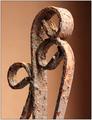
| 05/17/2004 11:36:46 PM | Time and Elementsby HRoxasComment: greetings from the critique club!!
Congratulations on wonderful shot, and your high finish. It's always interesting to me how subjective photography is. In reading the comments of the others, opinions are very split about DOF, background color, lighting, etc. I would be tempted to spend some more time with this shot, now that the challenge is over, and you're not hampered by editing rules.
Here's what I'd do: Tone down the overexposure on the front high parts of the hanger. Clone out the digital spots and reflections on the inside of the loop and other miniscule places through out. My comment about the background is that it's too soft against and soft DOF. I would try to get a little more contrast. Add some texture or noise, or just ofset the color away from your subjects color a little more. On the right side background, where the plywood seem is evident, I would smooth out. Then I would put this shot up for sale on DCPrints. It is very nice. saludos, russ | | Photographer found comment helpful. |
| 05/17/2004 11:03:40 PM | rustby lelaniComment: greetings from the critique club!!
Well, by reading your comments you can see that the subject of depth of field has the DPC'ers split on you concept here. I don't find a problem with your choice. In fact I find it compelling. I do find the crop distracting however. I think that the photo needs to end at the end of the fence line. My eyes are being pulled to far right and away your subject, the rusty pipe. saludos, russ | | Photographer found comment helpful. |
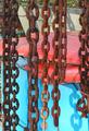
| 05/17/2004 07:57:49 PM | Rusty Chainsby jociepComment: greetings from the critique club!!
Well, I guess by reading your comments that DPC'ers want you to post your work larger, jajaja. Take their advice, or they will hammer you every time. You are allowed 640 pixels for your longest dimension, and a file size of 150k. There is also a tutorial you can read that can help you through the process.
I think that your subject is interesting enough, although the chains don't seem to be in focus. I would try to get myself positioned for this shot against a more solid background. There are some interesting shadows happening with the chains against the blue, but that benefit is lost on the distraction of the red cushions. That sliver of far background running down the left hand side, off the end of the blue box is really pulling my eye to the left. The left side definately needs to be cropped slightly. saludos, russ |
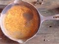
| 05/17/2004 07:31:42 PM | Cowboy Cookwareby s_bfernComment: greetings from the critique club!!
Well I'm sure that you already know from reading you comments that DPC'ers want you to post your work larger. You are allowed 640 pixels for your longest dimention, and a file size of 150k. The comments that you are slightly out of focus are valid. It looks like your camera locked on the table top instead of your skillet. And your subject is a little over exposed as well.
The people that are commenting on your cropping and framing are right on the money. I think that you have a couple choice...you could zoom in even tighter and show just part of you pan,,,,or you could come out some and show all of it. In any case, this of ways to pose your subject in an interesting way in your frame. Shoot from an angle, hang your skillet from a tree. I think your dead on shooting is what the people here are trying to get you to think about. |
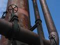
| 05/17/2004 06:55:46 PM | Dual wheel driveby mykolearyComment: greetings from the critique club !!
What this picture lacks for me is composition. It is a little blocky and square, and with such strong verticle lines, I think that you could benefit from a tighter crop. I am in agreement with the comment that the sky trailing all the way down the right side is a distraction, and I think the small patch of sky to the lower left could be cropped out as well.
Good detail and color. You certainly selected a great subject. If this were mine I would play with a bunch of different crops. I think I see several nice images in the photograph. | | Photographer found comment helpful. |
| 05/16/2004 12:49:24 AM | Uneditedby sevenine0Comment: Greetings from the critique club!!
You give a guy a tough job when you ask for a critique of an abstract. I could tell you that there are blown out details, and you could respond that that was your intention. Lack of detail is sometimes the strength of an abstract.
Emotionally, this image doesn't speak to me. But I'm not a bigot when it comes to art. Your statement escapes me, but others have found your image compelling. Good for you! If this image only speaks to you, it is fine by me.
Technically, I have two comments. Crop Unedited a little tighter. The most distracting element is the hint of blue in the lower right corner. I also object to your filter application. It is way to strong for my eyes. It kind of makes me feel that this patchwork filter was applied only to hide the other deficiencies of the shot.
|
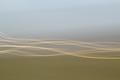
| 05/14/2004 06:04:25 PM | Flowby divernickComment: Greetings from the critique club!!!
This is a great photograph. Very strong composition, compelling visually, and certainly abstract. You provide a difficult subject to critique in depth, primarily because of the high quality of the shot. But here goes!! I'll rip you as I can.
The first question that I ask myself is when critiquing is, if this were mine, would I bother to print it and hang it on my wall. In this case the answer is definately yes.
The second question I ask, is if I were a photo editor, would I print it. And what would I ask the photographer to touch up. Keeping in mind that I would only want perfect photos appearing in my publication.
In the case of Flow...I would ask that you crop a little tighter. The light waves being higher to the left, are tugging my eye to the right. But be careful, the central ovals need to remain center. I might ask that you fade the green foreground on the left, just below where the lightwaves start, to match the foreground rather than the background.
I might ask that you do the same on the right, only the opposite, blend more skytones above the first light ray. All of this said to acheive more balance, and to keep my from veering right. Do those things, and I would print Flow.
I hope that you found this constructive. russ |
Home -
Challenges -
Community -
League -
Photos -
Cameras -
Lenses -
Learn -
Help -
Terms of Use -
Privacy -
Top ^
DPChallenge, and website content and design, Copyright © 2001-2025 Challenging Technologies, LLC.
All digital photo copyrights belong to the photographers and may not be used without permission.
Current Server Time: 04/07/2025 06:20:11 AM EDT.
|