| Image |
Comment |
| 05/29/2006 04:43:11 AM |
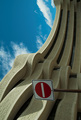
No entry- God's Playgroundby smykComment: Love the architecture but I really dont like the sign. I also like that you turned the building on end like it was reaching to the sky. |
 Photographer found comment helpful. Photographer found comment helpful. |
| 05/29/2006 04:41:17 AM |
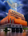
Water and Lightby alfrescoComment: Simiply amazng. The best exposure thus far. The colors on the brick are sutnning and the glassy effect on the water really make for a sereal image. Good job. |
| Photographer found comment helpful. |
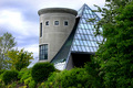
| 05/29/2006 04:37:47 AM |
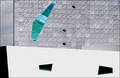
Walker Art Centerby bladComment: Would have been a GREAT abstract but the blown out wall is distracting to me. I do think that you framed the shot extremely well.
dc |
| Photographer found comment helpful. |
| 05/29/2006 04:36:19 AM |
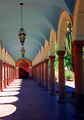
Arches in the Southwestby phinbobComment: One of my favorits in the challenge so far. The colors make this photo pop. I also love that the end of the walkway ends in a stariway. Really pulls me down the image. My only criticism is that I think I might have tried to straighten the image so that the lamp cords hang perfectly vertical. However you dont have to tell me that there may be 20 different reasons in that lower corner that made this impossible. Great Job. |
| Photographer found comment helpful. |
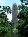
| 05/29/2006 04:33:05 AM |
Bok Towerby ArpeggioAngelComment: I love the framing of this photograph. On my monitor the bricks in the tower looks odd. Oversharpened? |
| Photographer found comment helpful. |
| 05/29/2006 04:31:04 AM |
The Dom, Salzburgby jrtoddComment: Simply beautiful. Almost looks like a kaleidoscope. Everything is tack sharp and love that you spent the time to get the crop dead center. Goood job. |
| Photographer found comment helpful. |
| 05/29/2006 04:28:10 AM |
|
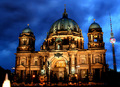
| 05/29/2006 04:26:26 AM |
berlin nighshotby shotComment: Beautiful exposure, lighting and mood. My only critisism is that I would have cloned out the lighlight in the lower left hand corner. Good job |
| Photographer found comment helpful. |
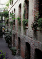
| 05/29/2006 04:25:12 AM |
The Old Market Passagewayby PixyComment: Small overexposure problem at the top but this is a hard image to expouse. At least a few stops difference from top to bottom. I learned all about this problem myslef whild working on this challenge. It would have been handy to have a ND filter. Aside from this I think that the mood you captured in the image offsets this minor problem. The image is sharp but not oversharpened. Definately deserve above avg score!!
dc |
| Photographer found comment helpful. |
| 05/24/2006 05:40:09 PM |
Auroraby ivargComment: I am not sure how no one left a comment on this photo. The colors really play off one another. Blue and Green are so complimentary.
Pros... Great color, Great concept, Great exposure.
Cons... Would have liked subject a tad sharper.
dc |
| Photographer found comment helpful. |
Home -
Challenges -
Community -
League -
Photos -
Cameras -
Lenses -
Learn -
Help -
Terms of Use -
Privacy -
Top ^
DPChallenge, and website content and design, Copyright © 2001-2025 Challenging Technologies, LLC.
All digital photo copyrights belong to the photographers and may not be used without permission.
Current Server Time: 04/12/2025 05:15:42 AM EDT.