| Image |
Comment |
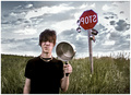
| 06/12/2006 03:02:07 PM |
Winning Ticket, Fantasy Challengeby PhotoTessComment: Okay, found the original and this is hard to say but I'm not seeing much improvement here. The original is okay, lacks a certain POP factor and the color in this one helps that a bit but this one still remains a bit flat overall. The first one was in focus but this one seems blurred and if you were going for a dreamy state or soft focus, it does not come across to me in that manner. The lighting is very harsh on this one, on board flash? The shadows from the ticket and her chest are noticable. Not sure of the steps you took in post processing but if you want to talk about it after the challenge I would be happy to offer a few suggestions in making this a more IN YOUR FACE type shot. It's a very good improvement over the first in set up and composition. The original, if I had voted would have gotten a 4 or 5 from me this one gets a 6 for effort and improvement. :) |
 Photographer found comment helpful. Photographer found comment helpful. |
| 06/12/2006 02:55:54 PM |
Architecture III Take IIby scarbrdComment: scarbrd, right? Nice, very nice improvement. Got rid of the distraction in the aisle and the composition is much better in this one. I like the feel of the shot overall. The only thing that bothers me betweent this one and the original is the original looked a bit brighter and whiter. But otherwise, much better. I would have given the original a 5, this one gets a 7 for improvement and just cuz it deserves it! ;) |
| Photographer found comment helpful. |
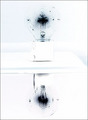
| 06/12/2006 02:49:01 PM |
Brilliance Retake: Mirror Image (Negative Image Challenge)by spistoleComment: Okay, an improvement for sure. Much better contrast and clarity on this shot than the original, spistole. I like the idea of making it a mirror image but there are a few little things that bug me, mostly the line in the middle of the shot, the blue line and spots all over the bulb. If you had cloned those out this would be very good. Also the mirror looks like it was shaking while the shot was being done. Your original shot got a 4 from me, this one gets a 7 for improvement and better quality! Much better! :) |
| Photographer found comment helpful. |
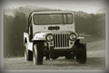
| 06/12/2006 02:45:08 PM |
1947 Willy Jeep (Something Old)by DianaComment: Okay, it looks older now but, I know, those horrible buts, I'm turned off by the tilt of the shot. I keep thinking the jeep is going to roll back down the hill, but that's probably just me. It is an improvement over the original as far as what you were trying to convey (making it look like an older shot) but still lacks a punch, maybe a slight contrast bump or levels adjustment? Also, the lack of focus or soft focus also doesn't work for me on this shot, but again, just my opinion. If I had voted on the original it would have gotten a 5, this one gets a 7 for improving what you wanted to convey and a nice feel to the shot overall. |
| Photographer found comment helpful. |
| 06/12/2006 02:39:39 PM |
Surreal Dyslexiaby Joey LawrenceComment: Wow, talk about an improvement on a shot! You've come a long way, kiddo! LOL! An 8 for overall improvement and humor! ;) :) |
| Photographer found comment helpful. |
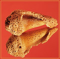
| 06/12/2006 02:33:20 PM |
Naturally Textured - Take IIby DigiFotoBuddyComment: Shail!!!! Nice! Very nice! HUGE improvement over the original. Focused on one shell, not three, better color, nice pop to the shot. Only two little things bother me, the shell looks a tad oversharpened and the orange background. I would have stuck with black but that's me. I would have given the original a 5, but this one gets an 8 for overall improvement and effort! ;) |
| Photographer found comment helpful. |
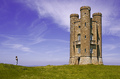
| 06/12/2006 02:29:02 PM |
157452 - Broadway Towerby ArtanComment: OMGoodness! What an improvement over the original! Fantastic color, clouds, everything but the horizon and tower straightness. It still seems a tad off, leaning to the right, just a touch. I would have given the original a 4 or 5 if I had voted in that challenge, this one gets an 8 for color and clarity improvement! :) |
| Photographer found comment helpful. |
| 06/12/2006 02:26:21 PM |
Sophisticated 2 (86275)by hopperComment: Much better color than the first, better crop, nicer image overall but I still don't like the hand position very much, it's the years of traveling with a portrait studio and watching them set up shots. But still an improvement. Your original got a 6 from me, this one gets a 9, would have been 10 if not for those hands! :) |
| Photographer found comment helpful. |
| 06/12/2006 10:51:21 AM |
In A Lighter Vien II - Book Titlesby MWittComment: MWitt? LOL! I love it! Very nice, says much more than th original did and very creative! I had given the original an 8 because I loved it but this one made me laugh as well so you get a 10! :) |
| Photographer found comment helpful. |
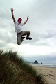
| 06/12/2006 10:49:13 AM |
Dune Jumping IIby ZoomdakComment: Having no reference to the original (Looked in Jump Challenge, didn't see it, not sure where else to look) I have to go on this shot on it's own merits. If you want to PM me a link to the original I can compare them and adjust your score up accordingly if needed. As is, lacks that POP that makes me look more than once, a bit dull and flat. A 6 |
| Photographer found comment helpful. |