| Image |
Comment |
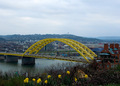
| 04/03/2006 04:47:31 PM |
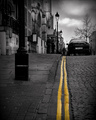
"The Big Mac Bridge"by MarjoComment: Double arches? :) Nice shot, you have the bridge in the background and the flowers in the foreground so a good mix of yellow for the challenge. The sky seems to be a bit much, takinga way from the overall shot rather than adding to it and the whole shot seems a bit dull overall in contrast and color. The yellow stands out nicely but the other colors are just there enough to compete with hit. When I scroll up and take out about half the sky it really brings the bridge to be the center of attention instead of fighting with the negative space. A 6 |
 Photographer found comment helpful. Photographer found comment helpful. |
| 04/03/2006 04:45:23 PM |
Sunny Sideby MWittComment: ewwww,raw egg, LOL :) Nice color on the yolk of the egg though it looks a tad more orange than yellow to me and the window or door reflection in the egg is nice though. I like the overall look of this shot but the black all the way across the top seems unnessary, when I scroll it up just a bit to take that strip out it really creates a whole new picture for me, a more balanced one. But that's just me :) I do like this, a 7 |
| Photographer found comment helpful. |
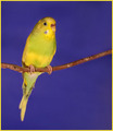
| 04/03/2006 04:41:38 PM |
Parakeetby angela_packardComment: ooo, what a cutie pie! I live little parakeets, have two of them myself. Little girl her from the color on the bridge of her nose. She looks like a sweetheart. Nice colors, good DOF on the shot though around the eyes and beak looks just a touch soft. The crop or composition looks just a tad off as well, just slightly out of balance. But otherwise a beautiful shot of a wonderful bird. A 7 |
| Photographer found comment helpful. |
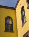
| 04/03/2006 03:01:28 PM |
Art Windows in the Yellow Houseby wheeleddComment: I love the shadow and color on this shot but the cropping and set up just seem off. If you could have centered teh corner more and had the roof lines leading you in one side and out the other side, maybe creating a V in the top part that would really bring a balance to the shot. As it is, it seems like the whole building is going to fall out the left side of the picture. The other window frames on the right are also very distracting. If you ever reshoot this with my suggestions or even recrop with a rotation I would love to see it. As is a 6 |
| Photographer found comment helpful. |
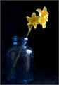
| 04/03/2006 02:59:20 PM |
Tree's a Crowdby RosskoComment: Okay, either this was a deliberate mistake in spelling or a "Oh crap! I can't believe I forgot the h" mistake. Either way, it works, I like the pun, tree in one stem and crowd as in by itself. :) Very nice shot, nice lighting, the glass jar is a good choice, the line of the stem, all well done. An 8 |
| Photographer found comment helpful. |
| 04/03/2006 11:53:52 AM |
Sunriseby karmatComment: Interesting lighting on this shot. I like the black background and the bright light underneath but all those splotches on the flower are very distracting. If they are waterdrops they are not helping the image in my view, a dry flower with the light reaching up and slight around the edge would really make this a beautiful shot. It's a 6 as is though, so still very well done! :) |
| Photographer found comment helpful. |
| 04/03/2006 11:51:34 AM |
Leading Linesby KonadorComment: My what crooked little lines you have there! The desaturation of the rest of the shot really brings out the lines and takes you right into the shot. But then I'm left there, stuck in the middle so I guess I'll have to follow one up and one back, heh? A 7 |
| Photographer found comment helpful. |
| 04/03/2006 11:46:04 AM |
Casual Fridayby JutildaComment: Aha, very risky! But in a good way! I like the crop, the curves to the straight line of the tie. The arm behind the back is a bit distracting, maybe if it was in the front, holding the bottom of tie or just hanging at the side, where it is ruins the lovely curve of the body and pulls away from that line, but we're not supposed to be looking at that, right? The tie, oh yeah, the tie. Nice colors, a slight orange tinge to it, maybe a slight curves adjustment to make the colors on the tie and skin stand out more? Nice lighting overall. A 7 |
| Photographer found comment helpful. |
| 04/03/2006 11:42:19 AM |
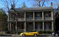
CLASH!by rayg544Comment: Not sure about the title, I'm guessing because of the New car to the OLD house? Nice car but the picture looks a bit tilted and the shadows on the car are a bit distracting. A 5 |
| Photographer found comment helpful. |
| 04/03/2006 11:41:33 AM |
A Bitter End - Murdered!!!by NigelComment: MURDERER!!! :) LOL! I love it, it's lovely, it's clear, it's sharp, it's funny and it's interesting! Good balance, composition and lines. A 10 |
| Photographer found comment helpful. |
Home -
Challenges -
Community -
League -
Photos -
Cameras -
Lenses -
Learn -
Help -
Terms of Use -
Privacy -
Top ^
DPChallenge, and website content and design, Copyright © 2001-2025 Challenging Technologies, LLC.
All digital photo copyrights belong to the photographers and may not be used without permission.
Current Server Time: 04/12/2025 11:21:35 AM EDT.