|
|
|
Showing 151 - 160 of ~2077 |
| Image |
Comment |
| 04/03/2006 05:08:49 PM | Peep-Ka-Bobsby TammerComment: Ooooo, poor little chickies! You mae them lose their color! :)
Very good idea, good balance, nice use of color, not overpowered by the yellow peeps and unique idea. The handle of the fork could be moved just a bit so it comes right out of the corner to give this an almost perfect balance. But you still get an 8 |  Photographer found comment helpful. Photographer found comment helpful. |
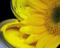
| 04/03/2006 05:07:29 PM | Touch Upby banmornComment: HAHAHA! I LOVE IT! Very creative, well done, good lighting, unique idea! The only thing that bugs me is the corner of blue in the lower left, it's fighting for attention with the flower and paint. Other than that, which I'm going to forgive you for because this is by far my favorite so far you get a 10 | | Photographer found comment helpful. |
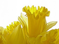
| 04/03/2006 05:06:25 PM | Daffy Dayby LouisonComment: Hahaha, cute! I like this, it's fun, it's clean, crisp, simple, clear and a very nice balance to the whole picture. There is just something that keeps me from giving it a 10, not sure what it is and I'll probably come back to figure it out if I have time but for now a 9 | | Photographer found comment helpful. |
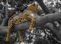
| 04/03/2006 05:05:18 PM | Well Spotted Catby HawkeyeComment: Oh man, he's not real! I'm so bummed! I was hoping this was a real kitty! I love these guys! You tricked me! :)
Nice use of the desaturation for the shot, bringing my attention to the cat and keeping it there but the desaturation seems to have affected the colors on the cat as well, the colors seem a bit muted and dull. Also if there was any other way you could have come from the other side so you could see the cat's face I would have loved that, they have such beautiful faces. As is a 5 | | Photographer found comment helpful. |
| 04/03/2006 05:03:40 PM | Two-Inch Bug!by davidus428Comment: I'll have to take your word for that since there is nothing to compare him too, LOL. I hate these things, they just freak me out for some reason. Nice focus on the bug though but the crop seems to leave the shot just a tad unbalance, not quite on the thirds or centered and the wall has a shadow in the lower left corner that's a bit distracting. A nice shot but nothing to really wow me, maybe a different post process with a different crop could really make this picture stand out. As is a 5 |
| 04/03/2006 05:01:37 PM | Yellow Flowers Smell Yummyby photodudeComment: Awww, what a sweet shot! Very cute child, cute flowers and a nice expression. But that chain! Cutting across the top of her/his (can't really tell, sorry) head is very distracting. Scrolling my screen up just a bit to take it out of the shot and it makes a HUGE difference in the shot, the focus comes back to the child and the flowers they are smelling. Also the light seems just a bit harsh, natural sunlight is wonderful but can be harsh, maybe a levels or curves adjustment to soften it just a bit? A 5 |
| 04/03/2006 04:59:42 PM | Suspendedby ShutterPugComment: Nice shot, looks like the bridge is just sitting there in mid air, very well composed. I like the color on the heavy equipment but not sure I like the treatment to give it that glowing effect. Not something I really associate with heavy equipment in broad daylight, but it's not bad overall. Just something different and unique, points for that. The straight lines of the railing are good for leading me in and out of the shot and balance of the shot is also very good. A 7 | | Photographer found comment helpful. |
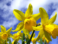
| 04/03/2006 04:57:07 PM | Duplicityby PatrolComment: Yep, lots of them to look at, :)
It's a bit too bright with tha natural light, though they are beautiful maybe a slight reflector to soften the harsh light just a bit would have really made this shot easier to look at. As bright as it is, it does hurt my eyes just a bit. I like the fact you took a different angle to give the flowers a nice sky for the backdrop, very well done. A 6 | | Photographer found comment helpful. |
| 04/03/2006 04:51:29 PM | Moonlight Serenadeby msdoubletroubleComment: Very nice shot here, the colors seem overly washed out around the edges and the center is not quite yellow enough, almost orange except for where the light is shining through. THough it does weok well, there are a few blown out areas on the edges of some the petals. The DOF is a bit confusing to me as well, almost like you have a line going across the middle of the flower to the one next to it, not really natural looking for some reason, can't quite put my finger on it. But I do like this, the colors, the light all work very well together. A 7 | | Photographer found comment helpful. |
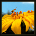
| 04/03/2006 04:49:27 PM | Bee At Playby anthonyczajaComment: Sweet capture! Nice take on the challenge as well. Nice yellow flower, good crisp DOF on the center of the flower and the petals leading me in and up to the main attraction. The boarder seems just a tad heavy to me but that's my personal opinion. Nice shot, good colors, an 8 | | Photographer found comment helpful. |
|
Showing 151 - 160 of ~2077 |
Home -
Challenges -
Community -
League -
Photos -
Cameras -
Lenses -
Learn -
Help -
Terms of Use -
Privacy -
Top ^
DPChallenge, and website content and design, Copyright © 2001-2025 Challenging Technologies, LLC.
All digital photo copyrights belong to the photographers and may not be used without permission.
Current Server Time: 04/12/2025 11:18:37 AM EDT.
|