| Image |
Comment |
| 07/31/2002 01:01:00 PM |
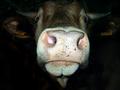
breaking the glass ceilingby macComment: I don't understand this at all. What is that big dark thing on the left? Why is she wearing sports shorts with her suit jacket? Why is there so much blank wall showing? The lighting is very dull and the colours are flat. No sorry I missed this one completely. |
| 07/31/2002 12:58:00 PM |
|
| 07/31/2002 11:37:00 AM |
|
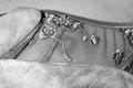
| 07/31/2002 12:05:00 PM |
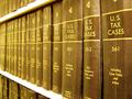
Tax Lawsby ttruthComment: I don't know hat colour these books were originall but I am sure it wasn't anything like this. If you did this yellow thing on purpose then I apologise but it doesn't enhance the work for me. If not then you needed to choose the correct white balance setting on your camera. You could have corrected the colour in photoshop or similar, I tried it and ended up with dark brownish books with gold lettering, quite natural looking. Alternativly it looks good in balck and whit - very stark and foreboding. Really nice copmosition and a great idea for the challenge. The shelves are overexposed though and detract from the image. It's a pity the books aren't lined up perfectly. |
| 07/29/2002 08:39:00 AM |
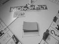
monopoly: a guide for the aspiring capitalist who envisions sole domination of the corporate worldby brent matsuoComment: I don't know if you made this deliberatelt dark to go with the Challenge title but I don't care for the greyness of everything especially those bits we know are white e.g the Monopoly name. No doubt you will get comments about sharpness with this image. I have no doubt the original was pin sharp but this version suffers from the fuzzy edges caused by JPEG compression. It could be fixed a little by using the sharpness tool in photoshop or similar. If soft focus was your aim then I apologise but I doubt it was, you wouldn't have put that single card face up in the image if you didn't mean us to read it and unfortunately I can't. |
| 07/31/2002 12:28:00 PM |
|
| 07/22/2002 02:05:00 PM |
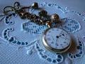
watch on linenby camelotnorthComment: this works much better if adjusted so the watch face is white and the whole thing is then converted to greyscale. I tried it cropped down a bit also and ended up with quite a nice image. Oh and the time is wrong as well. |
| 07/22/2002 07:21:00 AM |
Rat's Nestby CPatteeComment: One of these strands must be in focus but I can't decide which one. sorry! |
| 07/22/2002 01:54:00 PM |
|
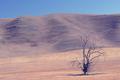
| 07/22/2002 01:30:00 PM |
Dry.by lennierComment: Forgive me for being critical. i am sure there were loads of textures in this scene but unfortunately I can't see any of them. yes it looks hot, yes it looks dry and it's not a bad shot but hot and dry aren't textures. |
Home -
Challenges -
Community -
League -
Photos -
Cameras -
Lenses -
Learn -
Help -
Terms of Use -
Privacy -
Top ^
DPChallenge, and website content and design, Copyright © 2001-2025 Challenging Technologies, LLC.
All digital photo copyrights belong to the photographers and may not be used without permission.
Current Server Time: 04/18/2025 08:25:56 PM EDT.