| Image |
Comment |
| 02/08/2006 11:52:26 AM |
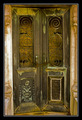
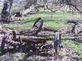
Sweets For My Sweetby idnicComment: I voted this one middle of the road during the challenge. A couple of reasons.
First, I didn't really say romance to me. Of all the reasons I had, that one plyed into my voting the least, because I realize how subjective that is.
Second, there are sharpening artifacts and jaggies on the edge of your plate and heart. This is something that can be avoided, and for whatever reason drives me bonkers.
Next, the color cast. The whites in this image seem to have a tinge of pink in them. I assume it's reflection from the heart. It give the image a warmer feel, but your white aren't white...
Finally, there's what I'm going to assume is senosr dust dotted over the image... I know it's basic editing, but you may want to physically clean that...
Hope this helps! =] Trey |
 Photographer found comment helpful. Photographer found comment helpful. |
| 02/08/2006 07:17:50 AM |
|
| 02/08/2006 07:15:42 AM |
|
| Photographer found comment helpful. |
| 02/08/2006 07:08:35 AM |
|
| Photographer found comment helpful. |
| 02/08/2006 07:07:31 AM |
|
| Photographer found comment helpful. |
| 02/08/2006 07:05:12 AM |
|
| Photographer found comment helpful. |
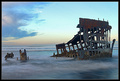
| 02/08/2006 07:02:42 AM |
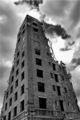
No Exitby ericwooComment: Leaning a bit to the left, and the crop is a little tight, other wise, very cool! |
| Photographer found comment helpful. |
| 02/08/2006 07:00:21 AM |
|
| Photographer found comment helpful. |
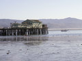
| 02/08/2006 06:55:23 AM |
No Vacancyby CamComment: Way oversharpened. There are jaggies on all the window lines as well as compression artifacts around the edges of the building. It's a shame, b/c I really like this shot. |
| Photographer found comment helpful. |
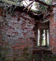
| 02/08/2006 06:49:07 AM |
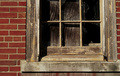
forgottenby tommyd65Comment: This is a cool shoot. A couple of things I'd change, however. First, the crop on the right side is too tight. I think this image would benefit greatly from being able to see some brick on the right of the sill. Second, the perspective. I'm not sure if it was possible, but if you could have gotten your camera a little higheryou wouldn't have the problem of both sides of the window tilting in as you go higher. |
| Photographer found comment helpful. |
Home -
Challenges -
Community -
League -
Photos -
Cameras -
Lenses -
Learn -
Help -
Terms of Use -
Privacy -
Top ^
DPChallenge, and website content and design, Copyright © 2001-2025 Challenging Technologies, LLC.
All digital photo copyrights belong to the photographers and may not be used without permission.
Current Server Time: 04/12/2025 08:07:21 PM EDT.