| Image |
Comment |
| 05/07/2010 03:44:19 PM |
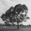
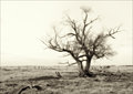
Freedom isn't Freeby PhocalComment: From The Critique Club - !
You have done a great job of preserving detail in the whole image but as a result it feels fairly washed out. Reading the comments made during voting I agree it needs much more contrast, partially taste for me (I love high contrast images) but I think it would have really helped with the visual impact to bring in some more black and let the cloud tips just reach white making the whole thing really pop.
The composition is very nice, perhaps a tad tight on the left. I feel the tree is pointing in that direction and is a little jammed against the edge, but even with the same crop but just moving the whole crop left would make it feel less cramped. The tree does work very well with the square crop however.
I think with more contrast and a little more room on the left of the tree this image could have placed much higher in the challenge!
Good job :)
 tehben tehben
|
 Photographer found comment helpful. Photographer found comment helpful. |
| 05/06/2010 07:31:04 PM |
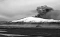
Nature at workby JohannesFrankComment: From The Critique Club - !
Nice image, your placement of 83% is very good, congratulations!
I only have a couple of issues (being picky here) one is the horizontal line of the road or base of the mountain is slanted down on the right. I would suggest straightening it.
The other one is you have a great crop of the mountain, but the ash cloud is leading the eye right off the right side of the image wheres if it had been on the left or further towards the center it would lead you across the image instead of off of it. This very well may have been intentional or you didn't have another choice, but it is something to think about.
Great job on the highlights they may be clipping but the transition is very smooth and they look really good.
I am also noticing a very slight amount of noise in the sky, I don't know if this is due to PP or compression... Its more grain than pixilation so it may just be the result of sharpening and the vast amounts of volcanic ash in the air ;)
Cheers,
tehben
|
| 05/06/2010 04:12:44 PM |
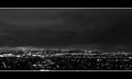
Starless nightby tinkie2010Comment: From the Critique Club - !
I think you have a very nice image going here. Good contrast, dark without being to dark, nice crop.
However I don't really like the border... personal taste.
Regardless of my taste on borders, one suggestion you might try would be to use a smaller white line as the thick ones grabs a lot of attention.
I think probably the factor behind the fairly low score (36%) is the lack of WOW factor, its a good image but not that exiting.
Cheers,
tehbenMessage edited by author 2010-05-06 20:18:38. |
| Photographer found comment helpful. |
| 05/04/2010 09:14:47 PM |
|
| Photographer found comment helpful. |
| 04/23/2010 07:32:32 PM |
|
| Photographer found comment helpful. |
| 04/23/2010 06:59:59 PM |
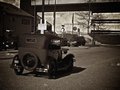
Model Aby tehbenComment: Originally posted by amateurboi:
Greetings from the Critique Club
First Impression: An old car well taken, been given a sepia effect to give a classic touch. Indeed Out of Ordinary.
Composition and Lighting: I like the slight tilt of the image, makes it more dynamic and draws the eye in (though DPC doesn't generally like tilted images).
Technical: The first thing that strikes my technical eye is the grainy texture. I think grain can be used to effectively boost the mood of an image, but I think it hinders this image. Although you have used a larger aperture of F/3.2, you were unable to get the desired result in DOF.
Conceptual: I would call it Out of Ordinary, but the real challenge is to present to the wide geographical audience how out of ordinary it is.
Overall: Good photo with a classic touch to it. |
Thanks!
I was surprised by mrbig65s comment. It is not that common to see one of these driving around in the US.
The grain was purposeful, though I may have overdone it a bit :)
It was taken on a Canon G10 which has a small built in zoom lens so I wasn't expecting a very shallow DOF. |
| 04/23/2010 03:06:51 PM |
|
| Photographer found comment helpful. |
| 04/20/2010 08:05:22 PM |
Watching the Contra Danceby tehbenComment: Originally posted by Spooky11:
Too posed as a result of which lost it spontaneous goes. |
Actually it was a candid shot. |
| 04/15/2010 11:54:46 AM |
|
| Photographer found comment helpful. |
| 04/15/2010 11:54:36 AM |
|
| Photographer found comment helpful. |
Home -
Challenges -
Community -
League -
Photos -
Cameras -
Lenses -
Learn -
Help -
Terms of Use -
Privacy -
Top ^
DPChallenge, and website content and design, Copyright © 2001-2025 Challenging Technologies, LLC.
All digital photo copyrights belong to the photographers and may not be used without permission.
Current Server Time: 04/08/2025 10:11:21 AM EDT.